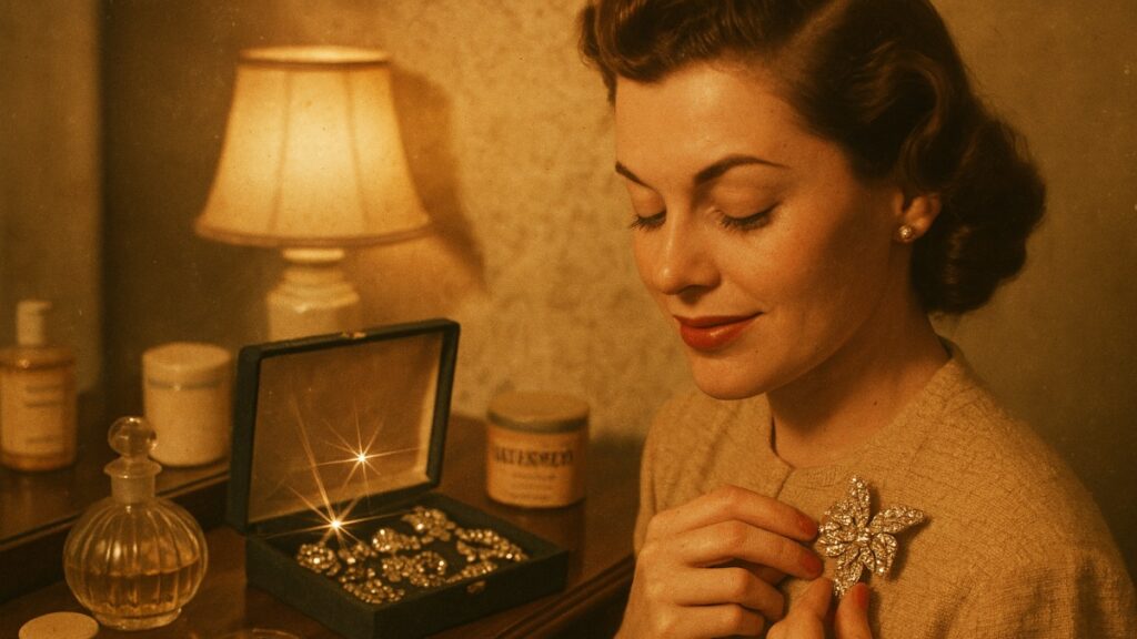
The 1970’s brought us album covers that were genuinely framed pieces of art. As manager of a record store in that decade, I saw countless customers mesmerized by the artistry on the album covers. Many of them got into detailed discussions about the meanings of all the different elements on the covers. Here are some covers that not only caught eyes, but had rich stories behind them.
Table of Contents
- 1 1. Pink Floyd’s “Dark Side of the Moon” (1973)
- 2 2. The Rolling Stones’ “Sticky Fingers” (1971)
- 3 3. Led Zeppelin’s “Houses of the Holy” (1973)
- 4 4. David Bowie’s “Aladdin Sane” (1973)
- 5 5. Eagles’ “Hotel California” (1976)
- 6 6. Queen’s “News of the World” (1977)
- 7 7. Bruce Springsteen’s “Born to Run” (1975)
- 8 8. Kansas’s “Point of Know Return” (1977)
- 9 9. Supertramp’s “Breakfast in America” (1979)
- 10 10. Fleetwood Mac’s “Rumours” (1977)
1. Pink Floyd’s “Dark Side of the Moon” (1973)

Storm Thorgerson’s prism cover has gone down in rock history as one of the best visual representations of an album. The band asked for something ‘simple and bold’. Thorgerson gave them a prism cover. The representation of Pink Floyd’s theme of light and dark in the prism imagery draws from the band’s famous light shows, and has become an enduring cultural icon.
Save for later
Want to come back to this story? Save it with your email so it is easy to find again.
2. The Rolling Stones’ “Sticky Fingers” (1971)

Andy Warhol designed an album cover that was so out of the box that a zipper was included! When pulled down, the cover revealed underwear as part of the model’s outfit, which remained a mystery for years. The Warhol cover led to the band losing a lot of money on the first round of sales due to the high costs of vinyl packaging. However, the innovative cover design won the band a lot of fame and influenced album packaging for years to come.
3. Led Zeppelin’s “Houses of the Holy” (1973)

The album cover featuring the Giant’s Causeway in Northern Ireland was taken during a child climbing the rocks. The shoot happened over a span of ten days in poor weather and was later tinted golden by the design studio Hipgnosis. Cover images with children were banned in several countries, and alternative versions had to be created instead.
4. David Bowie’s “Aladdin Sane” (1973)
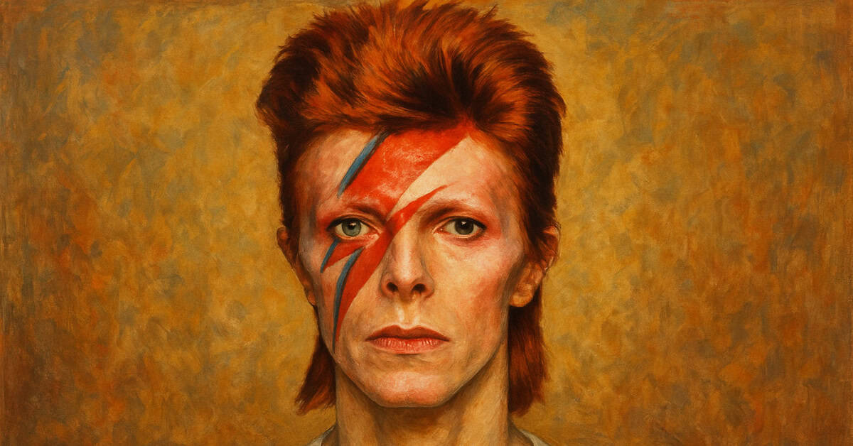
Bowie’s face with a lightning bolt is one of the most recognizable poses in music history. It was Brian Duffy who took that photo, and it took nearly an hour for the makeup artist Pierre Laroche to finish the lightning bolt. Because of the metallic silver print, it was one of the most expensive album covers ever made.
5. Eagles’ “Hotel California” (1976)
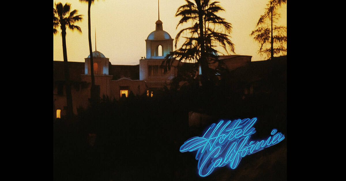
Countless conspiracy theories have sprung from the sunset image of the Beverly Hills Hotel. It was David Alexander who took the photo from on top of a 60-foot cherry picker. The hotel was initially against the photo being used, but they eventually accepted their new position in rock history.
6. Queen’s “News of the World” (1977)
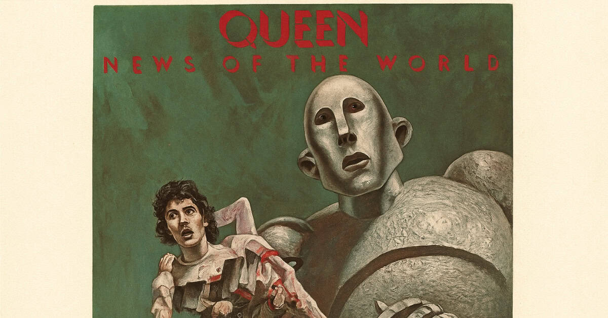
The robot with the dead band members was inspired by a 1954 sci-fi magazine cover. Frank Kelly Freas, the artist, created the graphic at the request of the band. The extremely graphic image captured the disturbing themes of the album, and it became a favorite amongst sci-fi fans.
7. Bruce Springsteen’s “Born to Run” (1975)
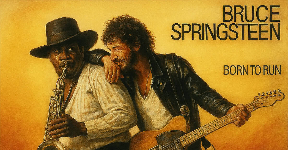
The cover photos of Bruce Springsteen and Clarence Clemons is one of the most legendary captures of their friendship. Eric Meola, the photographer, was covering a studio session and shot 900 photos that day, and this one of them having a spontaneous moment during a song was selected. It captured the racial harmony that Springsteen advocated for throughout his career.
8. Kansas’s “Point of Know Return” (1977)
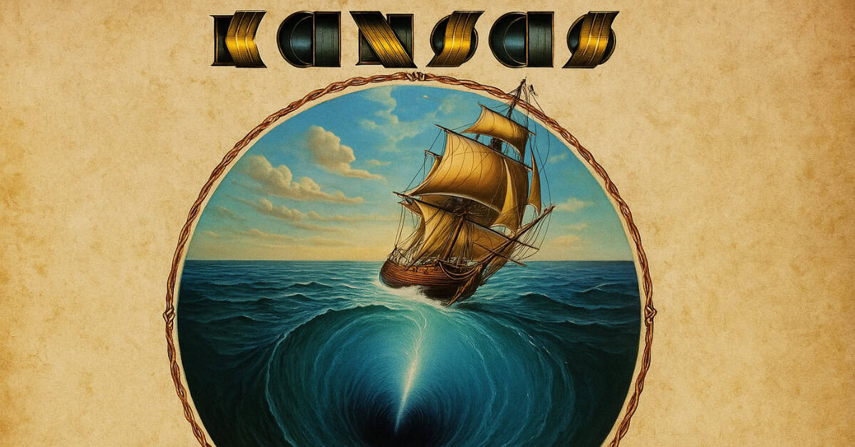
An example of an image created by Peter Lloyd using the scratchboard method. He created the ship sailing over the edge of a flat Earth. Most of the details took him many months to create as he hand carved each detail to perfection. The image is aligned with the album’s theme of adventure and questioning the status quo.
9. Supertramp’s “Breakfast in America” (1979)
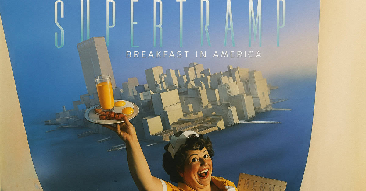
Actress Kate Murtagh was the waitress portraying the Statue of Liberty. She constructed the Manhattan skyline using only white kitchen utensils set against a black background. The backdrop served as a witty visual pun and captured the irony of the British perspective American commentary the album cover was critiquing.
10. Fleetwood Mac’s “Rumours” (1977)
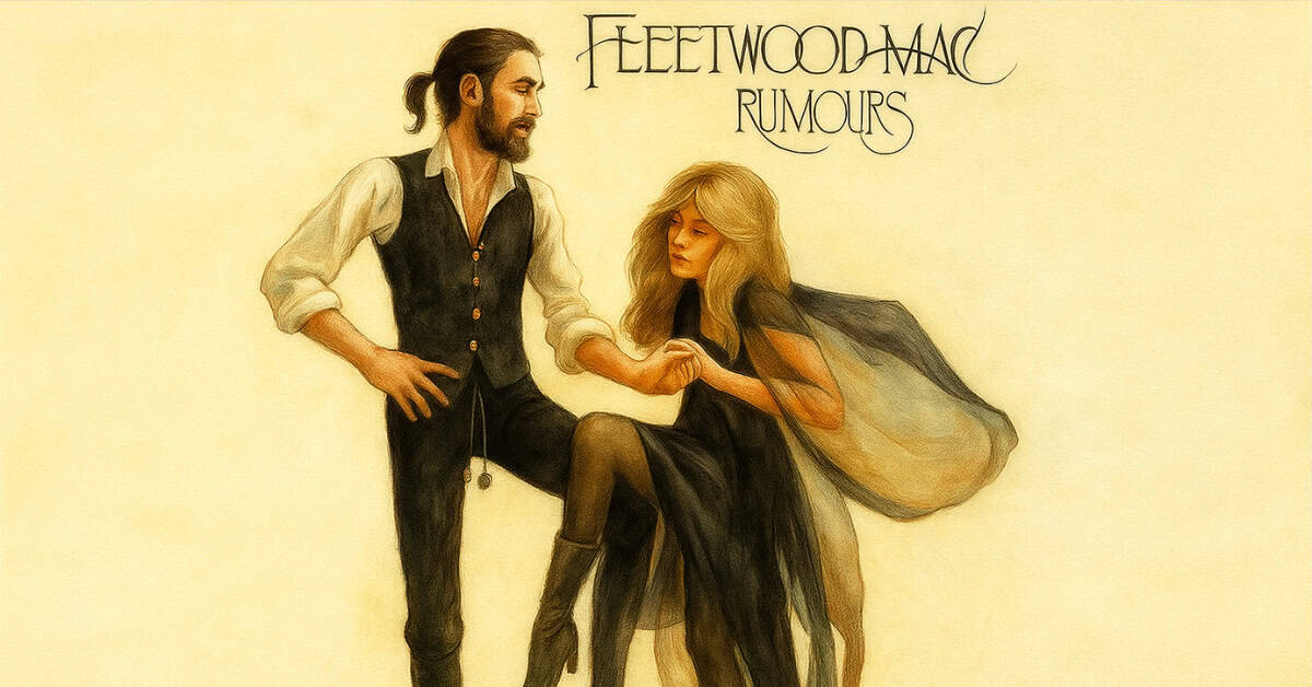
The themes of relationship conflict present on the album were embodied in the enigmatic image of Mick Fleetwood and Stevie Nicks. The dangling wooden balls that belonged to Fleetwood were toilet chains from a pull-chain toilet he had rescued from a club where the band had played in the early days of their career. This photo became iconic in representing how complicated the relationships were within the band.