
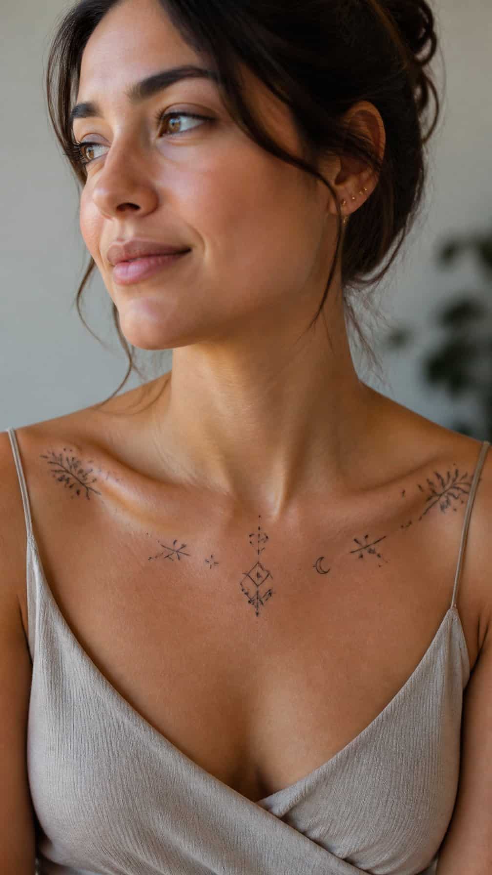
A collarbone tattoo can complement your natural lines while expressing something personal, subtle, or symbolic. I’ll explore designs that suit different styles, placements, and levels of visibility without overwhelming this delicate area.
Save for later
Want to come back to this story? Save it with your email so it is easy to find again.
You can find a collarbone tattoo that balances your chosen image with the body’s natural shape, spacing, and movement. I’ll also cover placement, design considerations, pain, healing, and long-term care so you can make a more informed choice.
Table of Contents
- 1 1) Fine-line botanical sprig tracing the collarbone
- 2 2) Delicate lavender stem following the shoulder line
- 3 3) Minimalist crescent moon centered below the collarbone
- 4 4) Tiny constellation scattered across the upper chest
- 5 5) Single-line swallow gliding beneath the collarbone
- 6 6) Small wildflower trio tucked near the shoulder
- 7 7) Elegant script name following the collarbone curve
- 8 8) Subtle Roman numeral date under the collarbone
- 9 9) Fine-line mountain range spanning one side
- 10 10) Tiny sunburst placed at the collarbone center
- 11 11) Minimalist wave symbol beneath the shoulder
- 12 12) Delicate vine wrapping gently toward the shoulder
- 13 13) Small butterfly resting below the collarbone
- 14 14) Fine-line anatomical heart near the left collarbone
- 15 15) Tiny paper airplane angled toward the shoulder
- 16 16) Dainty feather aligned with the collarbone
- 17 17) Minimalist lightning bolt near the outer collarbone
- 18 18) Small star cluster following the natural curve
- 19 19) Delicate olive branch beneath the collarbone
- 20 20) Fine-line snake curving toward the shoulder
1) Fine-line botanical sprig tracing the collarbone
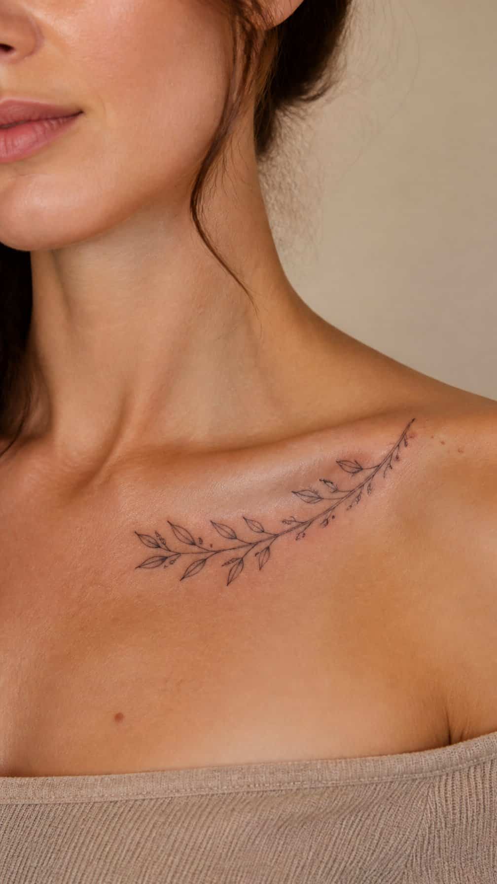
I like a fine-line botanical sprig for its natural fit along the collarbone’s gentle curve. Slim stems and small leaves can follow the bone without making the design feel crowded, while a slightly uneven arrangement keeps it from looking overly rigid.
I would place the stem just below or directly along the collarbone, depending on how visible you want the tattoo to remain under clothing. Olive branches, eucalyptus, lavender, and wild herbs each create a different effect through leaf shape and spacing.
Fine lines require careful aftercare and may soften with time, especially in areas exposed to sunlight or frequent friction. I would choose an experienced tattoo artist who can maintain consistent line weight and adjust the scale to your anatomy.
2) Delicate lavender stem following the shoulder line
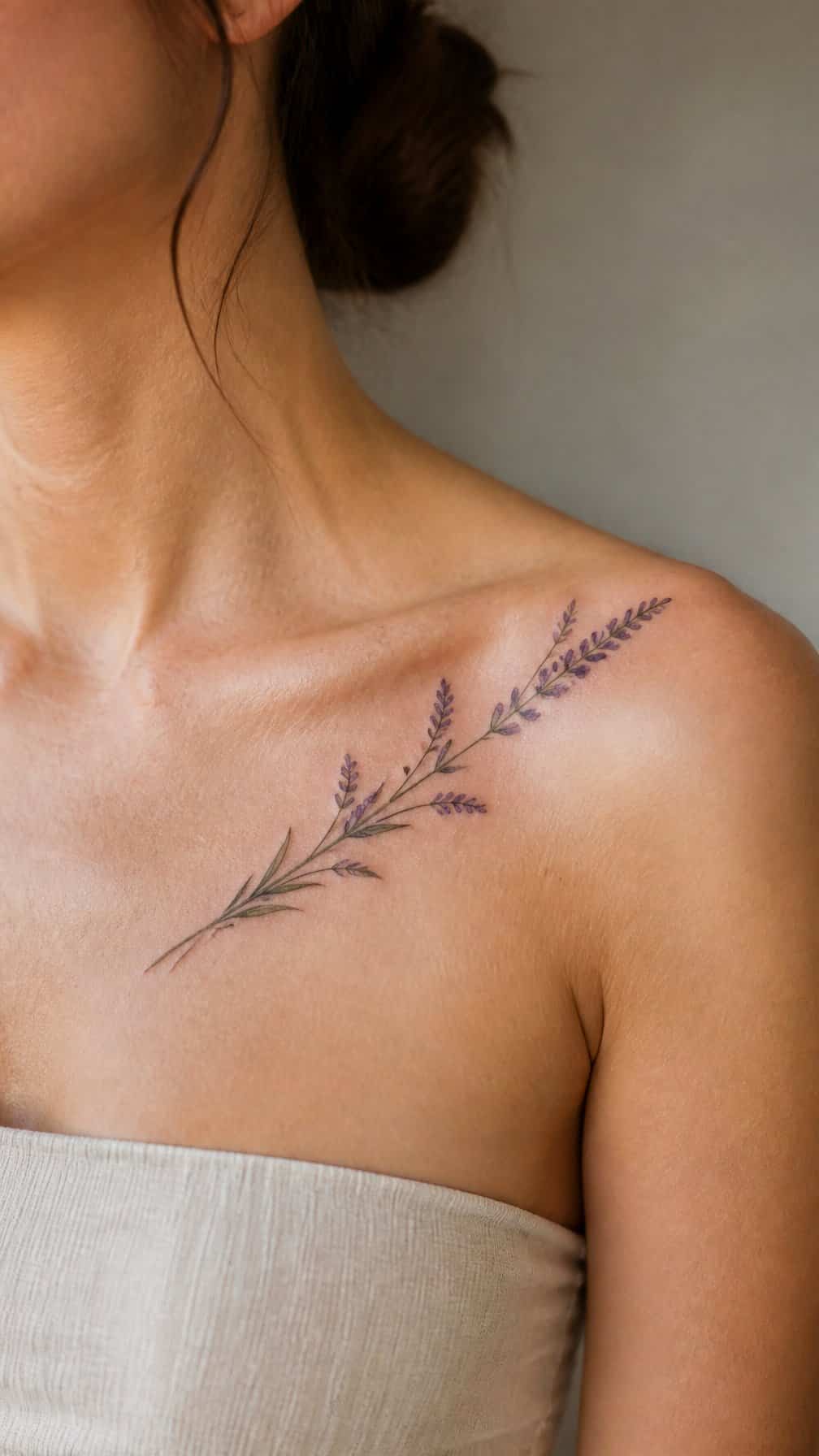
I like this design for its narrow shape and gentle movement. I would place the stem along the collarbone’s natural curve, letting the flower heads angle toward the shoulder while the leaves stay close to the skin.
A fine-line approach keeps the tattoo light and precise. I would choose muted purple for the blossoms and soft green or black for the stem, depending on how subtle I want the contrast. The placement also leaves room for a small date, initial, or second sprig without making the composition feel crowded.
3) Minimalist crescent moon centered below the collarbone
I like a small crescent moon placed just below the center of the collarbone because the design follows the body’s natural symmetry. Its curved shape adds gentle movement without making the tattoo feel busy, while fine lines keep the result clean and understated.
I would choose a slightly open crescent for a lighter look or a filled version for stronger contrast. A black-ink design usually suits this placement well, and its modest size makes it easy to keep discreet beneath a shirt or highlight with an open neckline.
4) Tiny constellation scattered across the upper chest
I like placing a few tiny stars and dots across the upper chest, with the design gently following the collarbone rather than forming a rigid line. The open spacing keeps the tattoo light and lets each mark remain distinct.
I would keep the symbols small and use consistent line weight for a clean result. A constellation can reference a birth sign, a meaningful date, or simply a pattern I find visually balanced.
This placement works well with fine black ink, though I would discuss skin tone, detail retention, and spacing with my tattoo artist before choosing the final size.
5) Single-line swallow gliding beneath the collarbone
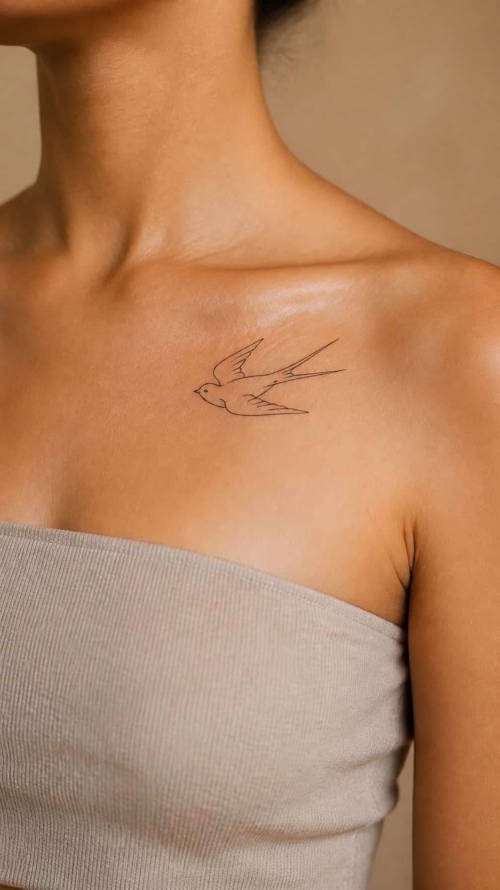
I like this design for its clean movement and restrained detail. A single-line swallow can follow the collarbone’s natural direction, creating a subtle shape that feels balanced without appearing crowded.
I would place the bird slightly beneath the bone, with its wings angled toward the shoulder or center of the chest. A small size keeps the outline crisp and makes the tattoo easy to cover when needed.
I would choose a tattoo artist experienced with fine-line work, since thin strokes require careful placement and consistent technique. Black ink gives the silhouette a classic look, while a small blue or red accent can add definition without overpowering the design.
6) Small wildflower trio tucked near the shoulder
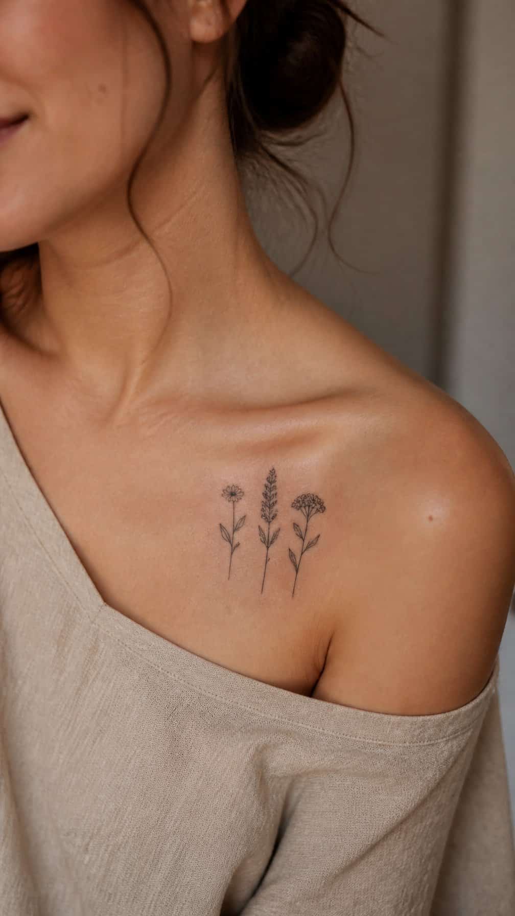
I like placing three small wildflowers along the collarbone’s natural slope, with each stem angled slightly differently. The uneven spacing keeps the design relaxed while preserving a clean, lightweight appearance.
I would use fine lines for the stems and restrained detail in the petals. A tiny leaf or two can add structure without making the tattoo feel crowded, especially in the narrow space near the shoulder.
I find this arrangement works well in black ink, though muted color can distinguish each bloom. I would keep the scale modest so the trio follows the shoulder’s contour and remains easy to cover when needed.
7) Elegant script name following the collarbone curve
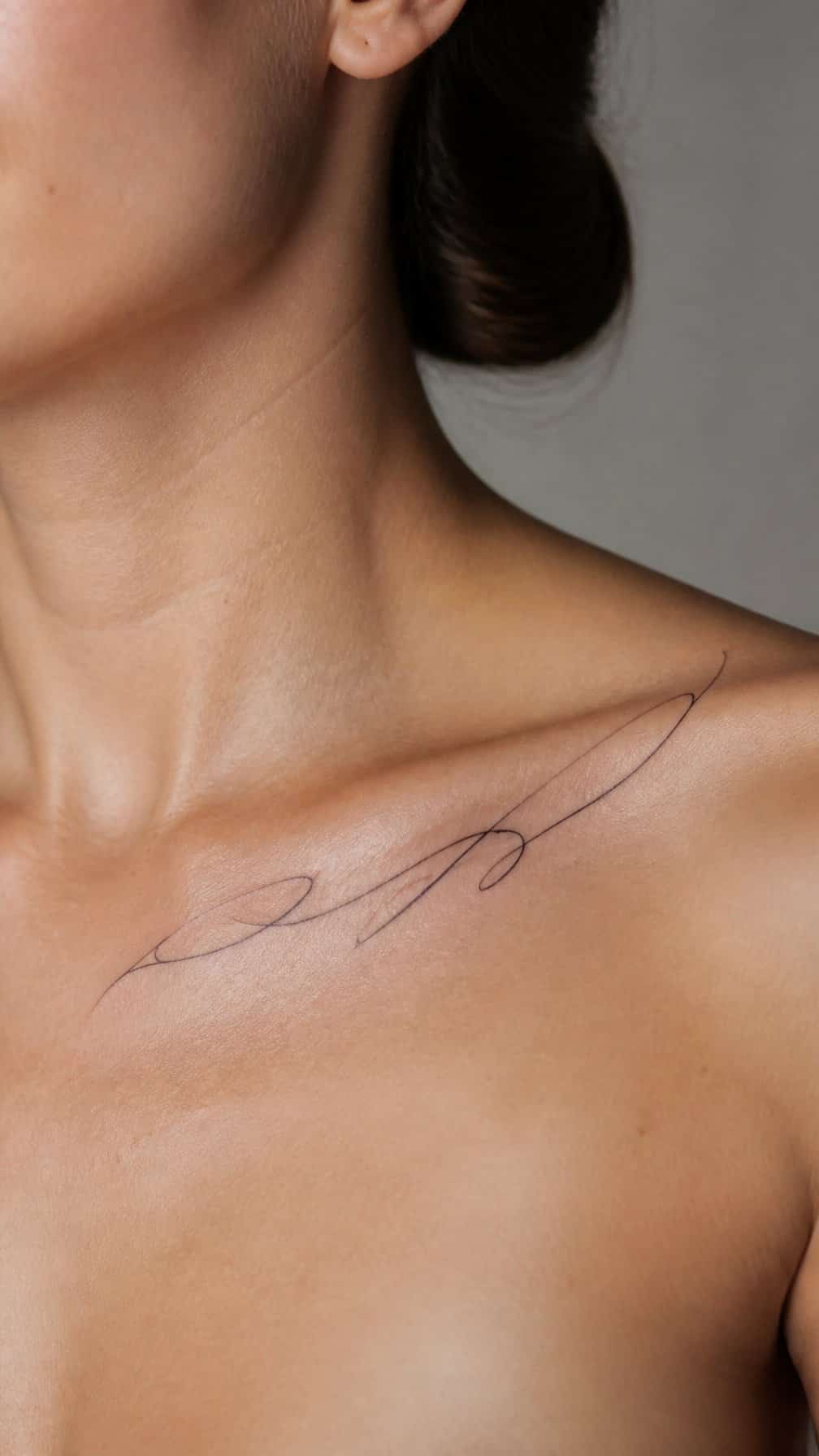
I would place the name slightly below the collarbone and let the lettering follow its natural line. A fine script style keeps the design light, while modest spacing helps each letter remain legible as the tattoo ages.
I prefer a short name or meaningful word for this placement because longer text can extend too far toward the shoulder or sternum. I would ask the artist to test several sizes and angles on the skin first, since body movement and individual anatomy affect the final alignment.
A subtle black or dark gray ink choice gives the script a clean appearance. I would also consider adding a small initial, dot, or fine flourish only if it supports the lettering without making the design feel crowded.
8) Subtle Roman numeral date under the collarbone
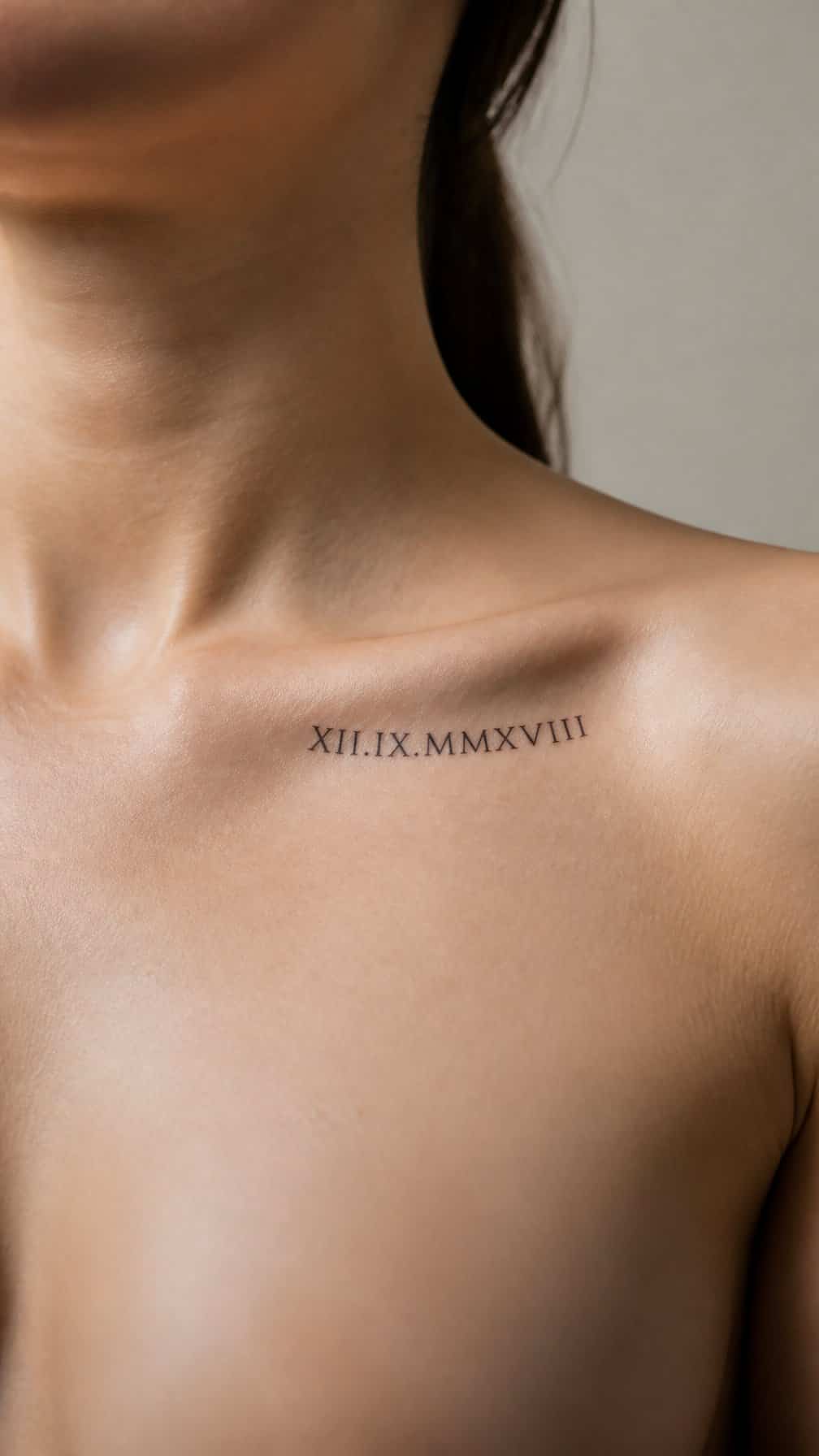
I like Roman numerals beneath the collarbone for a date that feels personal without demanding attention. The horizontal placement follows the natural line of the bone, while a slim typeface keeps the design clean and understated.
I would choose spacing carefully, especially for longer dates, so the numbers remain readable as the tattoo ages. Black ink offers the clearest result, while a slightly softer gray can create a more delicate appearance. A date connected to a birth, anniversary, or meaningful milestone gives the design its significance.
9) Fine-line mountain range spanning one side
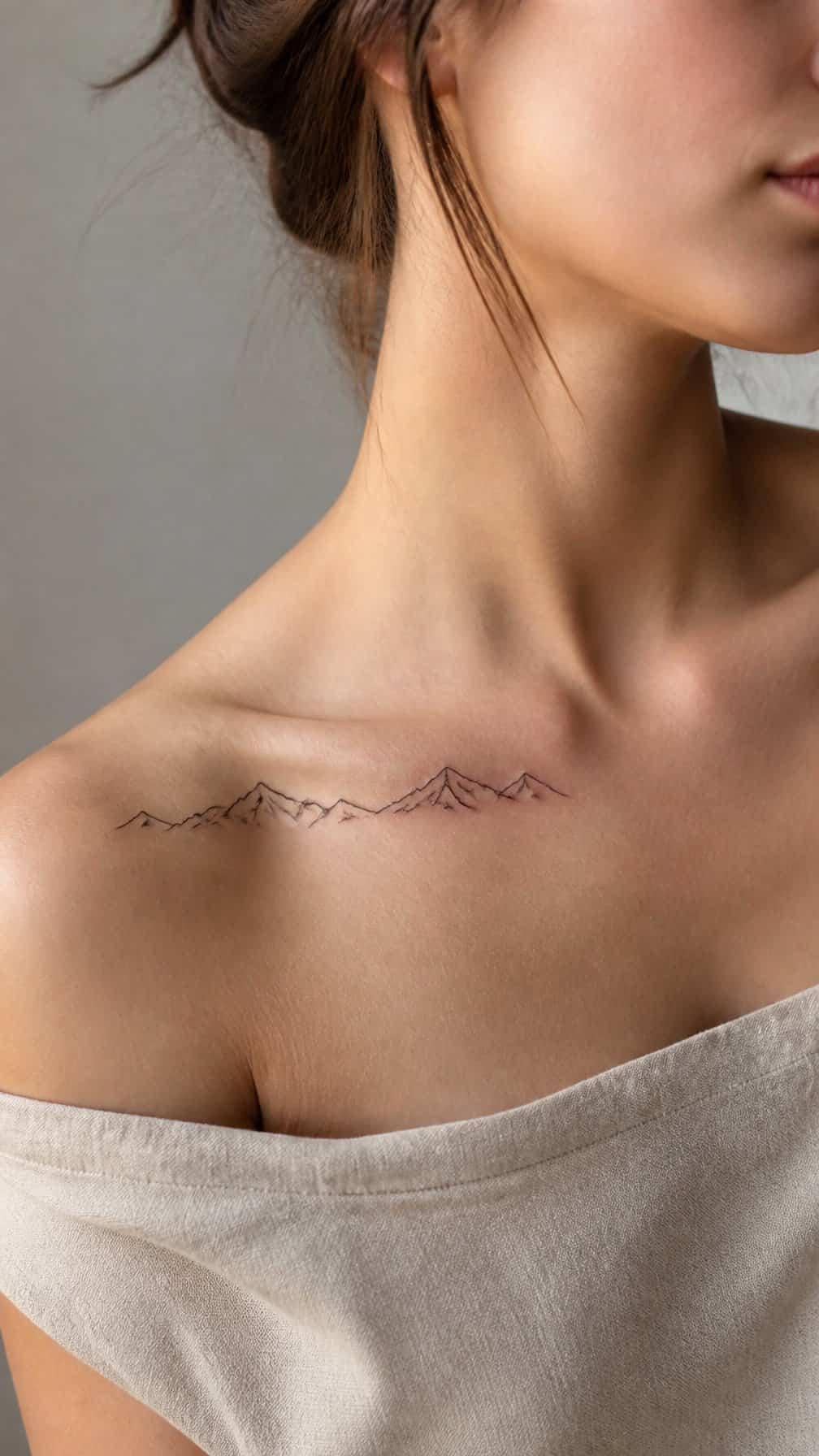
I like how a fine-line mountain range follows the collarbone’s natural slope without competing with its shape. I would place the design from near the shoulder inward, using varied peaks and small gaps to create a balanced, airy outline.
I would keep the line weight consistent and the detail restrained, especially if the tattoo remains narrow. A few ridges, a low sun, or tiny trees can add depth while preserving the clean appearance.
I would ask the artist to account for movement and anatomy before choosing the final length. The collarbone’s curve can make a straight stencil look uneven, so a gentle adjustment helps the range sit naturally.
10) Tiny sunburst placed at the collarbone center
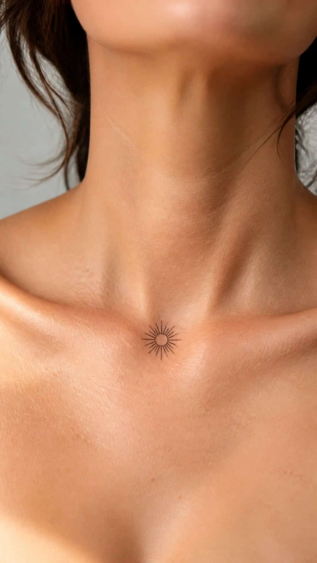
I like this placement for a small design that feels balanced without demanding much space. Centering the sunburst above the sternum lets its rays follow the natural line between the collarbones, while the compact scale keeps the result subtle.
I would choose fine, evenly spaced rays for a clean look, or slightly varied lengths for a softer handmade effect. Black ink usually keeps the details crisp, especially when the tattoo remains small.
I would also consider how the design sits with necklaces and open-neck tops. A little breathing room around the tattoo helps preserve its shape and keeps the center placement visually clear.
11) Minimalist wave symbol beneath the shoulder
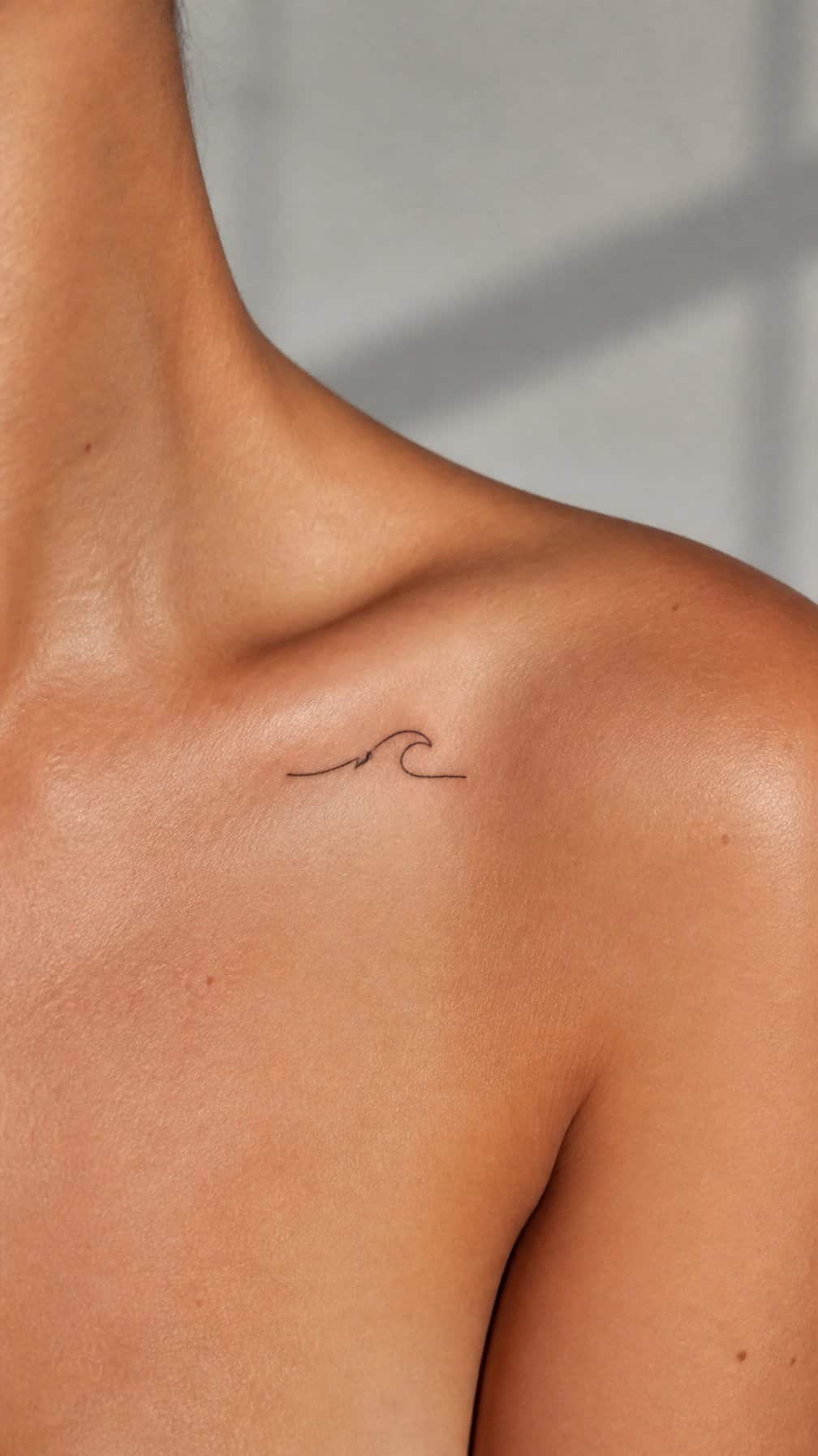
I like placing a small wave symbol beneath the shoulder, where its gentle curve follows the natural line of the upper chest. A fine black outline keeps the design clean and gives it a subtle presence without competing with the collarbone.
I would choose this placement for its balance between visibility and discretion. The tattoo can appear beneath an open neckline while remaining easy to cover with a shirt, and its compact shape leaves enough surrounding space for the skin to remain part of the design.
12) Delicate vine wrapping gently toward the shoulder
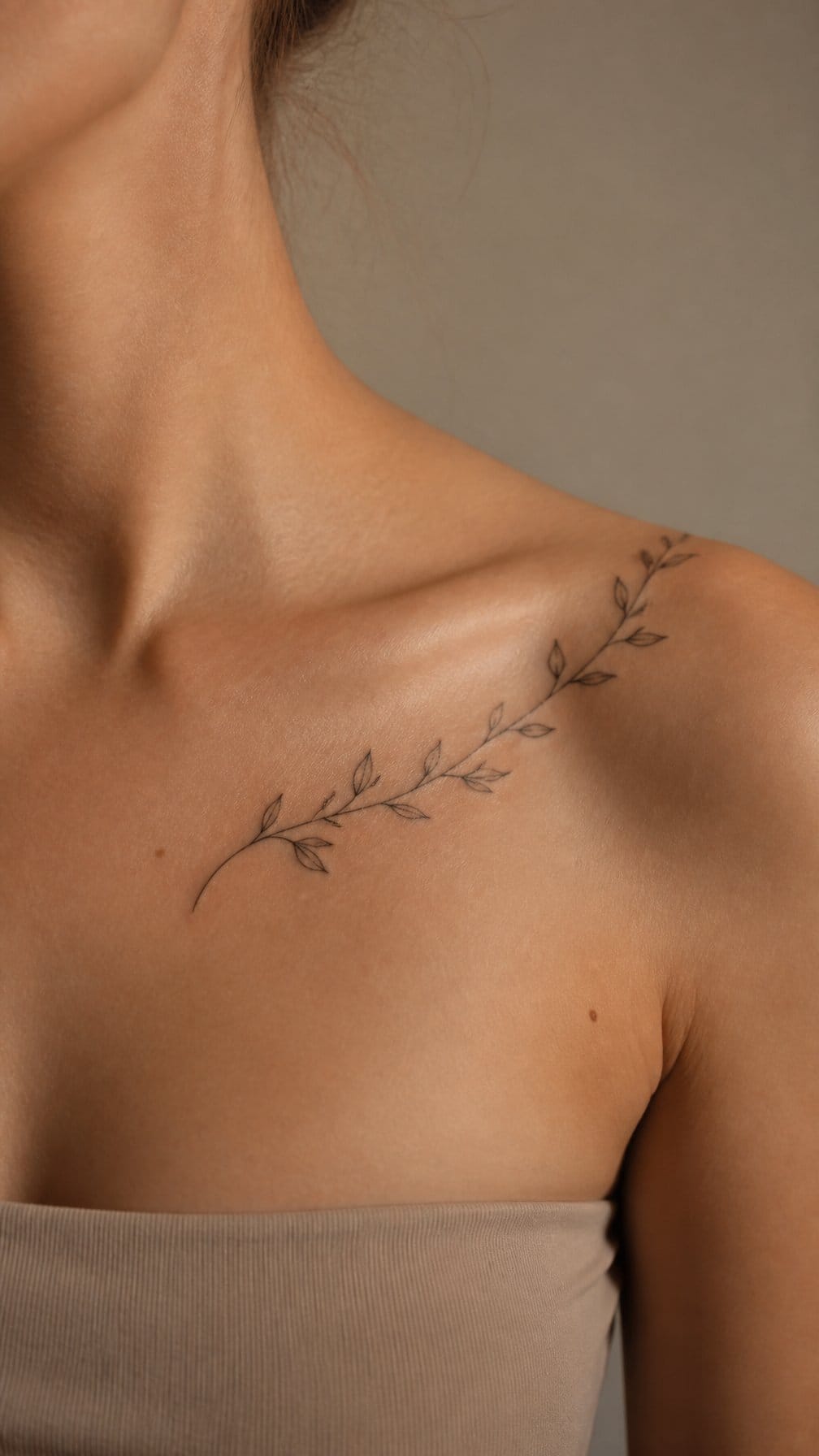
I like how this design follows the natural line of the collarbone before curving toward the shoulder. Thin stems and small leaves keep the tattoo light, while slight spacing prevents the details from blending together.
I would place the main stem just below the collarbone and let the leaves taper as they move outward. Black ink suits the fine structure, though muted green can add a botanical touch if the artist confirms it will age well on the skin.
I find this placement easy to personalize with olive leaves, ivy, or small buds. Its gentle direction also works well with sleeveless clothing and leaves room for future pieces near the shoulder.
13) Small butterfly resting below the collarbone
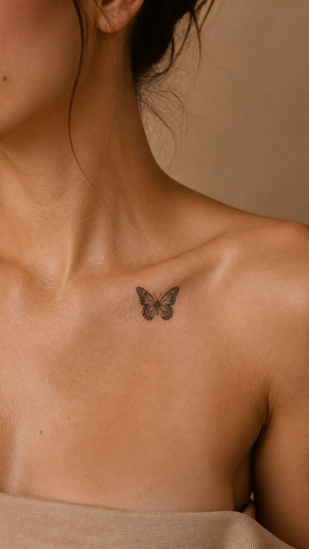
I like placing a small butterfly just below the collarbone because the area gives the design room to sit without crowding the bone. Fine lines can define the wings, while a few dots add texture without making the tattoo feel heavy.
I would keep the body aligned with the collarbone or angle the butterfly slightly upward. Black ink creates a clean, lasting look, while muted color can highlight the wings. This placement also stays easy to cover with most necklines.
14) Fine-line anatomical heart near the left collarbone
I like placing a fine-line anatomical heart just below the left collarbone because the area gives the design room to follow the body’s natural shape. Its slim contours and subtle anatomical details create a precise look without making the tattoo feel heavy.
I would keep the heart relatively small and use consistent line weight for a clean result. A slight angle can make it appear more natural across the chest, while minimal shading adds depth without competing with the delicate outline.
This placement works well with simple styling because the tattoo remains visible in open-neck shirts but stays easy to cover. I would choose an experienced fine-line artist who can manage small details and account for how the skin moves near the shoulder.
15) Tiny paper airplane angled toward the shoulder
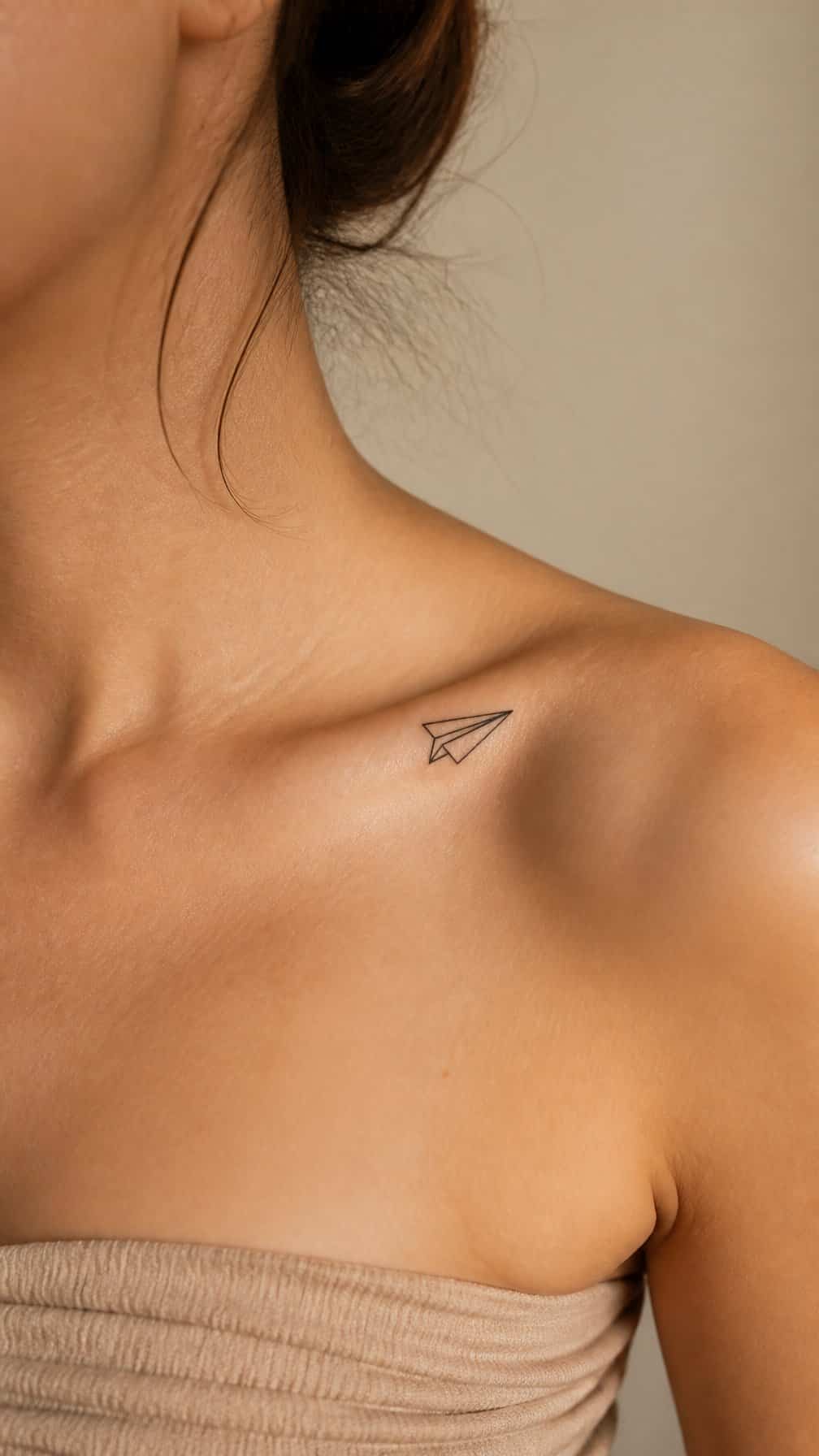
I like how this small design follows the collarbone’s natural direction without competing with it. I would angle the plane toward the shoulder, using clean lines and a simple outline to keep the shape recognizable at a small size.
I would place it slightly below the collarbone or near its outer third, depending on the available space. A black ink version gives it a crisp, understated look, while a small gray shadow can add depth without making the tattoo feel heavy.
16) Dainty feather aligned with the collarbone
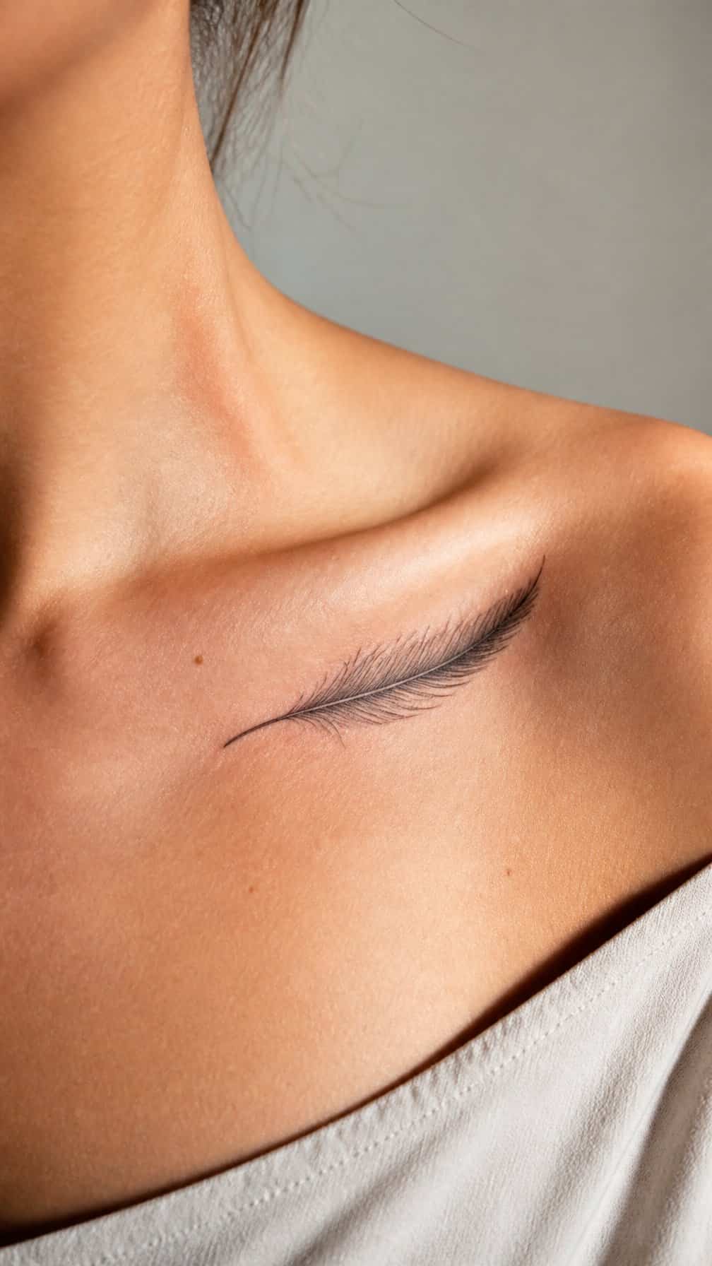
I like a fine-line feather placed along the collarbone because its tapered shape follows the body’s natural angle. I would keep the design slim and lightly detailed, using short strokes to suggest the central shaft and soft barbs without making the tattoo look crowded.
A black or muted gray palette keeps the piece understated and easy to style. I would position the feather slightly below the bone or let its tip point toward the shoulder, depending on the desired direction. This placement suits someone who wants a small tattoo with visible movement and delicate detail.
17) Minimalist lightning bolt near the outer collarbone
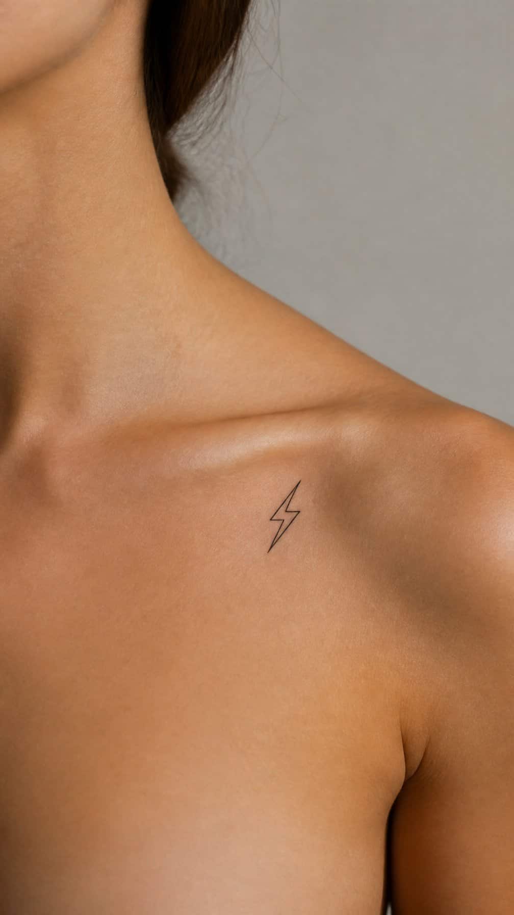
I like this placement for its clean direction and limited visual weight. A small lightning bolt can follow the collarbone’s natural line, while the outer position leaves enough space around the design for it to remain distinct.
I would choose a fine-line outline or a solid black shape, depending on how noticeable I want the tattoo to look. A slightly angled bolt adds movement without requiring extra elements, and its compact size works well with simple, understated styling.
I would also consider how the design aligns with clothing straps and necklines. The outer collarbone offers some flexibility, but I would ask the tattoo artist to position the stencil while I stand naturally.
18) Small star cluster following the natural curve
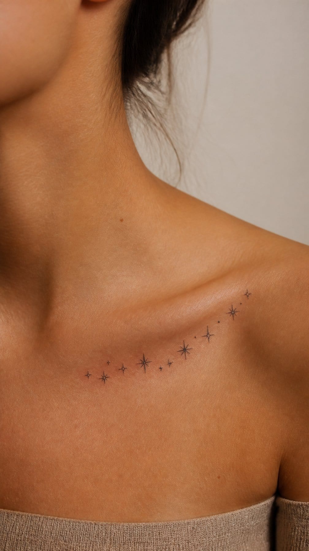
I like this design because its small stars can trace the collarbone without competing with its natural shape. I would place three to five stars along the curve, using slight differences in size to create a balanced, informal arrangement.
A fine-line style keeps the tattoo light and precise. I would choose a spot that leaves enough space between the stars so each shape remains clear as the tattoo ages, especially near areas that receive regular sun exposure.
Black ink gives the cluster a clean appearance, while tiny dot details can add variation without making the design feel crowded. I would keep the placement slightly below or beside the collarbone to reduce friction from clothing.
19) Delicate olive branch beneath the collarbone
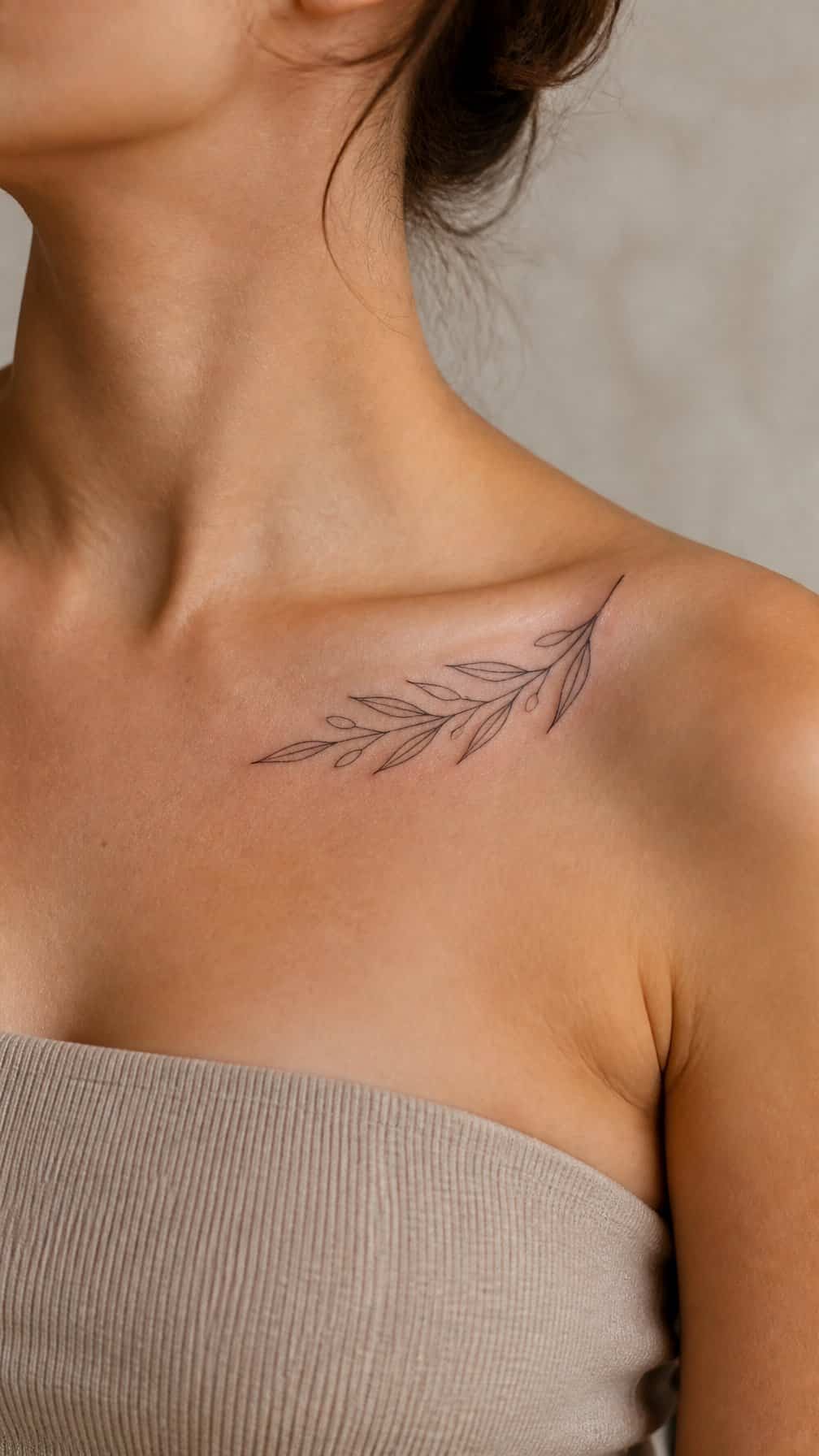
I like an olive branch beneath the collarbone because its narrow shape follows the body’s natural lines without appearing crowded. Small leaves create enough detail to make the design recognizable, while a fine stem keeps the tattoo light and understated.
I would place it slightly below the collarbone, following its curve or angling it toward the shoulder. Black ink suits the clean botanical form, while muted green can add a subtle natural quality. I would keep the leaves spaced clearly so the design remains legible as it ages.
20) Fine-line snake curving toward the shoulder
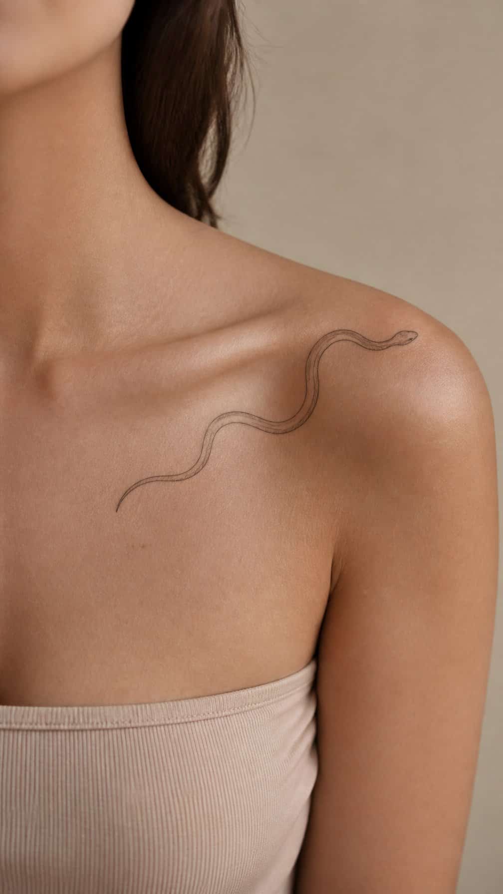
I like how a fine-line snake can follow the natural slope of the collarbone without appearing heavy. I would place its head near the shoulder and let the body curve inward, creating movement while keeping the design balanced.
I would choose a narrow profile, restrained scales, and a small amount of negative space between the coils. A slightly raised head adds direction, while a relaxed curve keeps the tattoo from looking crowded against the neck or shoulder.
I would also consider how the design will look with different necklines. Its slim structure works well on its own, but a few tiny leaves or dots can frame the curve without taking attention away from the snake.