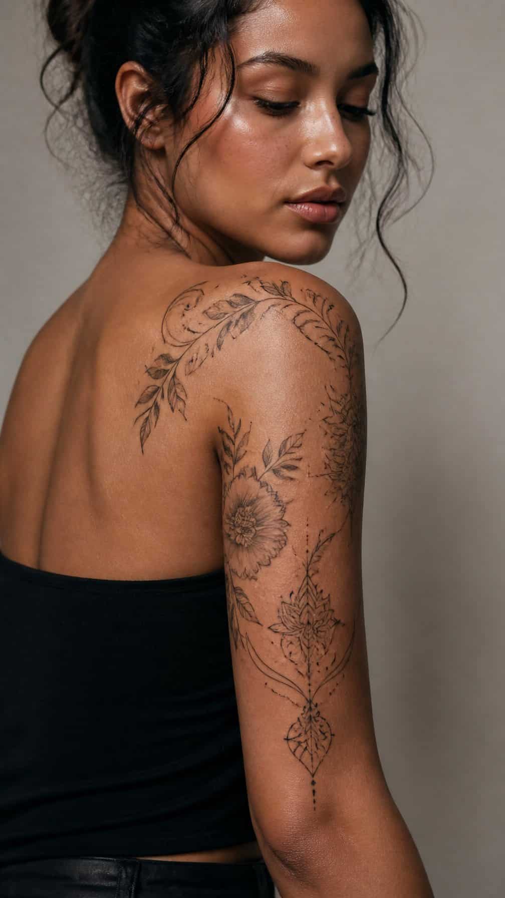
A shoulder tattoo can shape how your entire arm looks, balancing the curve of the shoulder with the lines of the upper arm. I’ll explore designs that range from delicate and minimal to bold and detailed, helping you compare styles, themes, and placements.
Save for later
Want to come back to this story? Save it with your email so it is easy to find again.
You can choose a shoulder tattoo that complements your arm’s natural structure while matching your personal style. I’ll also cover visual balance, sizing, placement, planning, and long-term care so you can approach your design with greater clarity.
Table of Contents
- 1 1) Botanical Shoulder-to-Upper-Arm Vine
- 2 2) Blackwork Shoulder Cap Mandala
- 3 3) Fine-Line Crescent Moon and Stars
- 4 4) Geometric Shoulder Armor
- 5 5) Watercolor Peony Spilling Down the Arm
- 6 6) Japanese Koi Fish Shoulder Wrap
- 7 7) Realistic Lion Shoulder Portrait
- 8 8) Minimalist Mountain Range Shoulder Band
- 9 9) Ornamental Shoulder Filigree
- 10 10) Snake Coiling from Shoulder to Bicep
- 11 11) Celestial Sun and Moon Shoulder Piece
- 12 12) Tribal-Inspired Shoulder Band
- 13 13) Black-and-Grey Rose Shoulder Tattoo
- 14 14) Abstract Brushstroke Shoulder Design
- 15 15) Phoenix Rising Over the Shoulder
- 16 16) Fine-Line Wildflower Shoulder Spray
- 17 17) Compass and Map Shoulder Wrap
- 18 18) Dragon Shoulder-to-Arm Tattoo
- 19 19) Roman Numeral Shoulder Band
- 20 20) Ocean Wave Shoulder Cuff
- 21 21) Butterfly Trail Across the Shoulder
- 22 22) Dotwork Sacred Geometry Shoulder Piece
1) Botanical Shoulder-to-Upper-Arm Vine
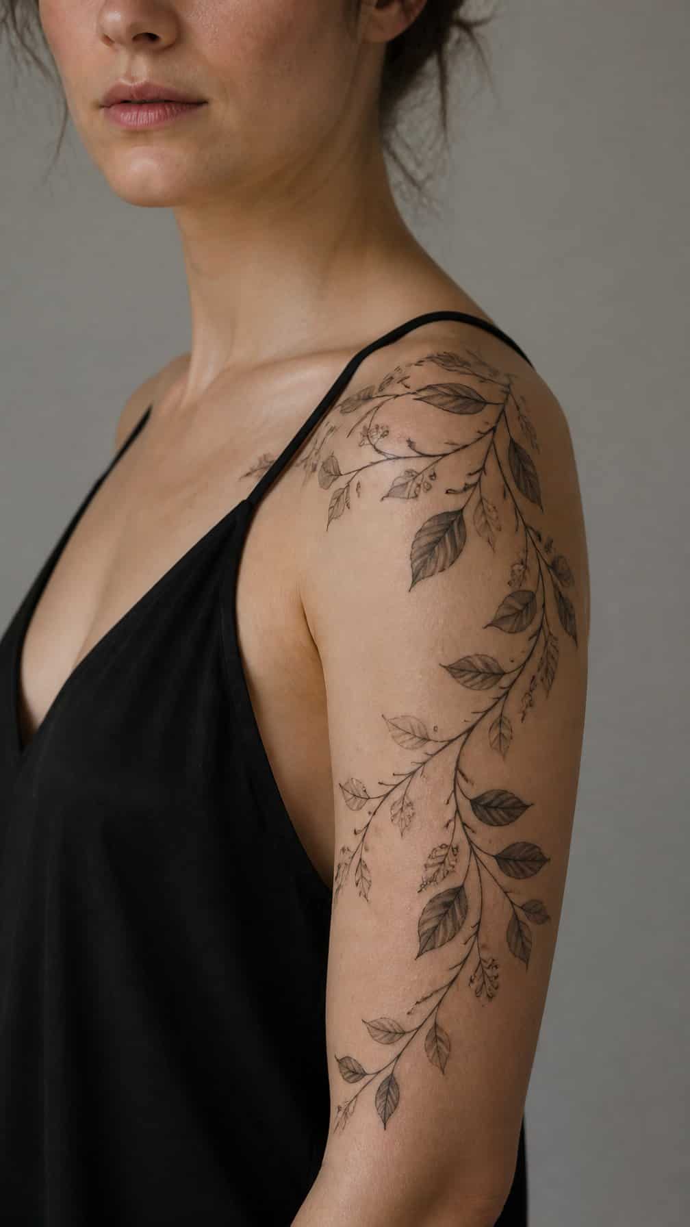
I like how a leafy vine can follow the shoulder’s curve before descending along the upper arm. I would use slender stems, spaced leaves, and modest shading to keep the design light and readable as the arm moves.
I find this placement works well for tattoos that need natural flow without covering the entire shoulder. I might add small buds or fine veins for detail, while leaving some skin visible to separate each element. The design can remain mostly black and gray or include muted green accents, depending on the desired style.
2) Blackwork Shoulder Cap Mandala
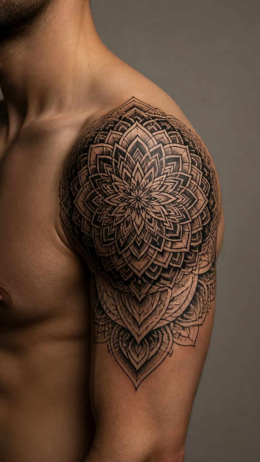
I like a blackwork mandala on the shoulder because its circular geometry follows the rounded deltoid naturally. Dense petal shapes, clean negative space, and bold outlines create a structured cap that can extend slightly onto the upper arm without losing definition.
I would ask my tattoo artist to place the central point over the shoulder’s fullest area, then adjust each ring to match my anatomy. Fine details work best when they remain clearly separated, while heavier outer lines help the design retain its shape as it wraps toward the arm.
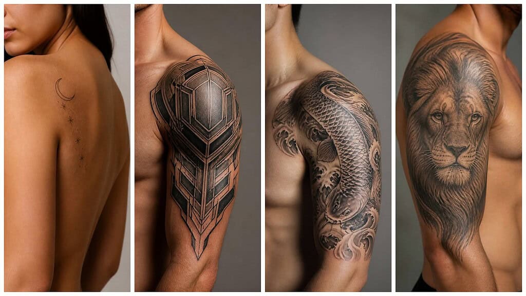
3) Fine-Line Crescent Moon and Stars
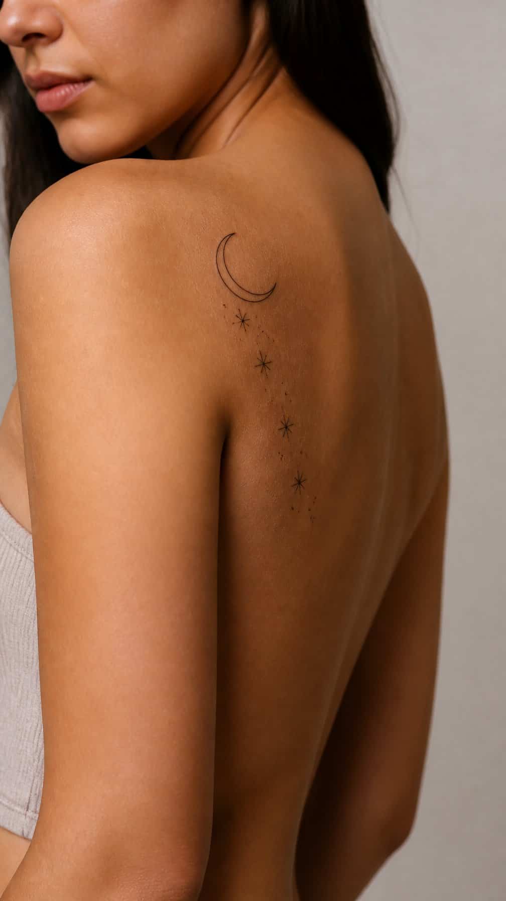
I like a fine-line crescent moon with small stars because the design follows the shoulder’s natural curve without making the arm look crowded. I would place the moon near the shoulder cap and let the stars trail slightly toward the upper arm.
Thin black lines keep the tattoo light and precise, while varied star sizes add depth without heavy shading. I would choose this layout for a subtle celestial theme that remains easy to view from the front or side.
4) Geometric Shoulder Armor
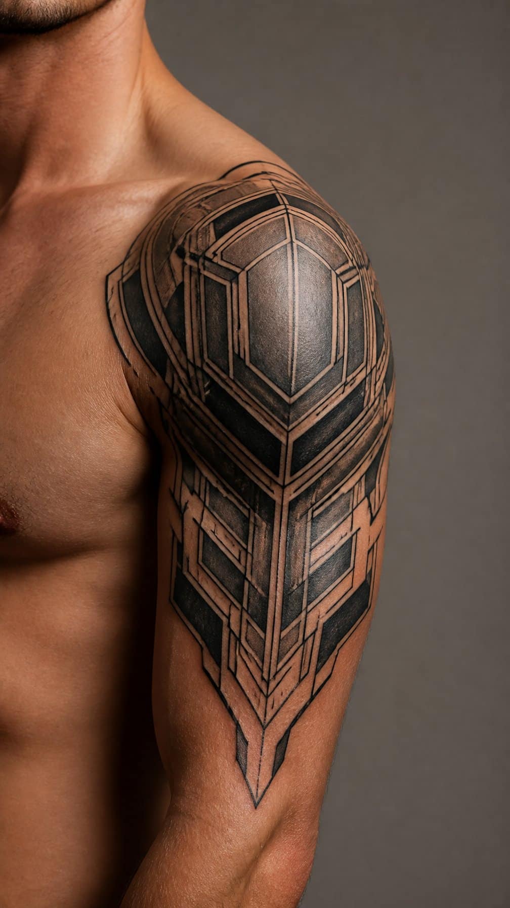
I use geometric shoulder armor to create a structured frame around the upper arm. Angular panels, intersecting lines, and repeated shapes can follow the shoulder’s curve while extending slightly toward the biceps. I prefer balanced spacing so the design looks intentional from both the front and side.
I can make the pattern bold with solid black sections or keep it lighter through fine lines and negative space. Symmetry often gives the tattoo an armor-like appearance, while small variations make it fit the body more naturally. I would ask the artist to map the design against the shoulder’s movement before choosing its final scale.
5) Watercolor Peony Spilling Down the Arm
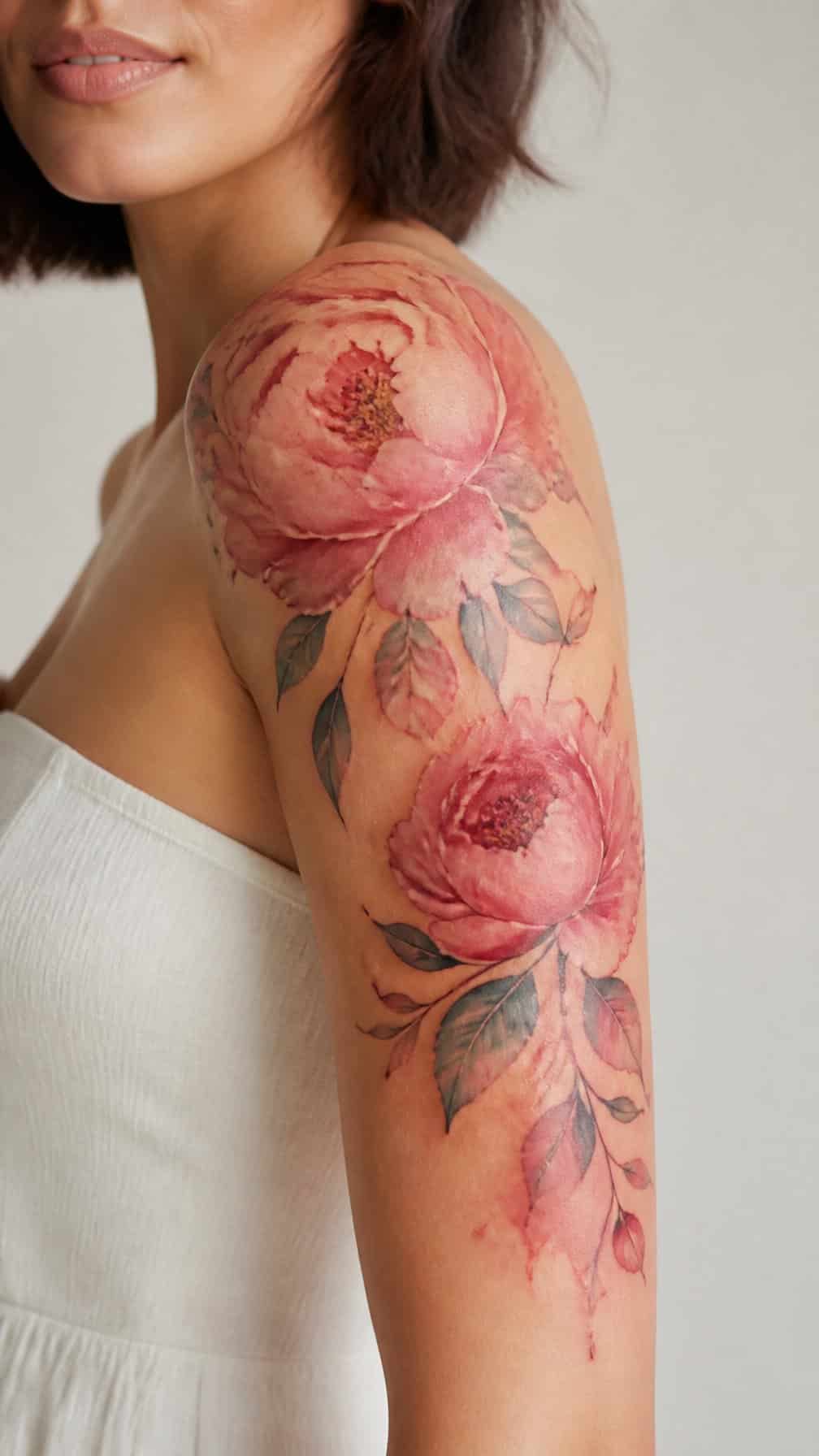
I like this design for its soft color transitions and natural movement. The peony sits across the shoulder, while loose petals, leaves, and diluted pink or red brushstrokes follow the upper arm. This arrangement frames the arm without creating a rigid border.
I would keep the center of the flower detailed and let the outer elements fade gradually. Fine black outlines can define the petals, while transparent color gives the tattoo a painted appearance. The design works well on the front shoulder or slightly toward the back, depending on how much of the arm I want to cover.
6) Japanese Koi Fish Shoulder Wrap
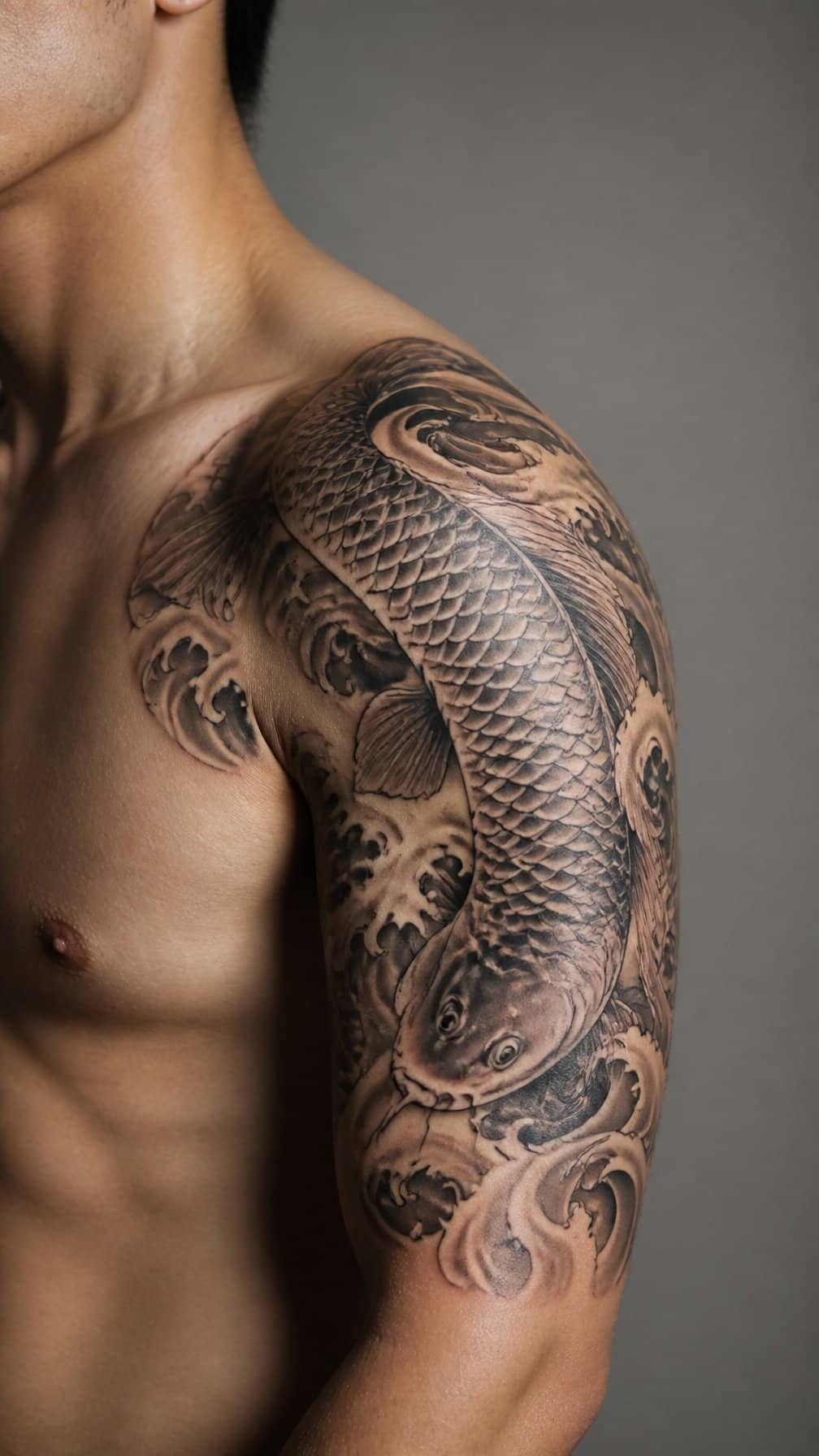
I like a Japanese koi design that follows the shoulder’s curve and extends slightly down the upper arm. Flowing water, maple leaves, and curved fins help the composition move naturally around the joint rather than sitting flat on the skin.
I would use the koi’s direction to shape the tattoo’s visual balance. A fish swimming upward can suggest movement, while one turning across the shoulder creates a broader frame. Black-and-gray shading emphasizes scales and waves, while controlled color adds focus to the fish without overwhelming the surrounding details.
I would also keep the background open enough to preserve definition as the tattoo ages. A skilled artist can adjust the koi’s size, angle, and water patterns to suit my shoulder width and connect the design smoothly with a sleeve or upper-arm piece.
7) Realistic Lion Shoulder Portrait
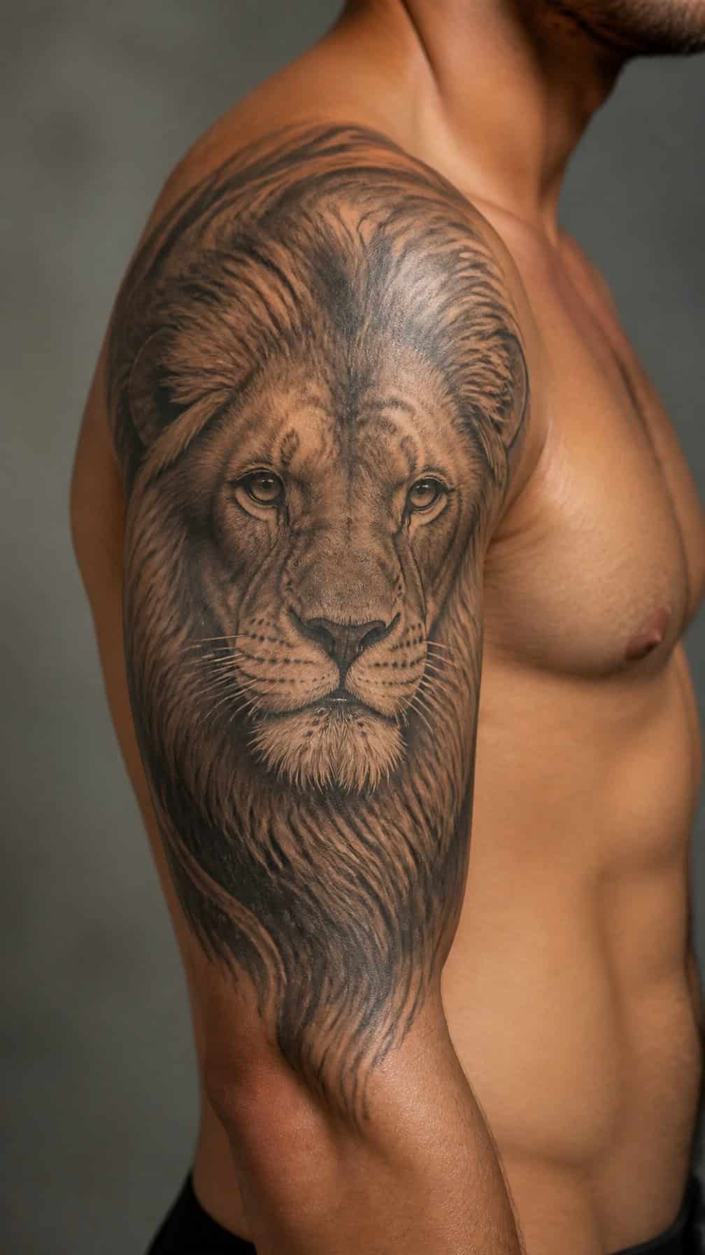
I like a realistic lion portrait for the shoulder because the rounded placement suits the animal’s face and mane. I would position the eyes near the shoulder cap, then let the mane extend toward the upper arm for a natural frame.
I would use fine shading, layered fur texture, and controlled contrast to define the muzzle, nose, and cheekbones. Black and gray ink keeps the portrait focused, while a small amount of color can emphasize the eyes without overwhelming the details.
I would ask the tattoo artist to follow the shoulder’s curve and account for movement in the upper arm. A reference photo with clear lighting helps preserve accurate proportions and recognizable expression.
8) Minimalist Mountain Range Shoulder Band
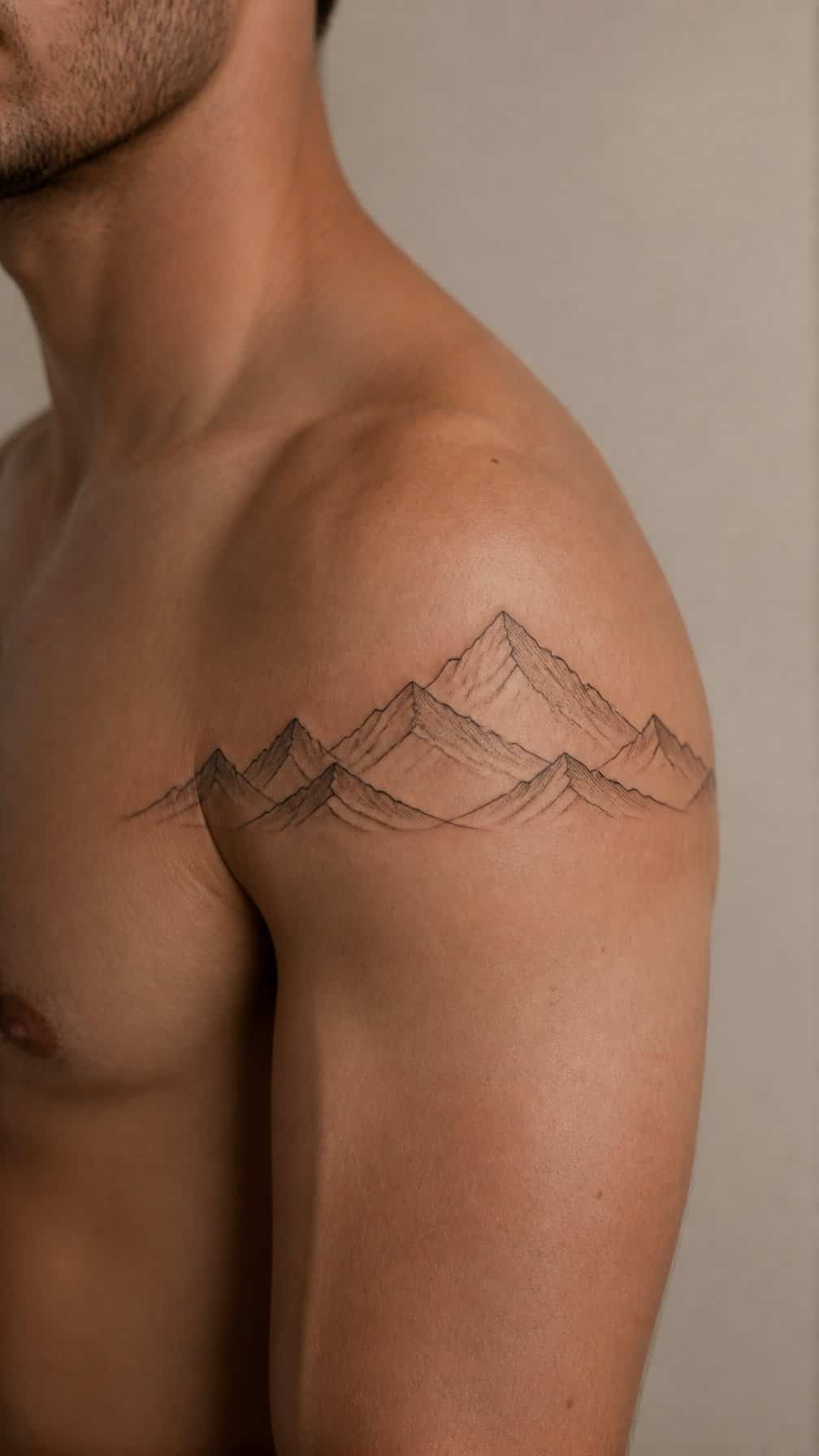
I like a minimalist mountain range band for its clean structure and quiet outdoor reference. A thin line can follow the shoulder’s curve, with sharp peaks placed across the upper arm to create a natural frame.
I would keep the design mostly black and use consistent line weight for a precise appearance. Small gaps between the peaks can preserve negative space, while subtle shading or a single sun detail can add depth without making the band feel crowded.
I find this placement works well with sleeveless clothing and can extend slightly toward the back or chest. Its horizontal layout also allows the tattoo to remain discreet when the arm rests naturally.
9) Ornamental Shoulder Filigree
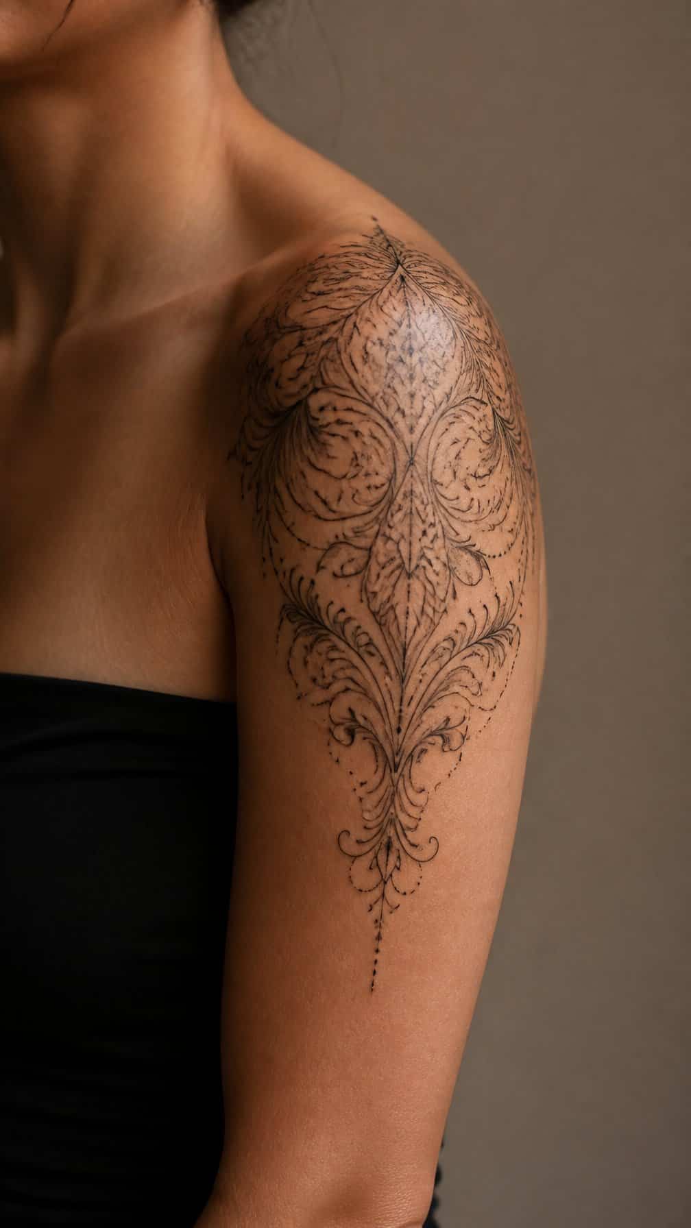
I like ornamental filigree for its fine lines, balanced curves, and decorative structure. I would place the design over the shoulder cap, allowing the pattern to follow the rounded anatomy before extending slightly down the upper arm.
I would use symmetrical motifs, small dots, and open negative space to keep the tattoo refined rather than dense. Black and gray shading can add depth, while delicate linework preserves the jewelry-like quality.
For a stronger arm-framing effect, I would angle the outer details toward the biceps and taper the lower edge. I would also consider how the design connects with an existing chest, back, or sleeve tattoo before finalizing its scale.
10) Snake Coiling from Shoulder to Bicep
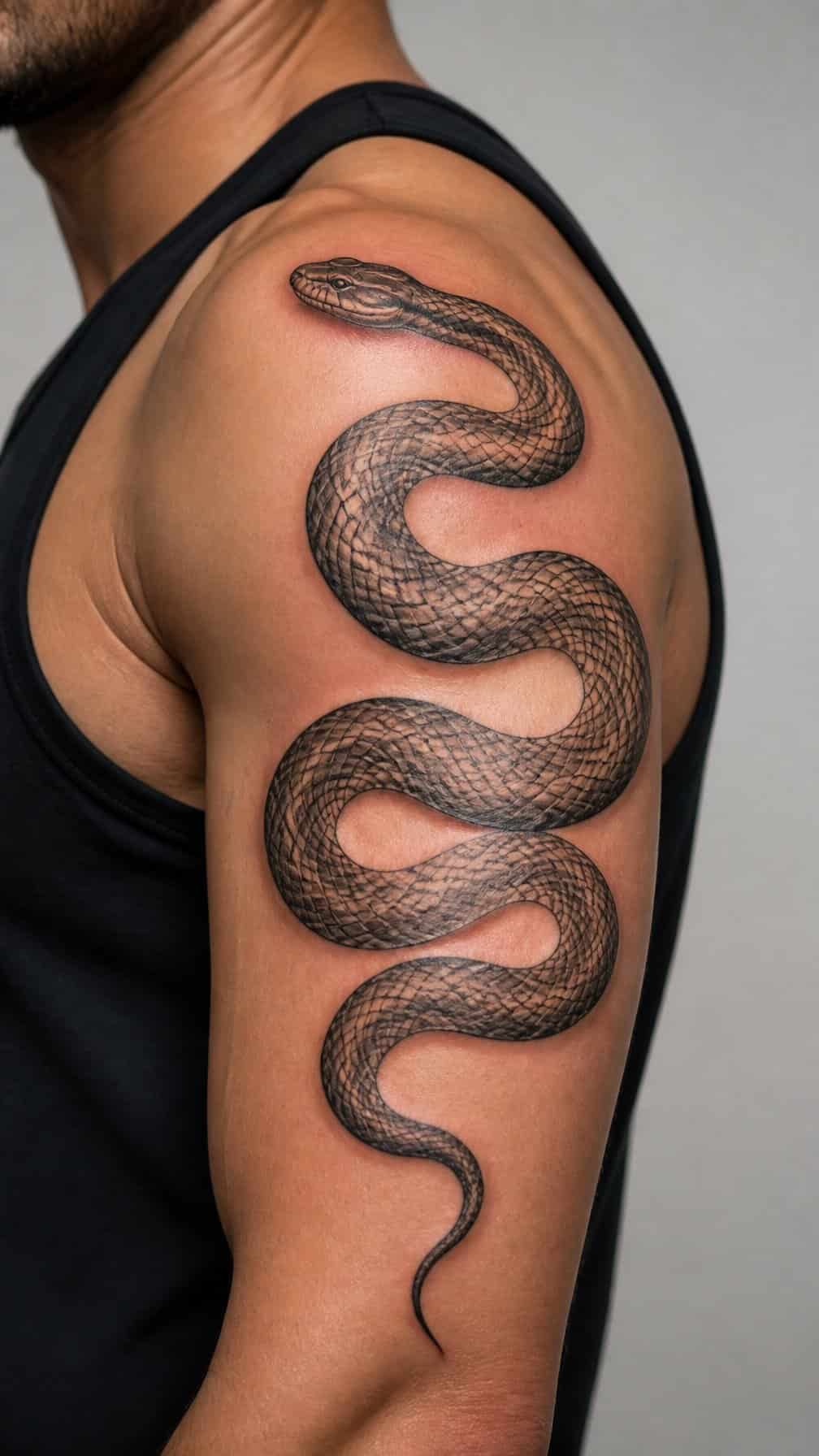
I like this design for its natural movement around the arm. The snake can begin across the shoulder cap, curve along the upper arm, and taper near the bicep, creating a shape that follows the body’s contours.
I would choose fine scales, a defined head, and controlled shading to keep the image readable as the arm moves. Black and gray ink suits the design well, while small touches of color can highlight the eyes, markings, or tongue without competing with the form.
11) Celestial Sun and Moon Shoulder Piece
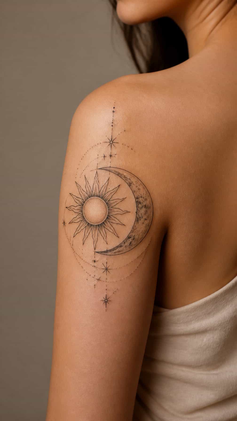
I like pairing a detailed sun with a crescent moon to create a balanced shoulder tattoo. The design can follow the shoulder’s rounded shape, while fine rays, stars, and curved lines extend slightly toward the upper arm.
I would use contrasting details to separate the symbols without making the piece feel crowded. A radiant sun can feature bold outlines, while the moon relies on negative space and delicate shading. Black ink keeps the design crisp, though small touches of muted color can add distinction.
12) Tribal-Inspired Shoulder Band
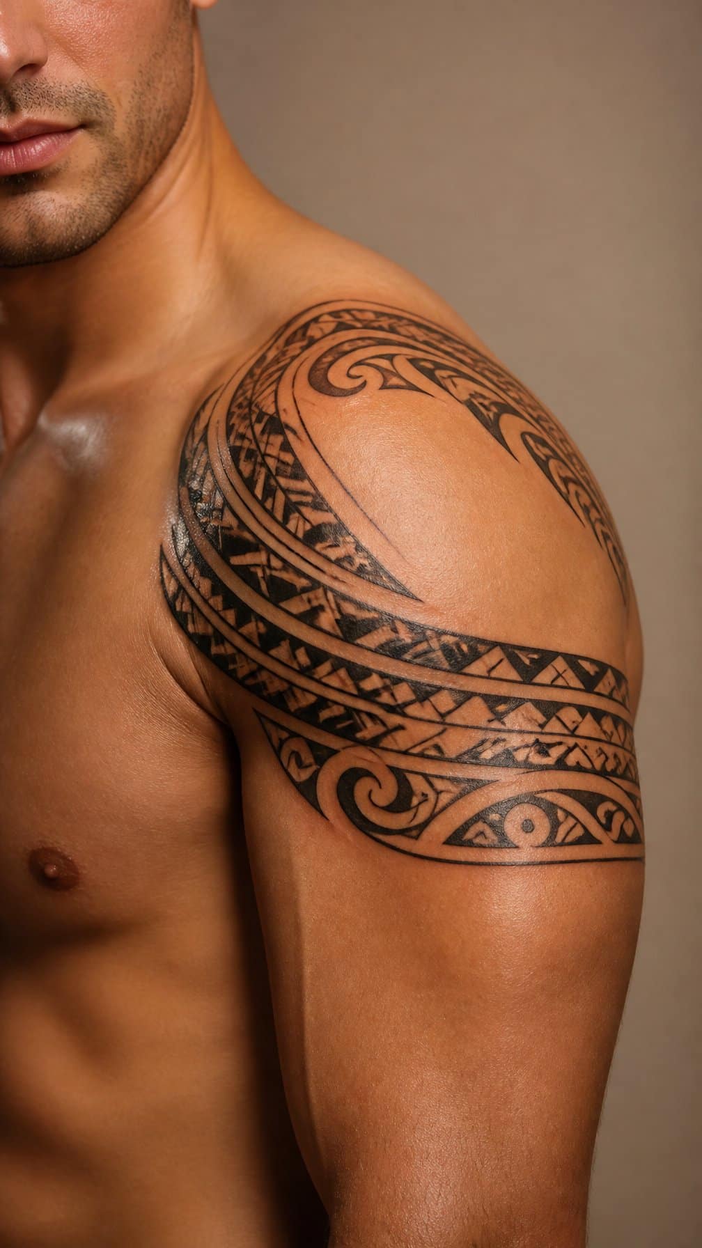
I like a tribal-inspired shoulder band for the way it follows the shoulder’s natural curve and frames the upper arm. Bold black shapes, tapered points, and repeating angles create a structured look without requiring a large image. I would place the band slightly above the deltoid so it remains visible with sleeveless clothing.
I would customize the spacing and line weight to match my build and preferred level of contrast. A wider design can create a stronger border around the arm, while finer details produce a lighter appearance. I would also choose an artist experienced in geometric and cultural motifs to ensure the pattern receives thoughtful, respectful treatment.
13) Black-and-Grey Rose Shoulder Tattoo
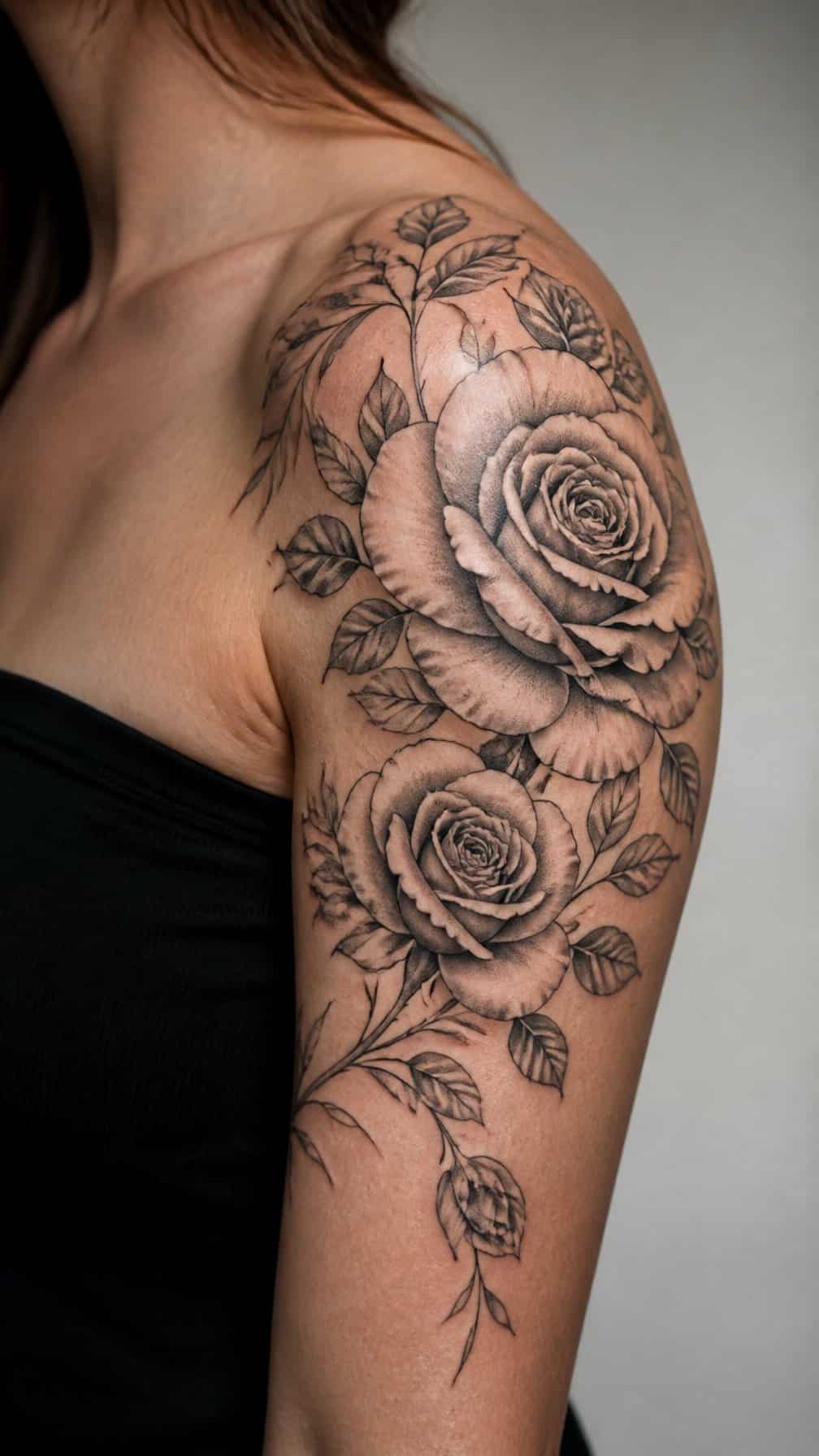
I like black-and-grey roses on the shoulder because the limited palette keeps the design refined while allowing shading to define each petal. I would use soft gradients for the bloom and sharper lines around the outer petals to create contrast without adding color.
The rose can sit across the shoulder cap, with the stem extending slightly toward the upper arm. I prefer adding a few leaves or subtle thorns to guide the eye along the arm’s natural shape while keeping the composition balanced. A medium-sized design gives the petals enough room to remain clear as the tattoo ages.
14) Abstract Brushstroke Shoulder Design
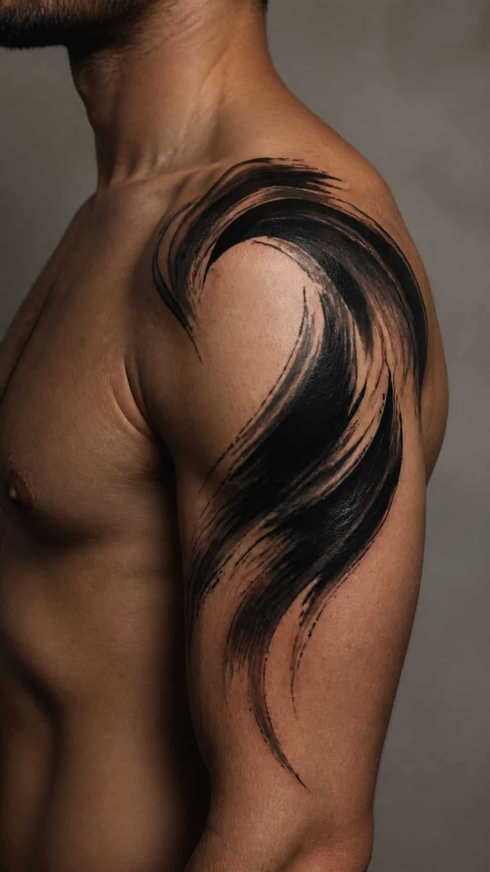
I like abstract brushstrokes for a shoulder tattoo because they follow the rounded anatomy without requiring a fixed image. I would use uneven edges, tapered ends, and varied line weight to create movement across the shoulder cap and slightly down the upper arm.
Black ink gives the design a graphic appearance, while muted gray or one restrained color can add depth without making it look busy. I would place the heaviest stroke near the shoulder’s center and let thinner marks extend toward the arm, helping the tattoo frame its natural lines.
This style suits my preference for expressive designs that remain open to interpretation. A tattoo artist can adjust each stroke to my shoulder width, muscle shape, and preferred level of negative space.
15) Phoenix Rising Over the Shoulder
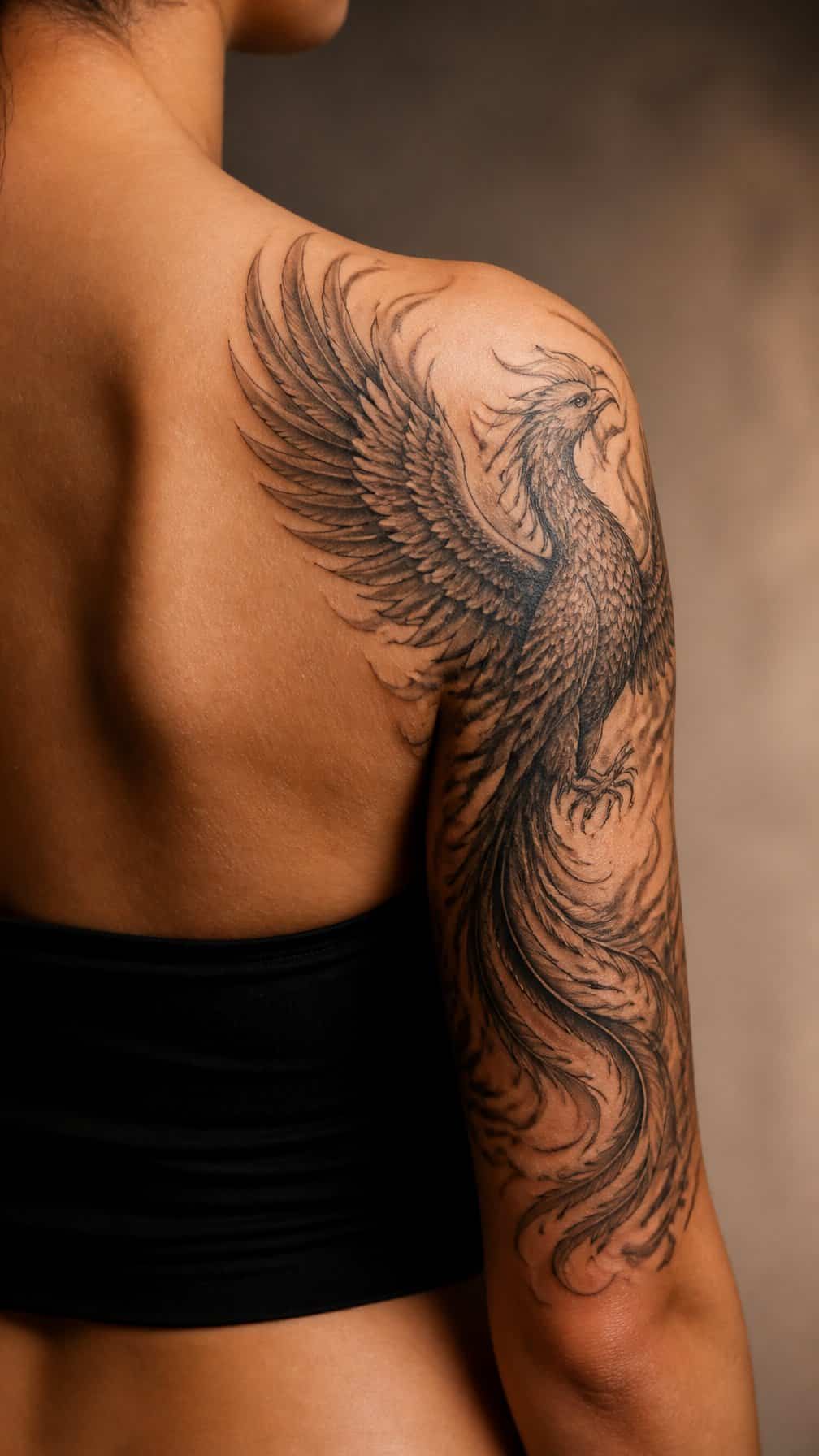
I like this design for its natural fit across the shoulder’s rounded shape. I would place the phoenix’s head near the collarbone, then let its wings extend toward the upper arm. Curved feathers can follow the muscle lines and create a balanced frame without making the tattoo feel crowded.
I would use fine linework for the feathers and stronger shading beneath the body to add depth. Red, orange, and gold ink can define the flame details, while black and gray keep the design more understated. A rising pose gives the tattoo clear movement without requiring a large, full-back composition.
16) Fine-Line Wildflower Shoulder Spray
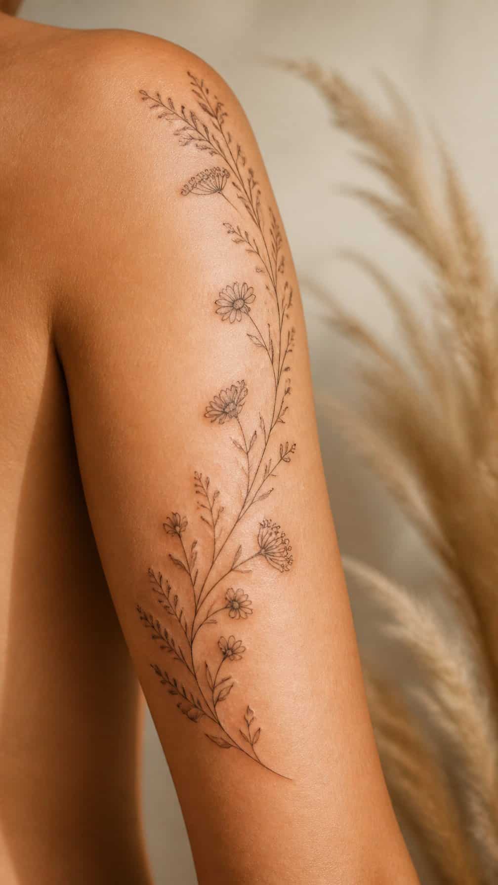
I like a fine-line wildflower spray for its light, botanical appearance. I would place the tallest stems near the shoulder’s curve, then let smaller blooms follow the upper arm for a natural, slightly tapered shape.
I would keep the flowers varied but connected through thin stems and sparse leaves. Black ink suits this design, while small areas of open skin preserve its delicate look and help each bloom remain distinct.
I might choose wildflowers with personal meaning, such as daisies, lavender, or poppies. A vertical arrangement can frame the arm, while a softer diagonal layout can follow the collarbone and shoulder line.
17) Compass and Map Shoulder Wrap
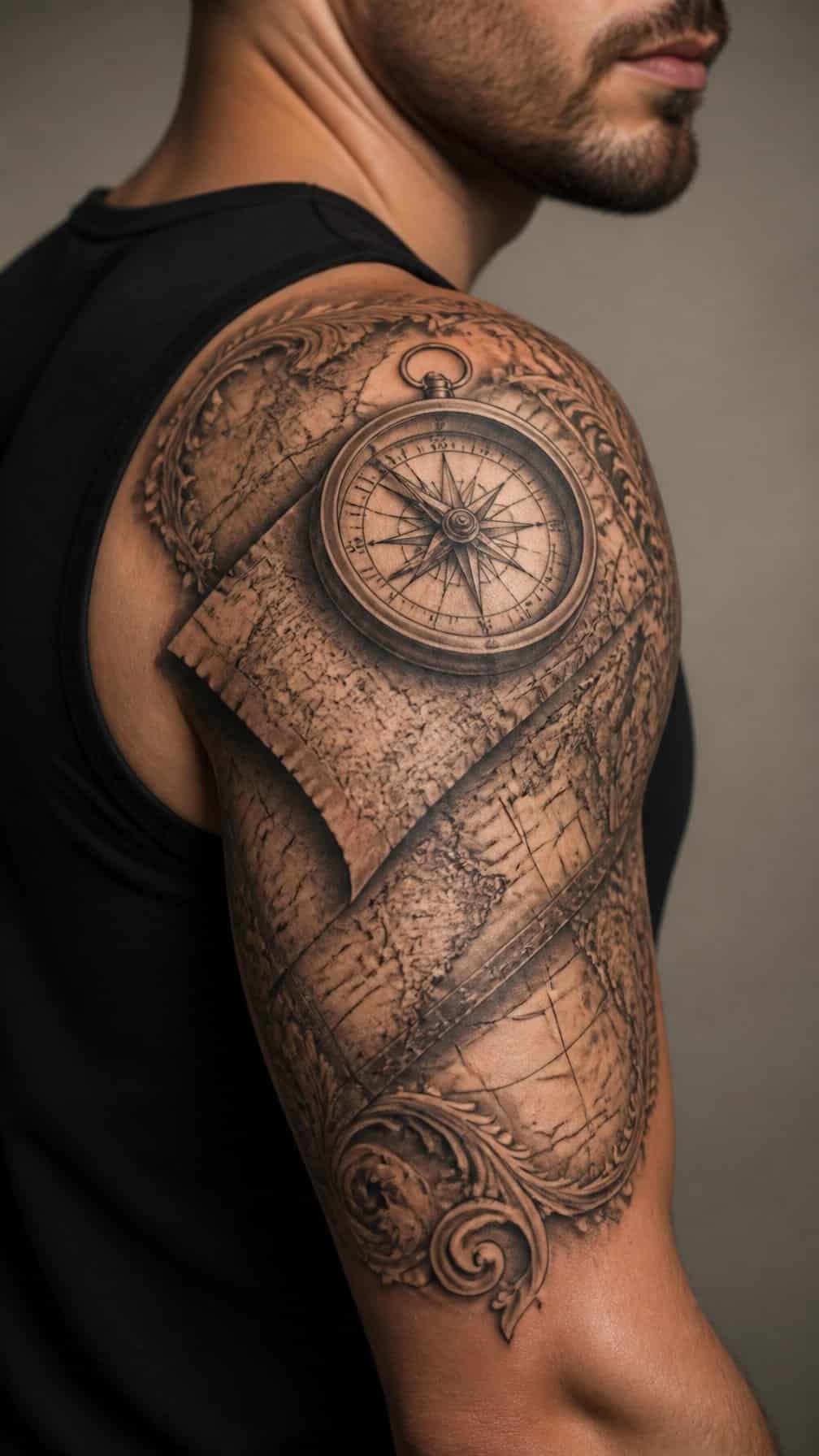
I like this design for the way it follows the shoulder’s curve and guides the eye toward the upper arm. A compass can sit near the shoulder cap, while map lines extend around the deltoid and taper down the arm.
I would use fine linework for roads, coordinates, and contour details, keeping the main compass points bold enough to remain readable. Black and gray shading can add depth without making the wrap feel too dense.
I would place the directional marker toward the front or outer shoulder, depending on how visible I want the centerpiece to be. A small date, location, or set of coordinates can personalize the map while preserving its clean structure.
18) Dragon Shoulder-to-Arm Tattoo
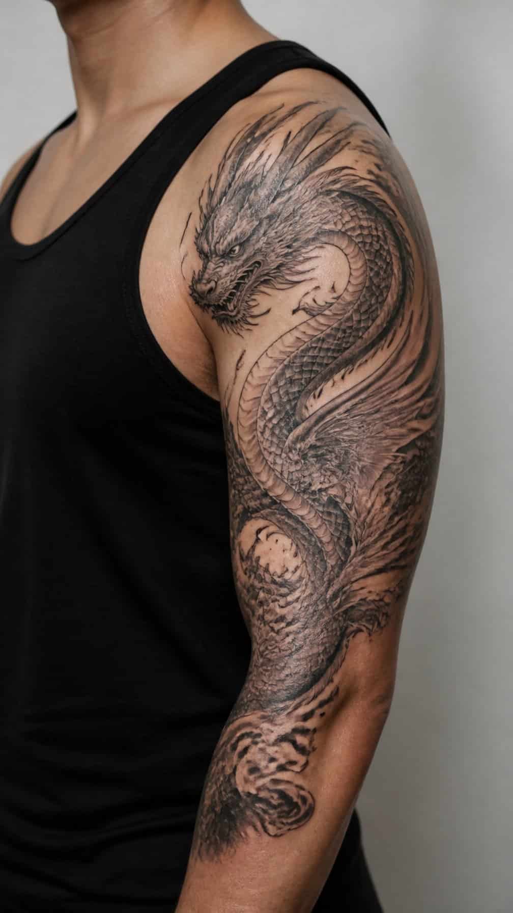
I would place the dragon’s head across the shoulder, then extend its body along the upper arm with the tail tapering toward the elbow. This layout follows the arm’s natural length and gives the design a clear sense of direction.
I prefer fine scales, defined claws, and controlled shading to keep the image readable as it curves around the muscle. A side-facing head creates a strong profile, while smoke, clouds, or small flames can fill gaps without overpowering the dragon.
For a more structured look, I would use black and gray with selective negative space around the wings and belly. I would also ask the artist to map the design while my arm rests naturally, since movement can change how the proportions appear.
19) Roman Numeral Shoulder Band
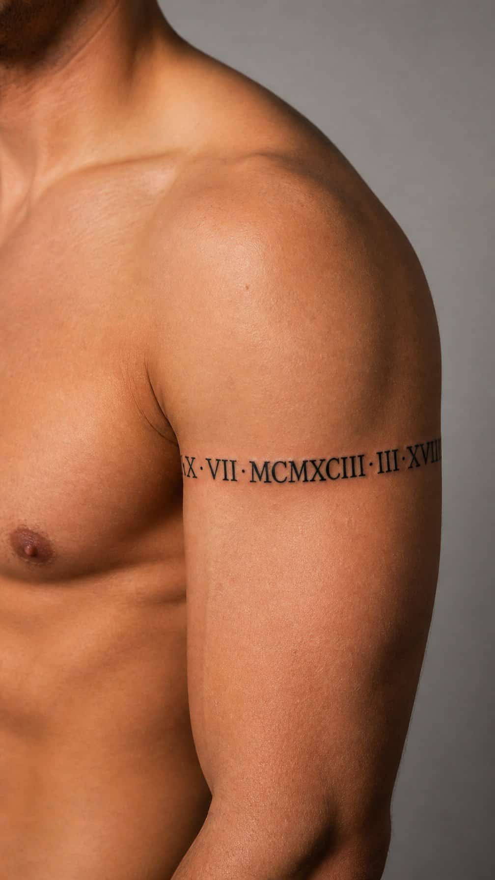
I like Roman numerals arranged as a narrow band that follows the shoulder’s natural curve. The design can mark a meaningful date while keeping the composition structured and easy to read. I would place the numerals along the upper shoulder, with even spacing and a consistent line weight.
I find this style works well in black ink, especially when the band remains simple rather than heavily shaded. I might add small separators, dots, or fine lines between numeral groups to clarify the sequence without making the tattoo look crowded.
Before choosing the date, I would check the Roman numeral conversion carefully. I would also consider how the band will align with the arm when relaxed, since shoulder movement can slightly change the spacing and visual flow.
20) Ocean Wave Shoulder Cuff
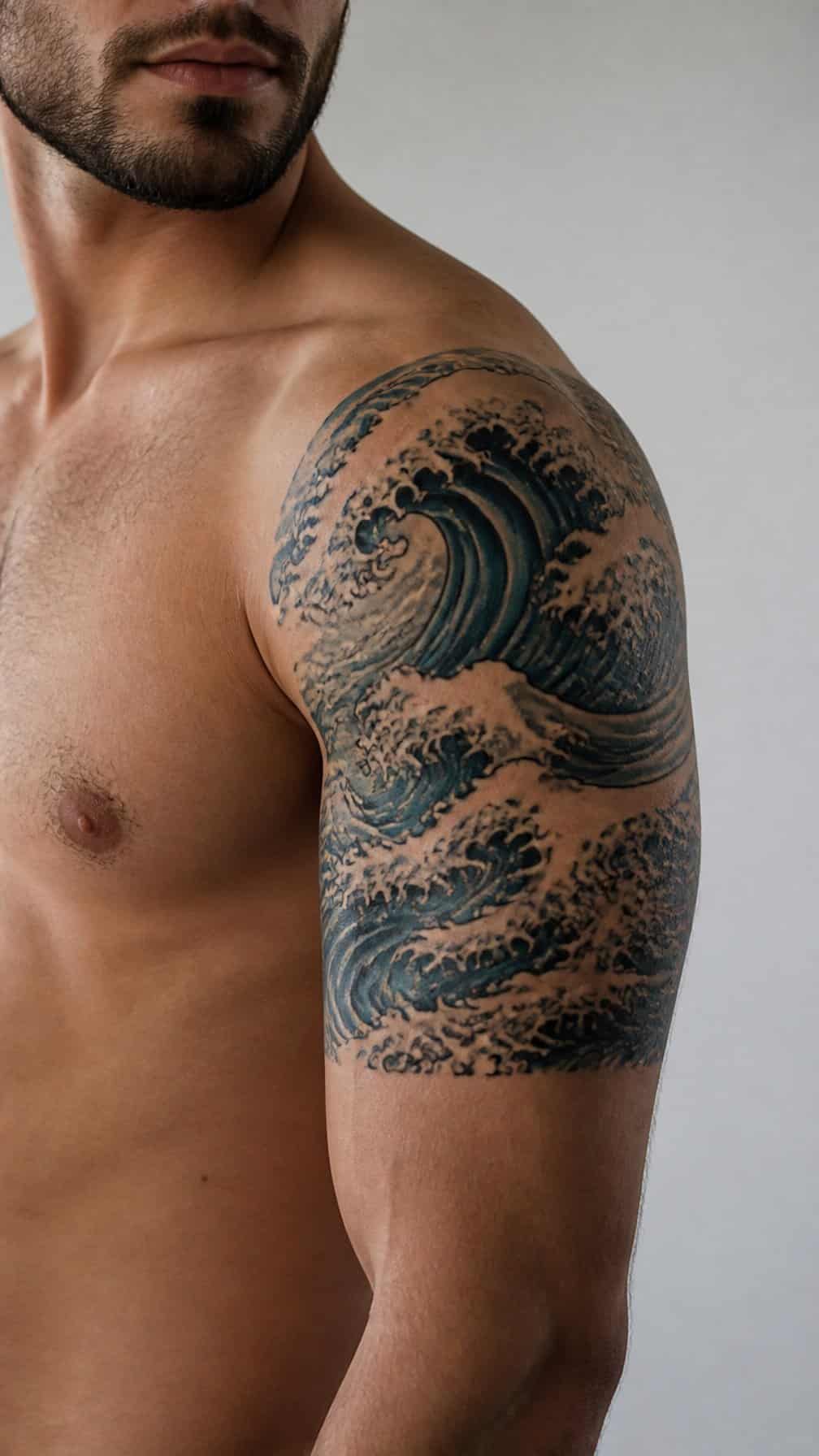
I would shape the wave to follow the shoulder’s curve and continue slightly down the upper arm, creating a natural cuff effect. Layered lines can show the crest, foam, and water movement without making the design too dense.
I prefer a fine-line or illustrative style for this placement, depending on the level of contrast I want. A mostly black design keeps the tattoo crisp, while muted blue shading adds color without overpowering the arm’s frame.
21) Butterfly Trail Across the Shoulder
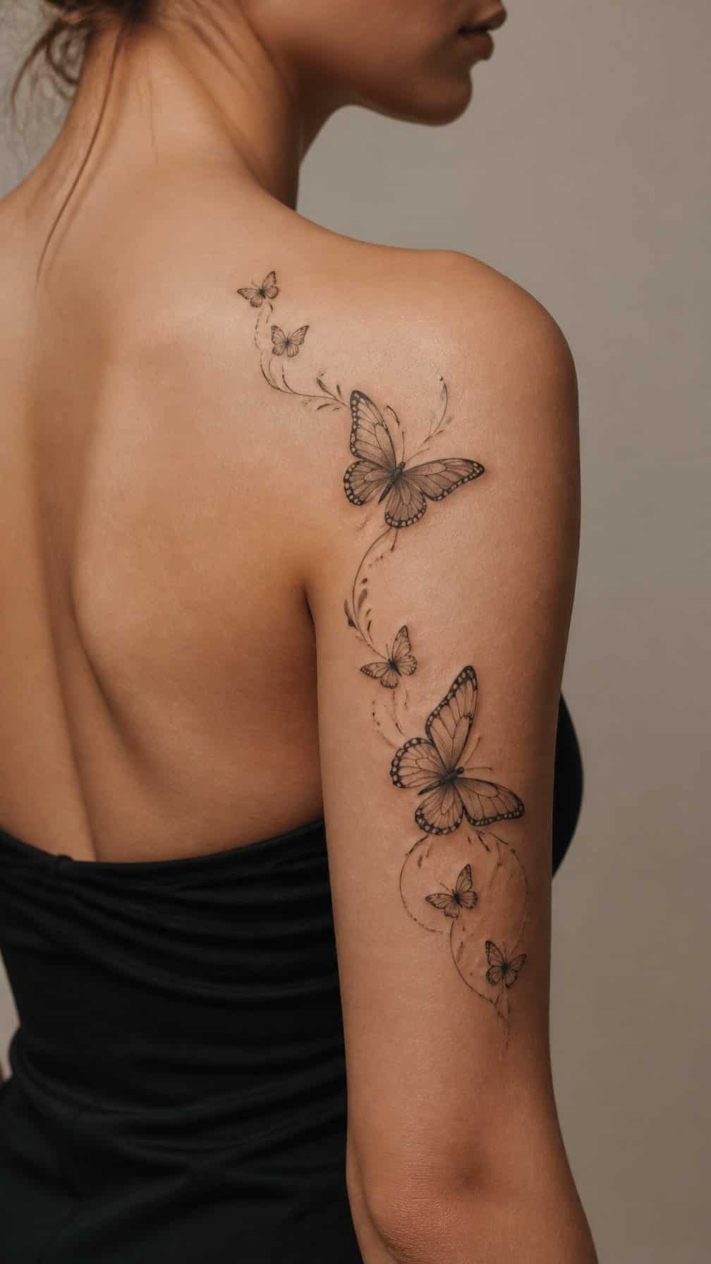
I like a butterfly trail that follows the shoulder’s natural curve and extends slightly toward the upper arm. Several butterflies in different sizes create movement without making the design feel crowded.
I would use fine lines for a delicate look or add light shading to define each wing. Soft spacing between the butterflies keeps the composition readable, while small flowers or leaves can connect the elements without competing with them.
22) Dotwork Sacred Geometry Shoulder Piece
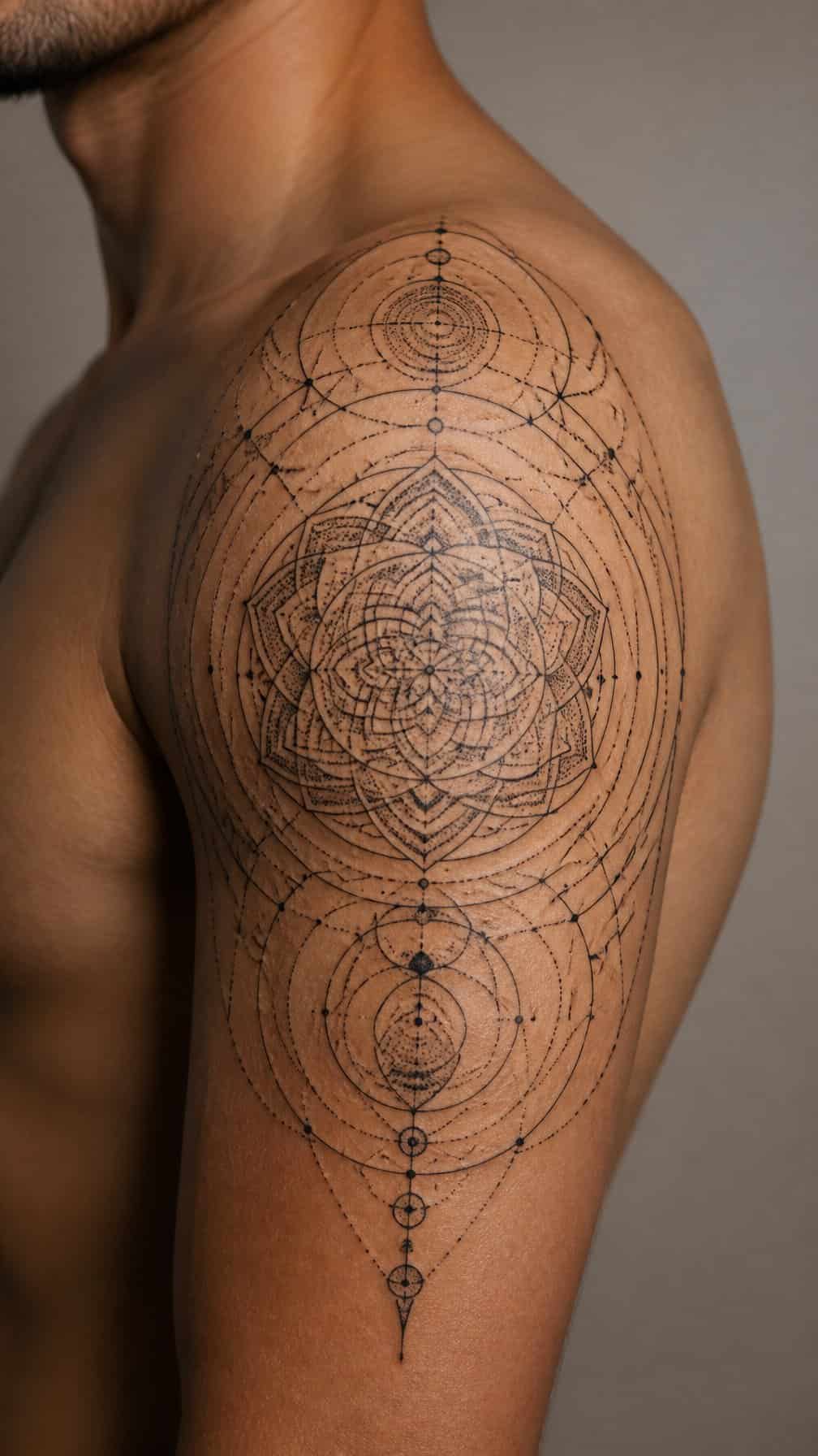
I like dotwork sacred geometry on the shoulder because its structured lines follow the rounded contour without making the arm look crowded. I would center a mandala, polygon, or interlocking pattern over the shoulder cap, then extend selected points toward the upper arm.
I would use graduated dot density to create contrast while keeping the design mostly black and gray. Smaller dots can soften the outer edges, while denser sections define the central geometry and give the piece a measured, architectural appearance.
I would ask my tattoo artist to account for movement and muscle shape before finalizing the stencil. A balanced layout can frame the arm from the front or back, depending on how far the pattern wraps around the shoulder.