
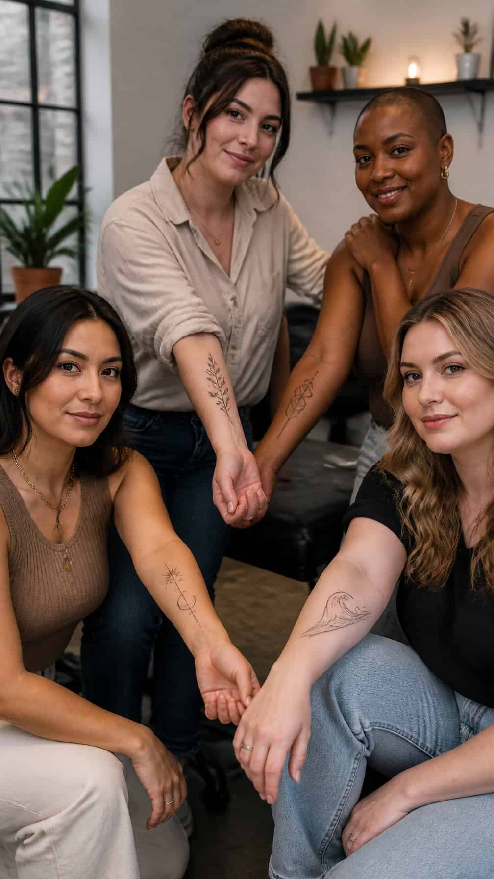
A forearm tattoo gives you visible space for artwork while allowing flexible placement and sizing. I’ll explore designs ranging from subtle linework and botanical motifs to bold blackwork, meaningful symbols, and realistic pieces.
Save for later
Want to come back to this story? Save it with your email so it is easy to find again.
You can choose a forearm tattoo by matching the design’s detail, scale, and placement to your style and daily routine. I’ll also cover practical considerations, including how to prepare for a lasting tattoo and how to select an arrangement that suits your arm.
Table of Contents
- 1 1) Delicate Wildflower Linework
- 2 2) Minimalist Moon Phases
- 3 3) Fine-Line Botanical Sleeve
- 4 4) Watercolor Hummingbird
- 5 5) Ornamental Mandala
- 6 6) Tiny Lavender Sprig
- 7 7) Blackwork Snake
- 8 8) Celestial Sun and Moon
- 9 9) Fine-Line Butterfly
- 10 10) Geometric Lioness
- 11 11) Roman Numeral Date
- 12 12) Dainty Olive Branch
- 13 13) Botanical Fern Wrap
- 14 14) Single-Line Female Profile
- 15 15) Realistic Rose
- 16 16) Minimalist Mountain Range
- 17 17) Floral Compass
- 18 18) Constellation Design
- 19 19) Fine-Line Dragonfly
- 20 20) Abstract Wave Pattern
- 21 21) Birth Flower Bouquet
- 22 22) Ornamental Dagger
- 23 23) Small Semicolon Tattoo
- 24 24) Black-and-Gray Peony
1) Delicate Wildflower Linework
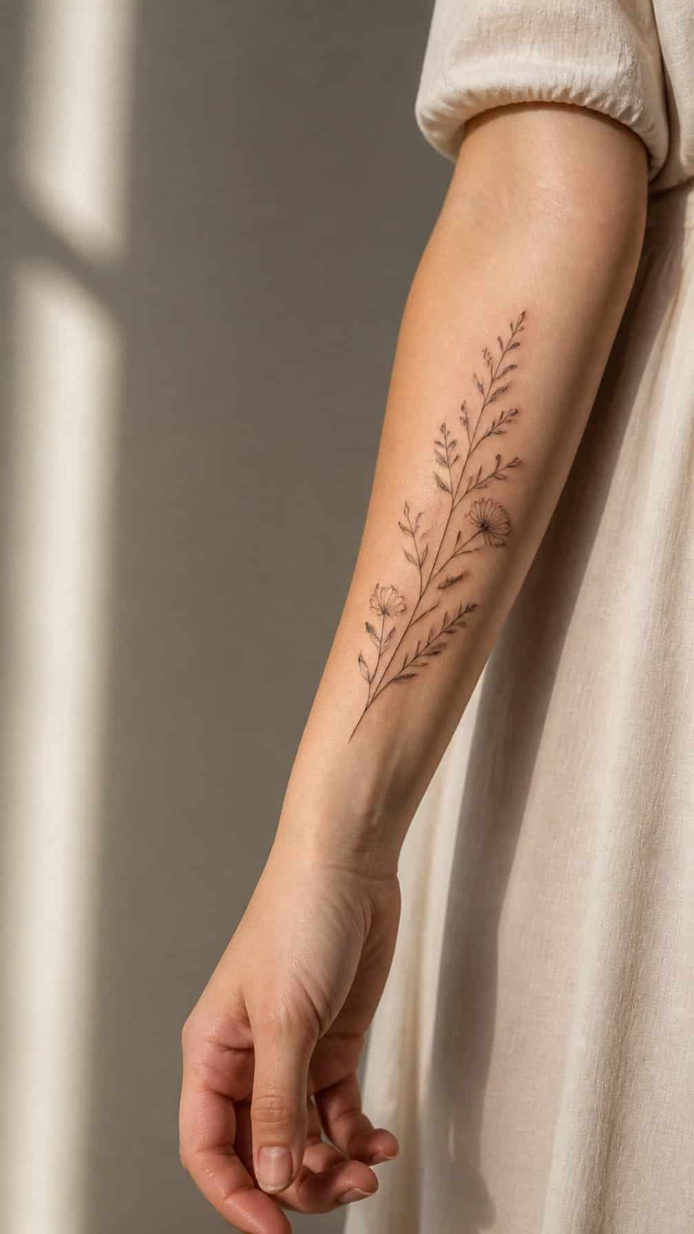
I like delicate wildflower linework for its clean, botanical appearance and flexible placement. Fine outlines can show stems, petals, and leaves without making the design feel heavy, while a vertical arrangement follows the natural length of the forearm.
I would choose a small cluster of meaningful flowers or a single stem, depending on the look I want. Black ink keeps the design understated, while a limited touch of color can distinguish each bloom without reducing its simplicity.
Before choosing the final design, I would consider line weight and size. Very fine details may require careful aftercare and periodic touch-ups, especially as the tattoo ages.
2) Minimalist Moon Phases
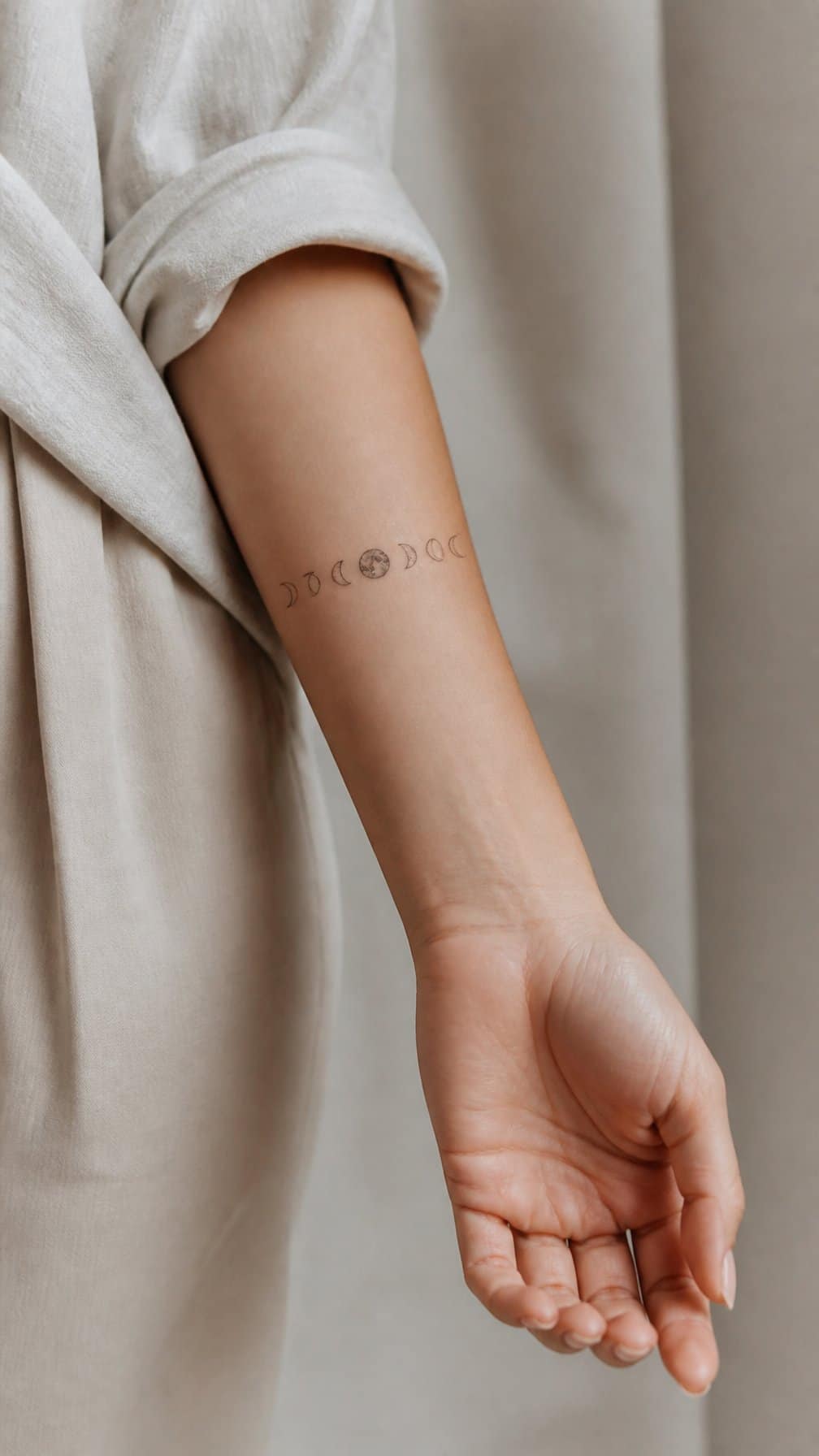
I like moon phase tattoos for their clean structure and subtle symbolism. A narrow sequence of crescent, half, and full moons fits naturally along the inner or outer forearm, where the design remains easy to view without taking up much space.
I would choose fine black lines and consistent spacing to keep each phase distinct. Small dots can frame the sequence, while a simple vertical layout follows the forearm’s natural length. This style suits my preference for delicate ink with a clear visual rhythm.
I can personalize the design by highlighting one phase, adding a birth date beneath it, or using tiny stars sparingly. A professional tattoo artist can adjust the scale and line weight so the details remain readable as the tattoo ages.
3) Fine-Line Botanical Sleeve
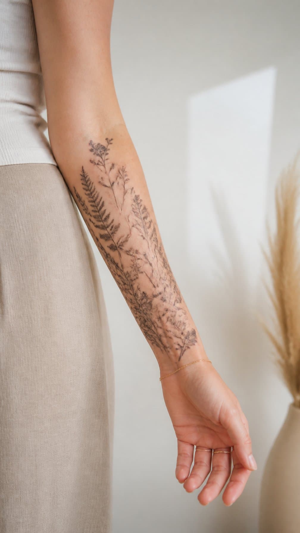
I like fine-line botanical designs for their delicate structure and natural movement. I can build the sleeve from slender stems, leaves, and small blooms that follow the forearm’s length without making the design feel crowded.
I often place larger flowers near the center and use tapering branches toward the wrist and elbow. This arrangement creates balance while allowing each plant to remain recognizable. Black ink keeps the style crisp, though subtle shading can add depth.
I would choose botanical elements with personal meaning, such as a birth flower, herb, or favorite wildflower. Because fine lines can soften over time, I recommend working with an experienced tattoo artist and following careful aftercare.
4) Watercolor Hummingbird
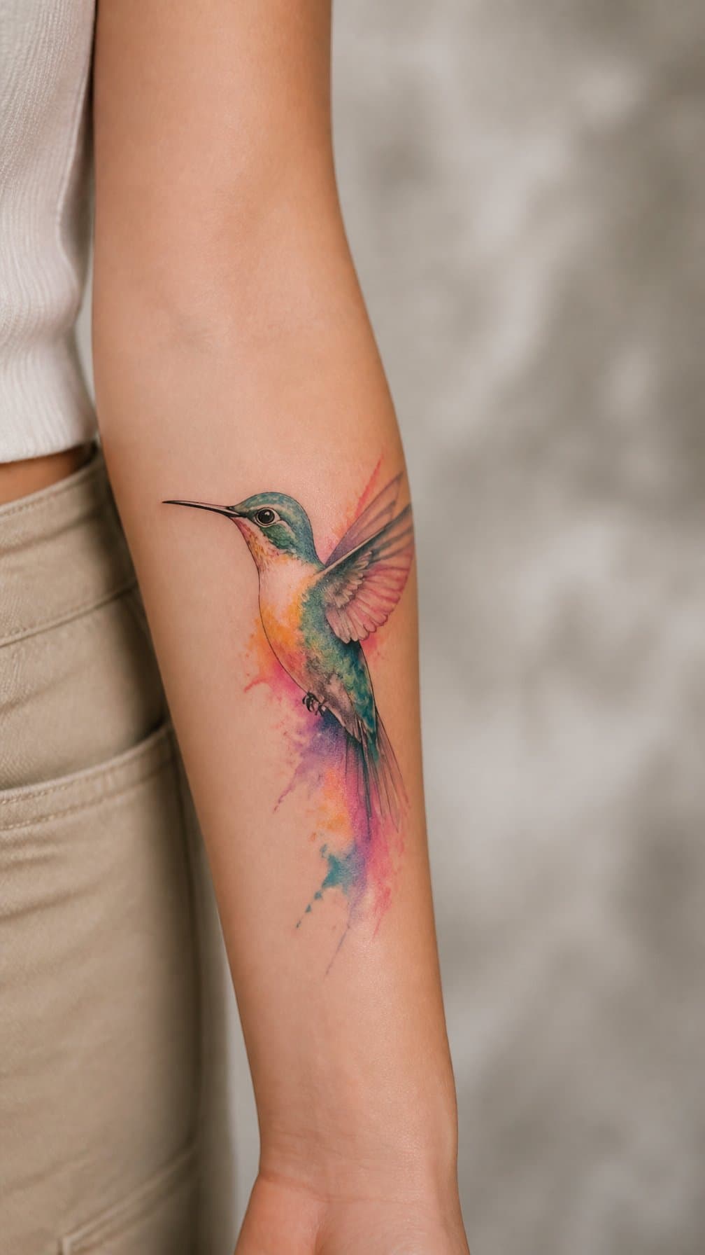
I like a watercolor hummingbird on the forearm because its narrow shape follows the arm naturally. Soft blends of teal, violet, pink, or yellow can suggest painted pigment, while a few defined lines keep the bird recognizable.
I would place the hummingbird near the inner forearm for a more private design or angle it along the outer forearm for greater visibility. Small flowers, leaves, or loose color strokes can add context without making the tattoo feel crowded.
I would ask the artist to use controlled shading and leave small areas of skin visible. Watercolor-style ink may require thoughtful planning, especially when delicate color transitions and fine details need to remain legible over time.
5) Ornamental Mandala
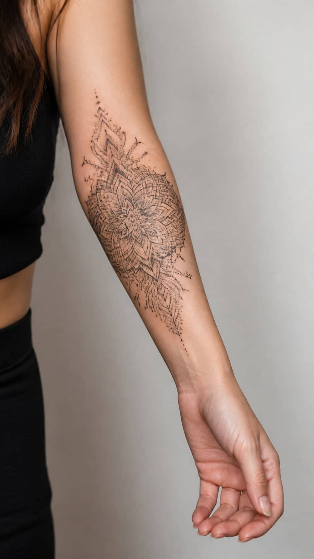
I like ornamental mandalas for their balanced geometry and fine decorative detail. On the forearm, I can place the design vertically to follow the arm’s natural length, or center it on the inner forearm for a more contained look. Dotwork, fine lines, and small flourishes can create contrast without making the tattoo feel crowded.
I would choose a size that preserves the pattern’s open spaces, especially when the design includes several concentric rings. Black ink gives the mandala a crisp appearance, while subtle shading can add depth to petals, leaves, or lace-like sections. A tattoo artist can adjust the symmetry and line weight to suit my preferred style.
6) Tiny Lavender Sprig
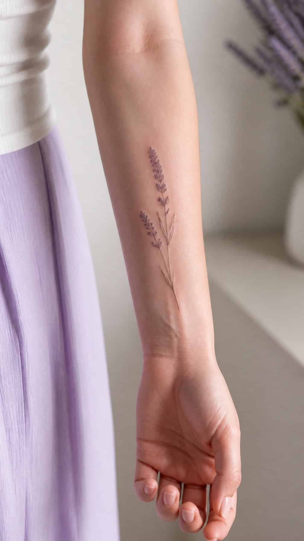
I like a tiny lavender sprig for its slim shape and gentle detail. I can place it along the inner or outer forearm, where the stem follows the arm’s natural length without taking up much space. Fine lines suit this design, while muted purple ink adds subtle color.
I would choose a small sprig with a slightly curved stem for a softer, more organic look. Simple leaves keep the tattoo clean and readable, especially at a compact size. I can also add a short date or initials beside it without making the design feel crowded.
7) Blackwork Snake
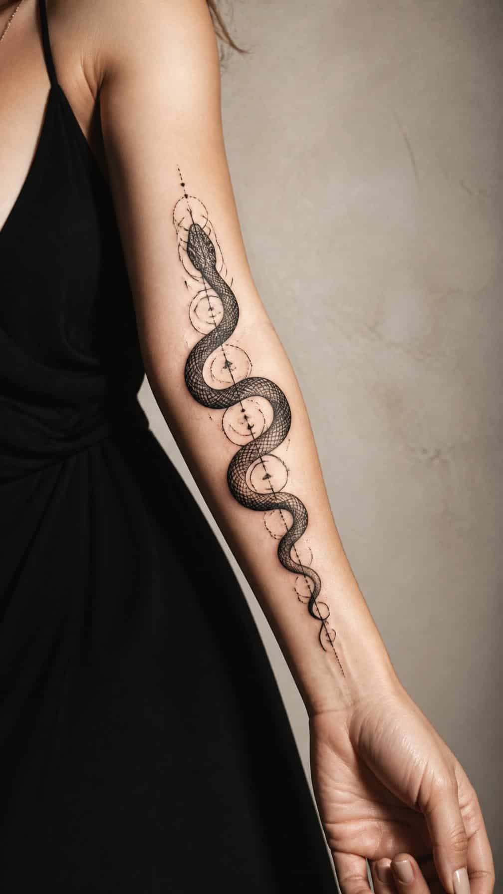
I like a blackwork snake for its strong contrast and adaptable shape. I can wrap the design along the forearm, follow its length, or curve it around the wrist. Solid black sections create a bold look, while negative-space scales add definition without relying on color.
I would choose a coiled pose for a compact tattoo or a stretched body for a more directional design. A carefully placed head, tapered tail, and consistent line weight help the snake remain readable as the tattoo ages. Locating it on the outer forearm also gives the design clear visibility.
8) Celestial Sun and Moon
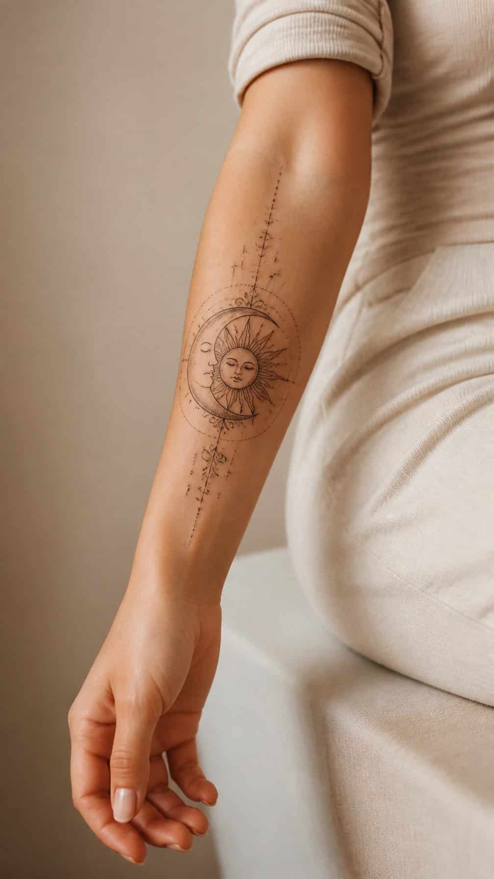
I like a sun-and-moon design because it combines two recognizable symbols in one balanced composition. On the forearm, I can place the sun near the wrist and the crescent moon higher up, creating a natural vertical flow.
Fine lines, small stars, and subtle facial details can give the tattoo a delicate appearance without making it feel crowded. I would choose black ink for a clean look or add muted gold, blue, or rust tones for gentle contrast.
I can also personalize the design with a birth date, constellation, or short phrase. A symmetrical layout feels structured, while slightly different sun and moon expressions create a more individual style.
9) Fine-Line Butterfly
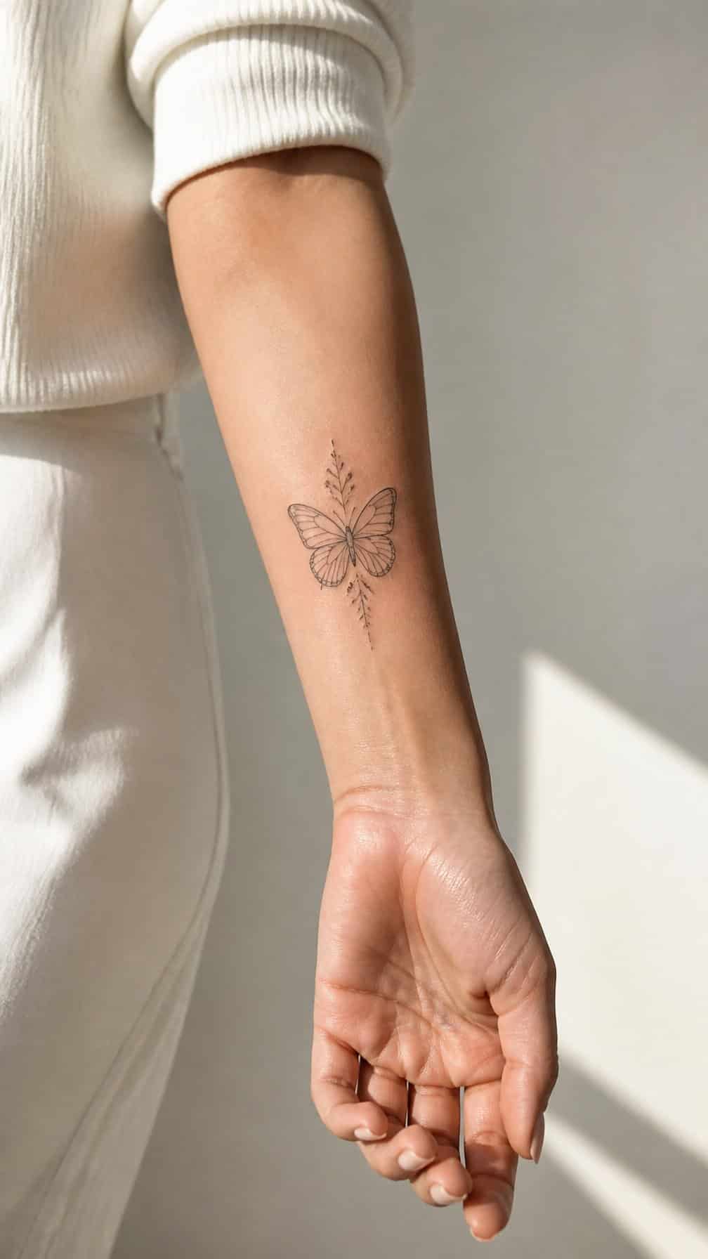
I like a fine-line butterfly on the forearm because its narrow wings suit the area’s natural length. I would choose delicate outlines, subtle symmetry, and limited shading to keep the design light without losing definition.
I can place it along the inner forearm for a more personal look or angle it toward the wrist for a sense of movement. Small dots, tiny stars, or a short stem can add detail while preserving the clean style.
I would ask my tattoo artist to adjust the wing shape and scale to match my arm. Fine lines need careful placement and aftercare, since excessive detail can make a small tattoo appear crowded as it heals.
10) Geometric Lioness
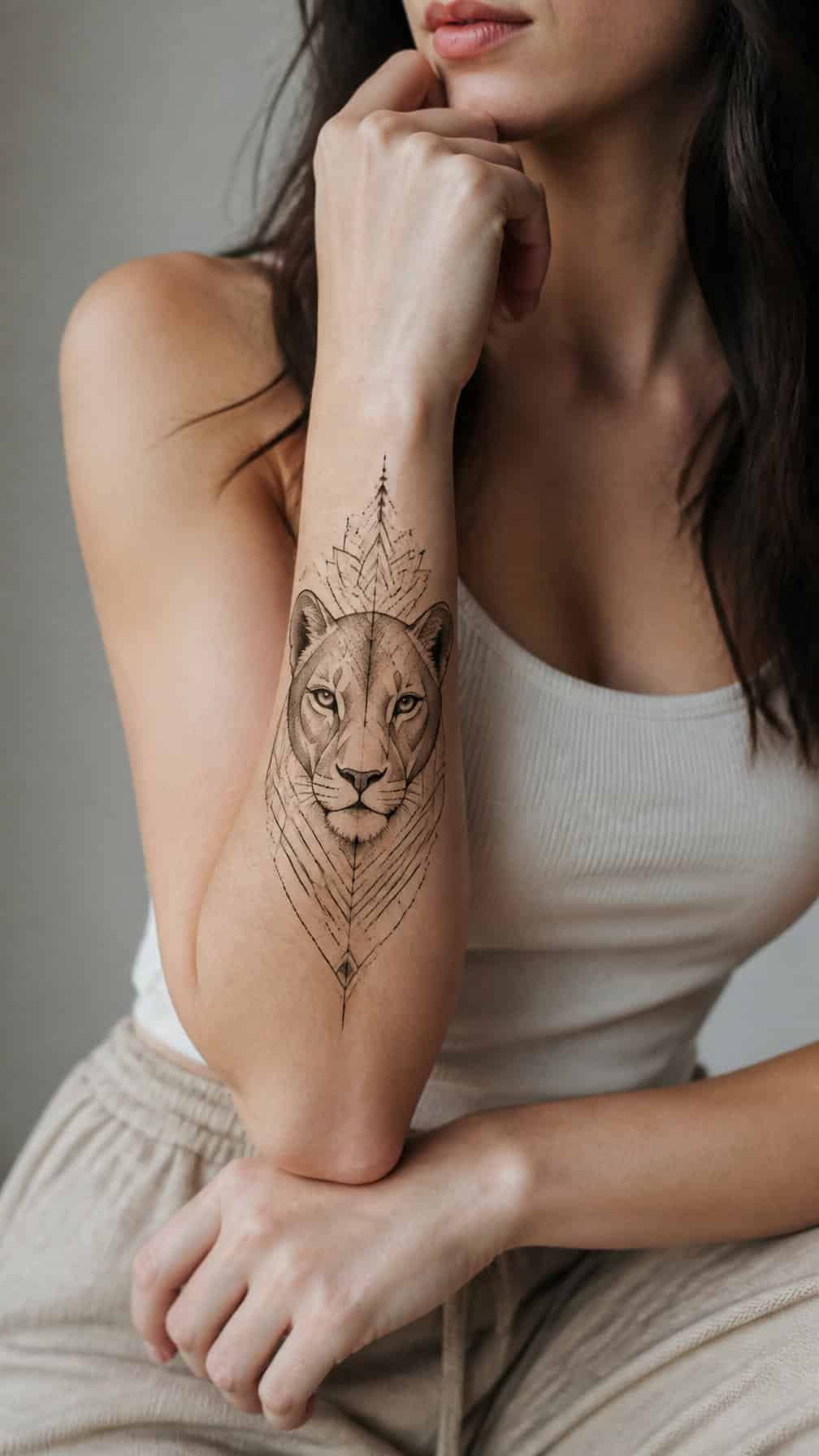
I like a geometric lioness design for its balance of strength and structure. Angular lines can define the face, while small triangles, circles, or symmetrical shapes add a modern pattern without hiding the animal’s features.
On the forearm, I would place the lioness vertically so the design follows the arm’s natural length. Black ink creates crisp contrast, while selective shading can give the eyes, nose, and mane more depth. I would keep the surrounding geometry light to maintain clear spacing as the tattoo ages.
11) Roman Numeral Date
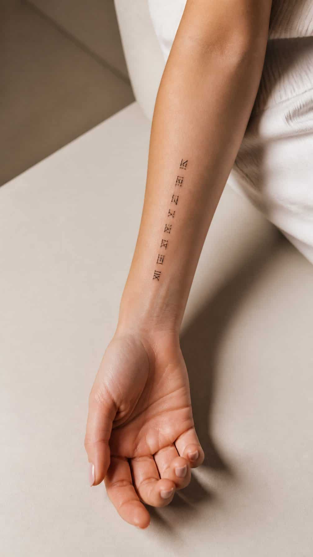
I can turn a meaningful date into Roman numerals for a discreet, personal design. Birthdays, anniversaries, or milestones work well, especially when I want the tattoo to carry significance without using words or obvious imagery.
I prefer a clean line style on the inner or outer forearm, where the horizontal layout remains easy to read. A small serif font gives the numerals a classic appearance, while fine spacing keeps the design balanced and refined.
I can add a subtle detail, such as dots, a short line, or a tiny heart, but the date should remain the focus. Before tattooing, I would verify every numeral carefully because one incorrect character changes the date.
12) Dainty Olive Branch
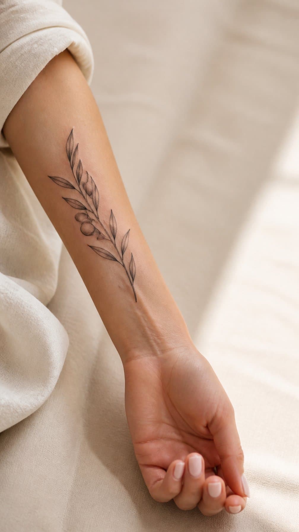
I like a dainty olive branch on the forearm because its slim shape follows the arm naturally without taking up much space. I would choose fine black lines, small leaves, and a gently curved stem for a clean, understated design.
I might place it along the inner forearm for a more personal look or near the wrist for easy visibility. The design can represent peace, resilience, or connection to Mediterranean imagery, while its simple structure keeps it suitable for both casual and professional settings.
A tattoo artist can adjust the branch’s length and leaf spacing to suit my proportions. I would also consider adding a tiny flower or subtle date if I wanted a more personal detail without losing its delicate appearance.
13) Botanical Fern Wrap
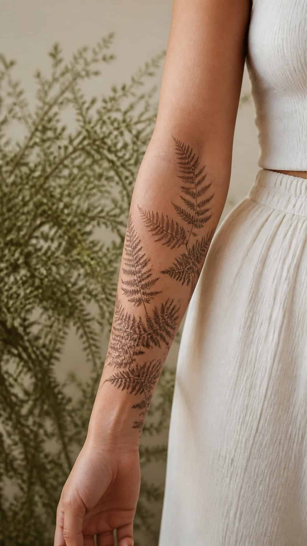
I like a fern wrap for its natural shape and gentle movement along the forearm. Curving fronds can follow the arm’s length, while layered leaflets create texture without requiring heavy shading.
I would place the stem slightly off-center so the design feels organic rather than perfectly symmetrical. Fine-line details keep it light, while selective blackwork can define the central stem and overlapping leaves. The wrap can remain delicate or extend toward the wrist and elbow for greater coverage.
14) Single-Line Female Profile
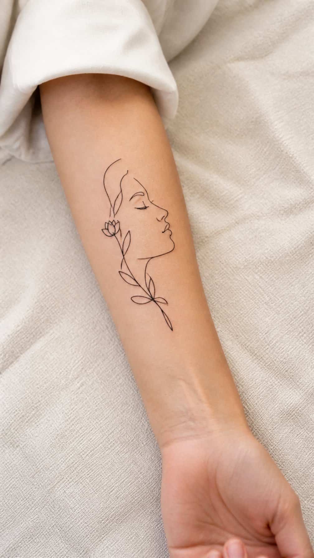
I like a single-line female profile for its clean shape and understated character. One continuous line can trace the forehead, nose, lips, and chin without adding shading or heavy detail. On the forearm, the design stays visible while retaining a refined, modern look.
I would place it along the inner forearm for a more personal feel, or on the outer forearm for easier visibility. A small botanical detail, star, or initial can add meaning without disrupting the profile’s simplicity.
I would choose an experienced tattoo artist for this style because consistent line weight and smooth curves determine how clearly the face reads. Fine-line tattoos may soften over time, so I would also discuss sizing and placement before booking.
15) Realistic Rose
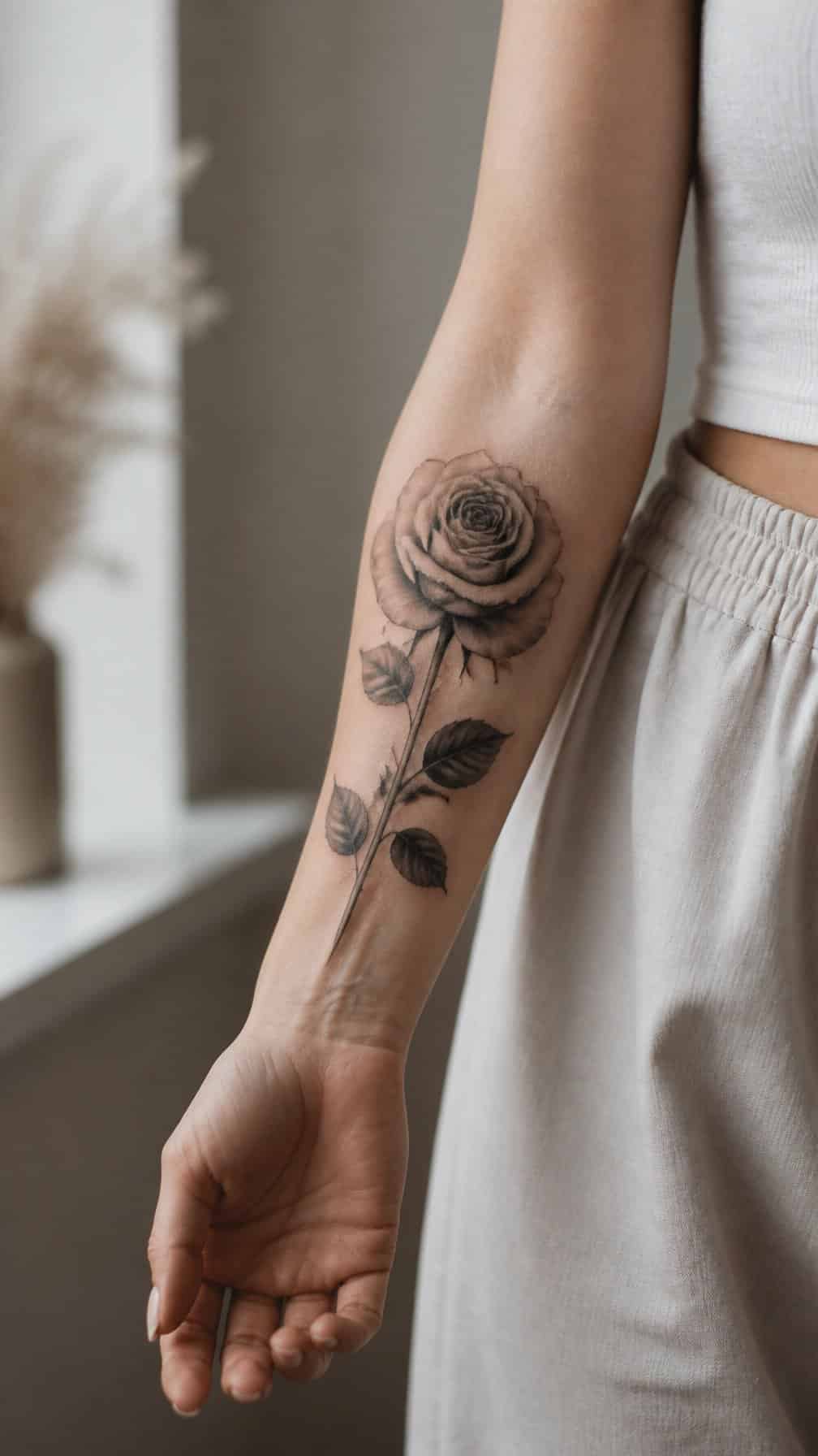
I like a realistic rose tattoo for its detailed petals, layered shading, and natural structure. On the forearm, the elongated shape gives the stem room to follow the arm while keeping the bloom easy to see.
I would choose black and gray for a classic, refined appearance or add muted red to emphasize the petals. Fine thorn details and leaves can make the design feel more botanical, while a single bloom keeps the composition clean and focused.
16) Minimalist Mountain Range
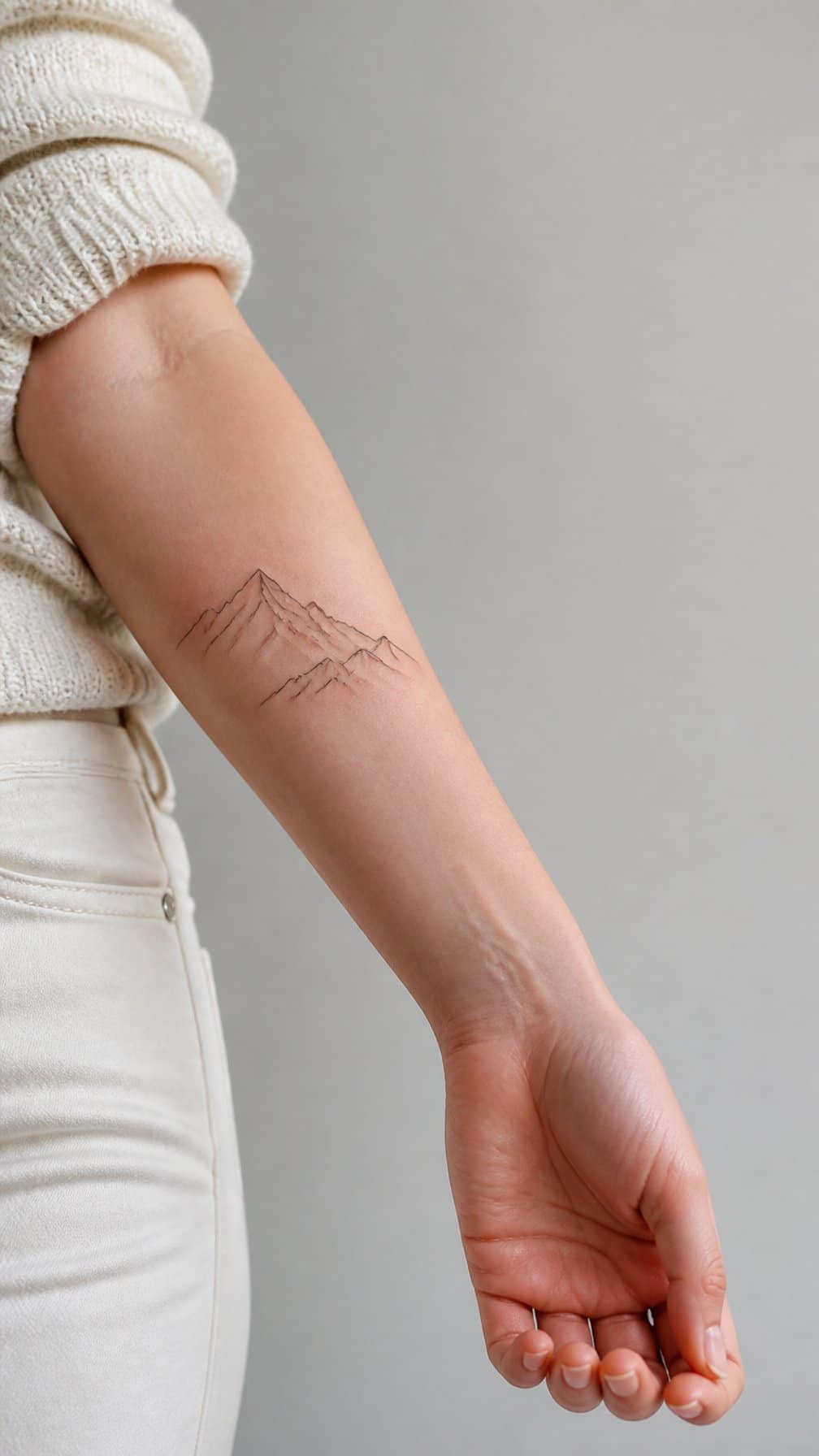
I like a minimalist mountain range on the forearm because its clean outline creates a calm, outdoors-inspired design without requiring much space. I would place it horizontally along the inner or outer forearm, where the natural length of the area supports the landscape shape.
A single fine line can suggest distant peaks, while two or three overlapping lines create more depth. I might add a small sun, moon, or few dots, but I would keep the details restrained so the tattoo remains legible as it ages.
Black ink suits this design best, although I could use muted gray for a softer appearance. Its simple structure also makes it easy to pair with nature-themed tattoos or leave as a standalone piece.
17) Floral Compass
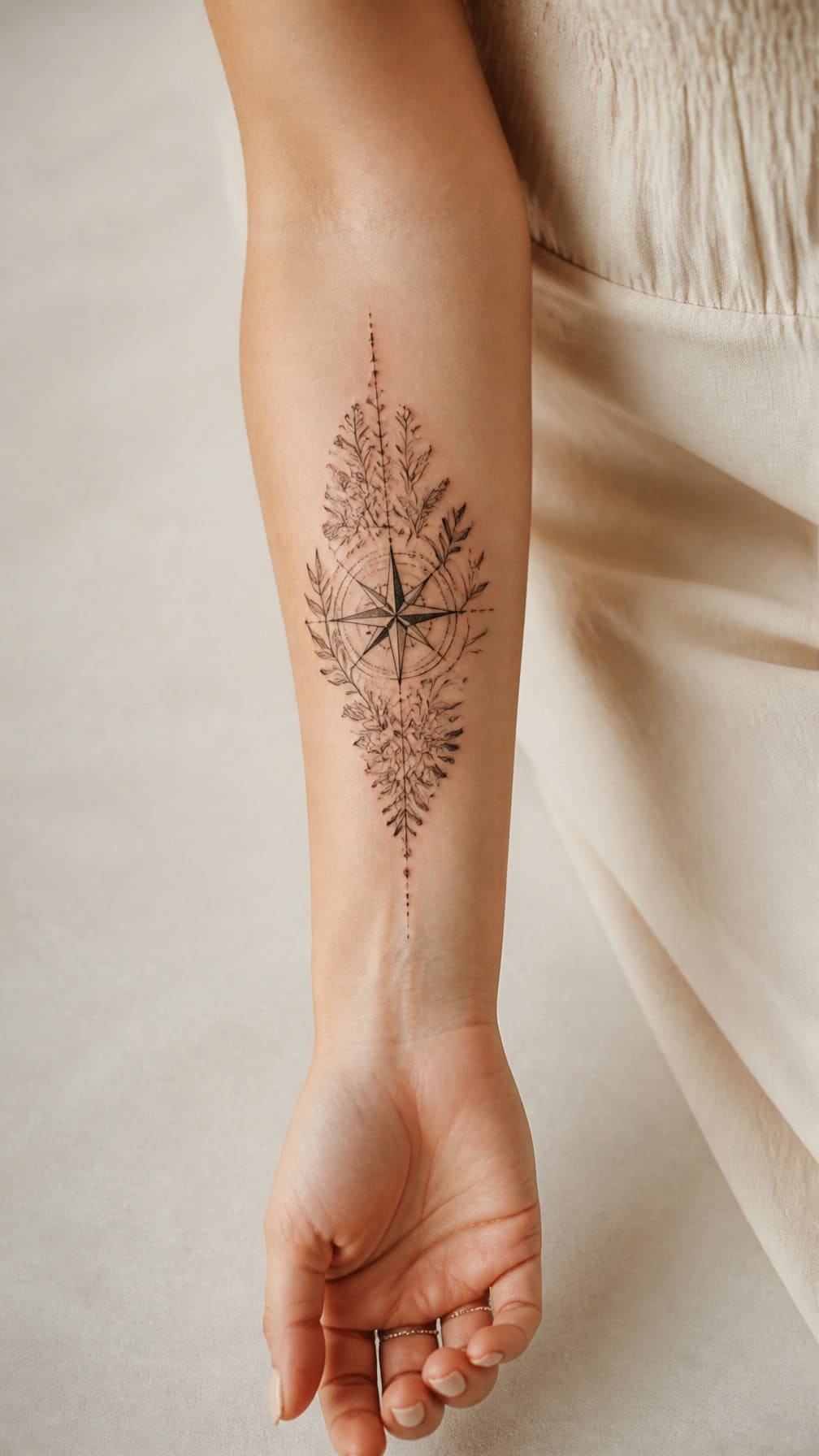
I like how this design combines direction with natural detail. A compass forms the central structure, while flowers soften its geometric lines and add visual interest along the forearm.
I would choose fine linework for the compass points and use petals or leaves to frame the outer edges. Small touches of shading can give the design depth without making it look heavy.
I think placement matters here. A vertical arrangement can follow the length of the forearm, while a smaller centered version works well near the wrist or elbow. Black ink keeps the design versatile, but muted color can distinguish the blooms.
18) Constellation Design
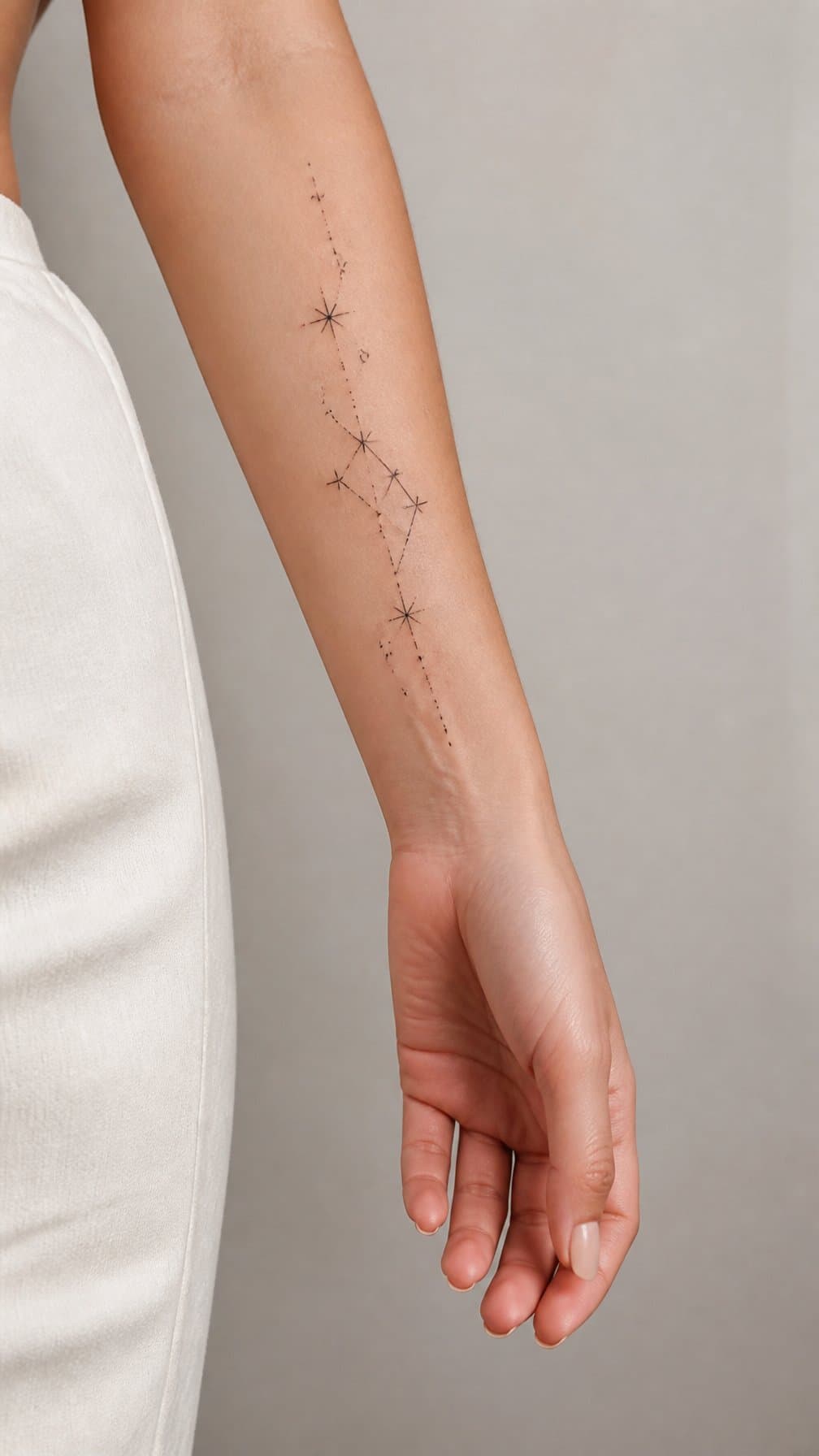
I like constellation tattoos for their clean lines and personal meaning. I can choose a zodiac pattern, a favorite star grouping, or an arrangement inspired by an important date. Small dots and fine connecting lines keep the design delicate without making it feel overly ornate.
I would place the constellation along the inner forearm for a subtle look or across the outer forearm for greater visibility. Adding tiny stars, a crescent moon, or a few initials can make the design more distinctive while preserving its open, balanced layout.
19) Fine-Line Dragonfly
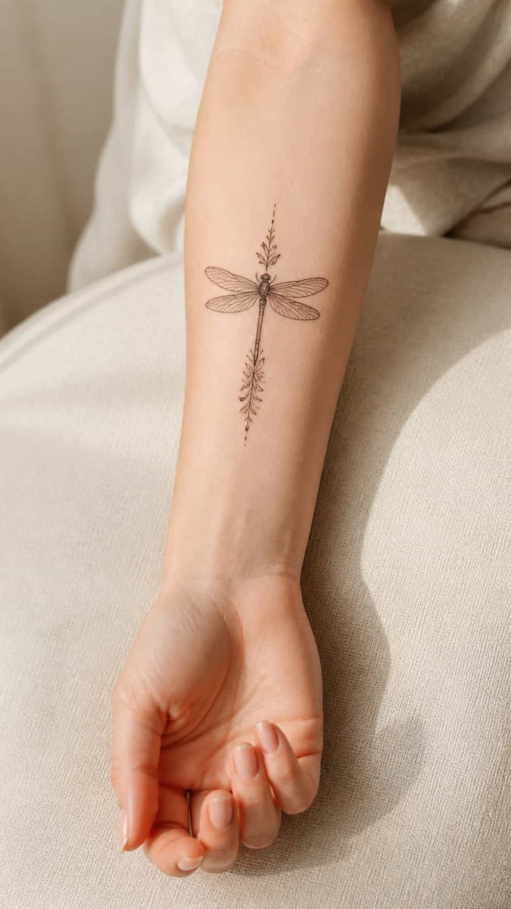
I like a fine-line dragonfly for its delicate structure and clean, airy appearance. On the forearm, its long body and transparent wings can follow the arm’s natural length without taking up much space.
I would choose thin black lines with minimal shading to keep the design refined. Small details, such as evenly spaced wing segments or a few subtle dots, can add definition while preserving the light look.
I can place it vertically along the inner forearm for a discreet design or angle it slightly across the outer forearm for more movement. A compact version also works well near the wrist.
20) Abstract Wave Pattern
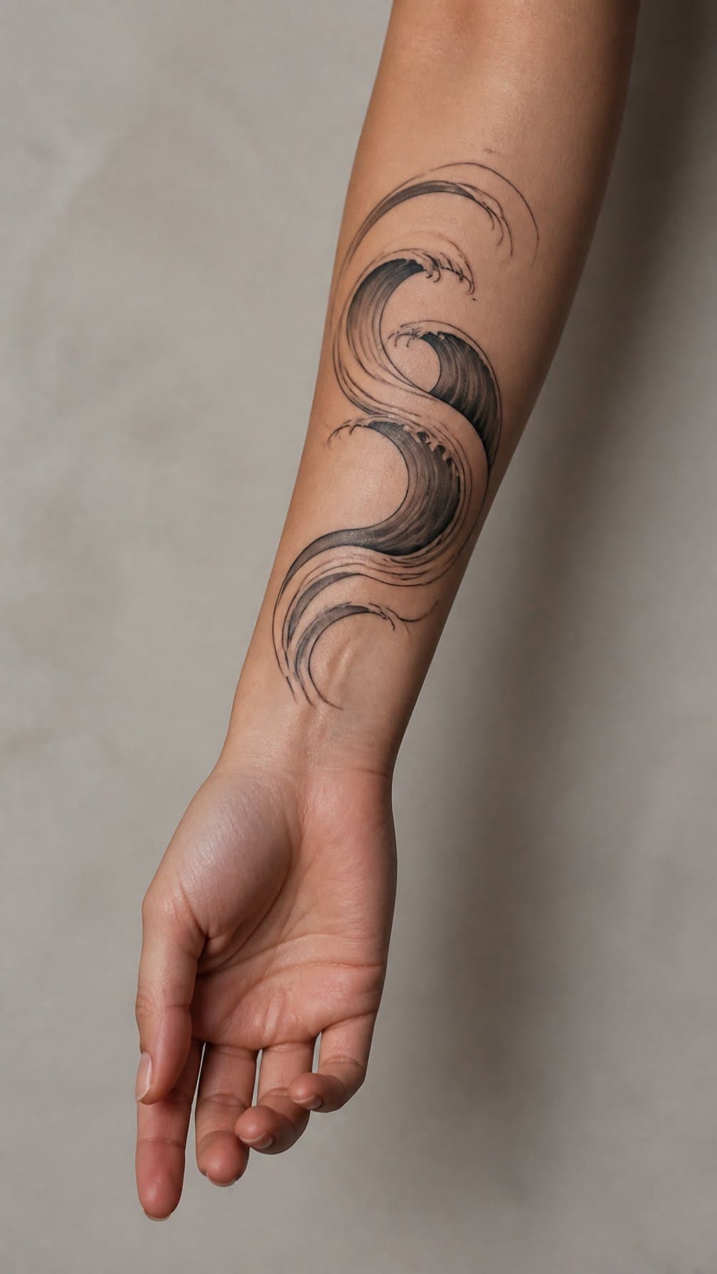
I like abstract wave tattoos because their flowing lines create movement without relying on a literal ocean scene. On the forearm, I can use a narrow vertical design that follows the arm’s length or a wider pattern that curves around its contour.
I might choose fine black lines for a quiet, modern look, or add limited shading to create depth between overlapping waves. Small breaks, uneven curves, and varied line weights can make the design feel intentionally drawn rather than perfectly geometric.
I would place this tattoo on the inner forearm for a more personal presentation or on the outer forearm for clearer visibility. Its open design also leaves room for future symbols, dates, or botanical details if I want to expand it later.
21) Birth Flower Bouquet
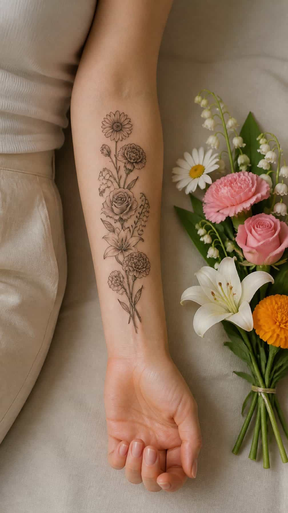
I would combine several birth flowers into a slim bouquet that follows the forearm’s natural length. Each bloom can represent a family member, friend, or meaningful month, while fine stems and small leaves keep the design balanced.
I prefer placing the larger flowers near the center and using smaller blossoms to taper toward the wrist. Soft color accents can distinguish each flower, while black linework creates a more understated look. A curved arrangement can also complement the arm’s shape without appearing too rigid.
22) Ornamental Dagger
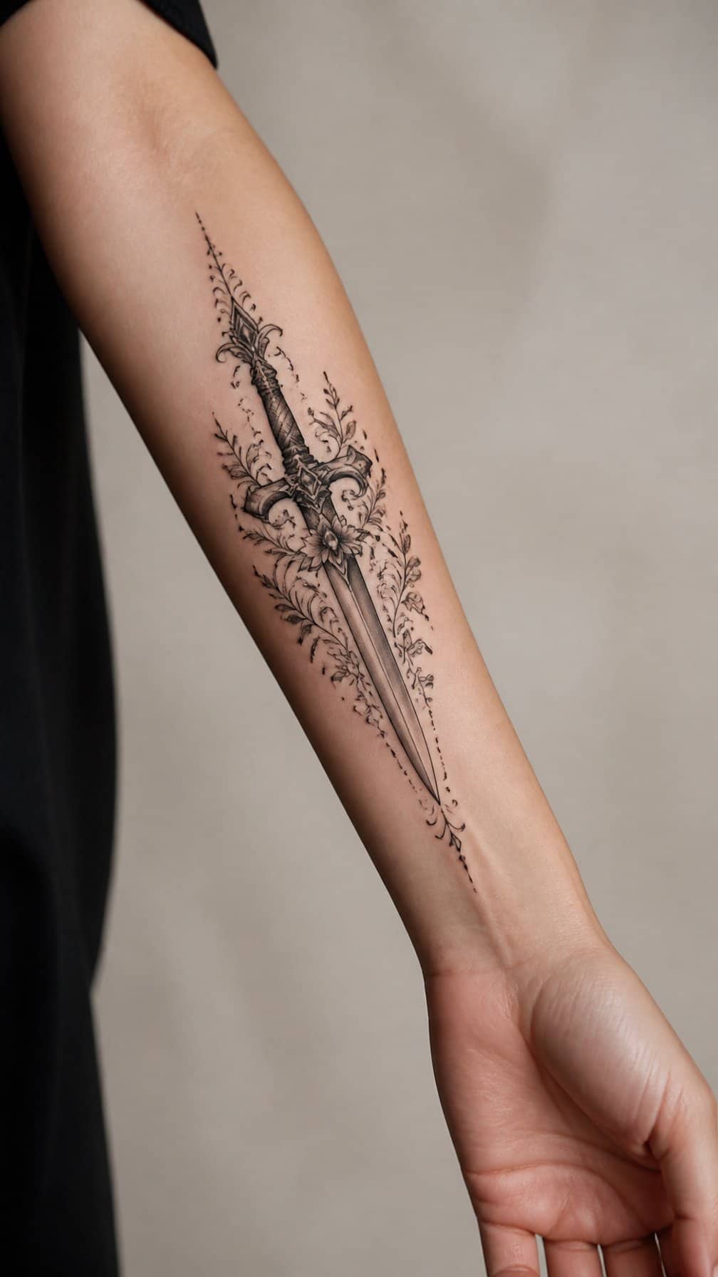
I like an ornamental dagger on the forearm because its narrow shape follows the arm naturally. Decorative details such as filigree, gemstones, ribbons, or a patterned handle can soften the weapon’s hard edges while preserving its defined silhouette.
I would place the blade lengthwise for a streamlined look, or angle it slightly to create more movement. Fine linework suits delicate designs, while bold outlines and solid shading help the tattoo remain readable as it ages. I would also consider the wrist and elbow placement carefully, since nearby movement can affect symmetry.
23) Small Semicolon Tattoo
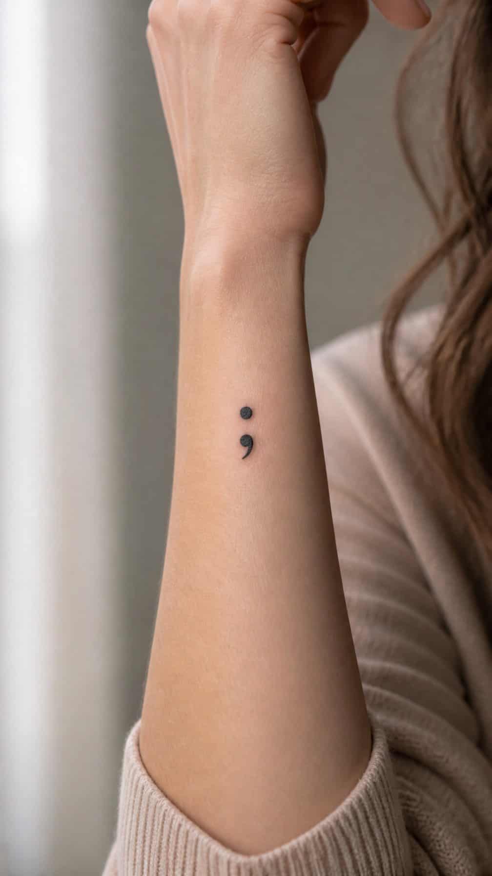
I like a small semicolon tattoo for its understated design and personal meaning. The punctuation mark can represent continuing through a difficult period rather than ending the story. On the inner or outer forearm, its compact shape stays visible without taking up much space.
I would choose fine black linework for a clean, lasting look, or add a tiny heart, flower, or soft color accent for a more personal detail. Its simple form also works well as a first tattoo because it requires minimal space and allows straightforward placement.
24) Black-and-Gray Peony
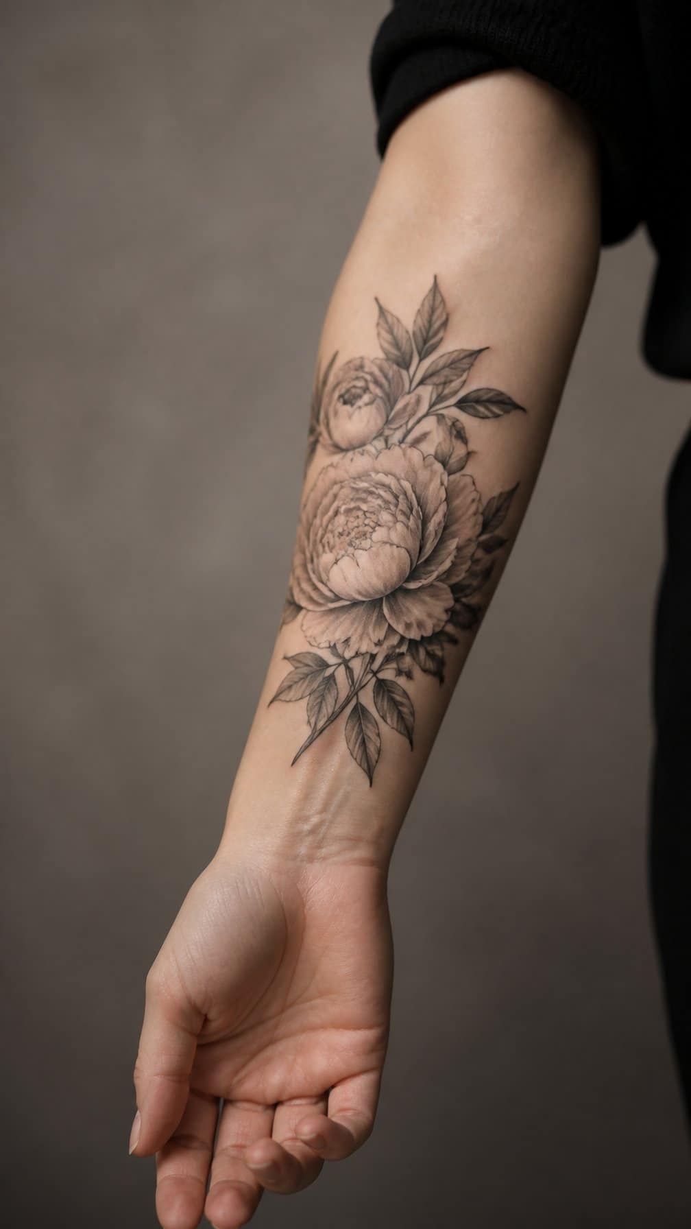
I like black-and-gray peonies for their layered petals, soft shading, and balanced structure. On the forearm, the elongated stem can follow the arm’s natural lines, while the flower creates a clear focal point without relying on color.
I would choose fine linework for delicate petals and deeper gray tones for depth between the folds. A side-facing bloom suits a narrower design, while an open peony can fill more space and create a stronger visual presence. Its placement also makes it easy to view and maintain.