
Choosing tattoo placement involves more than picking a spot that looks appealing. I consider visibility, comfort, skin movement, design size, and how the tattoo may fit your lifestyle before settling on a location.
Save for later
Want to come back to this story? Save it with your email so it is easy to find again.
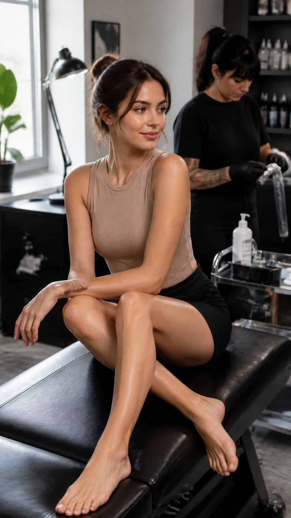
I can help you compare 24 tattoo placements so you can choose a location that suits your design, comfort level, and personal preferences. I’ll cover options ranging from discreet areas to visible placements, along with practical considerations to help you prepare for your first tattoo and make a confident decision.
Table of Contents
- 1 1) Inner wrist for a small meaningful symbol
- 2 2) Outer forearm for an easily visible design
- 3 3) Upper arm for a versatile first tattoo
- 4 4) Shoulder blade for a discreet artistic piece
- 5 5) Collarbone for delicate lettering or linework
- 6 6) Ribcage for a private personal design
- 7 7) Ankle for a subtle minimalist tattoo
- 8 8) Behind the ear for a tiny understated tattoo
- 9 9) Inner bicep for a personal design
- 10 10) Outer ankle for a simple symbol
- 11 11) Calf for a medium-sized illustrative tattoo
- 12 12) Thigh for a larger, lower-pain placement
- 13 13) Hip for a private decorative tattoo
- 14 14) Upper back for a design with room to expand
- 15 15) Nape of the neck for a small elegant tattoo
- 16 16) Side of the finger for minimal lettering
- 17 17) Back of the arm for a discreet placement
- 18 18) Chest for a meaningful personal tattoo
- 19 19) Sternum for symmetrical ornamental artwork
- 20 20) Spine for vertical lettering or imagery
- 21 21) Top of the foot for a visible delicate design
- 22 22) Elbow area for bold geometric linework
- 23 23) Knee area for a distinctive statement tattoo
- 24 24) Lower back for a centered decorative design
1) Inner wrist for a small meaningful symbol
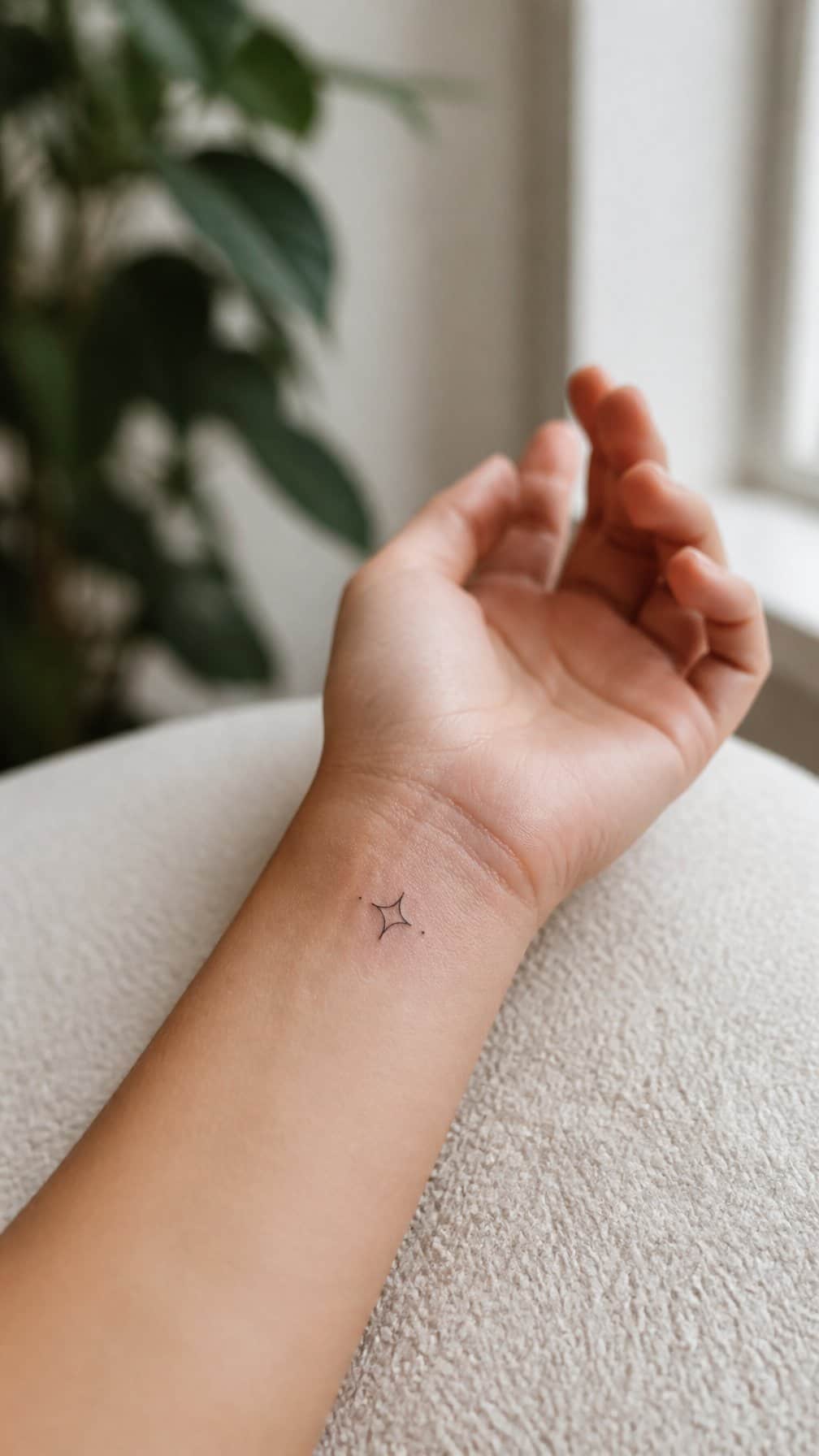
I find the inner wrist practical for a small symbol because I can see it easily without making it the main feature of my appearance. A simple heart, initial, date, or geometric mark fits the limited space and remains visually clear when the design uses clean lines.
The skin there can feel sensitive, and the area moves frequently, so I would choose an experienced tattoo artist and follow aftercare instructions carefully. I would also consider how often my watch, bracelet, or clothing may rub against the fresh tattoo.
A placement close to the palm may experience more friction and fading than one slightly higher on the wrist. I would avoid packing too much detail into a small design and select a size that allows the lines to age clearly.
2) Outer forearm for an easily visible design
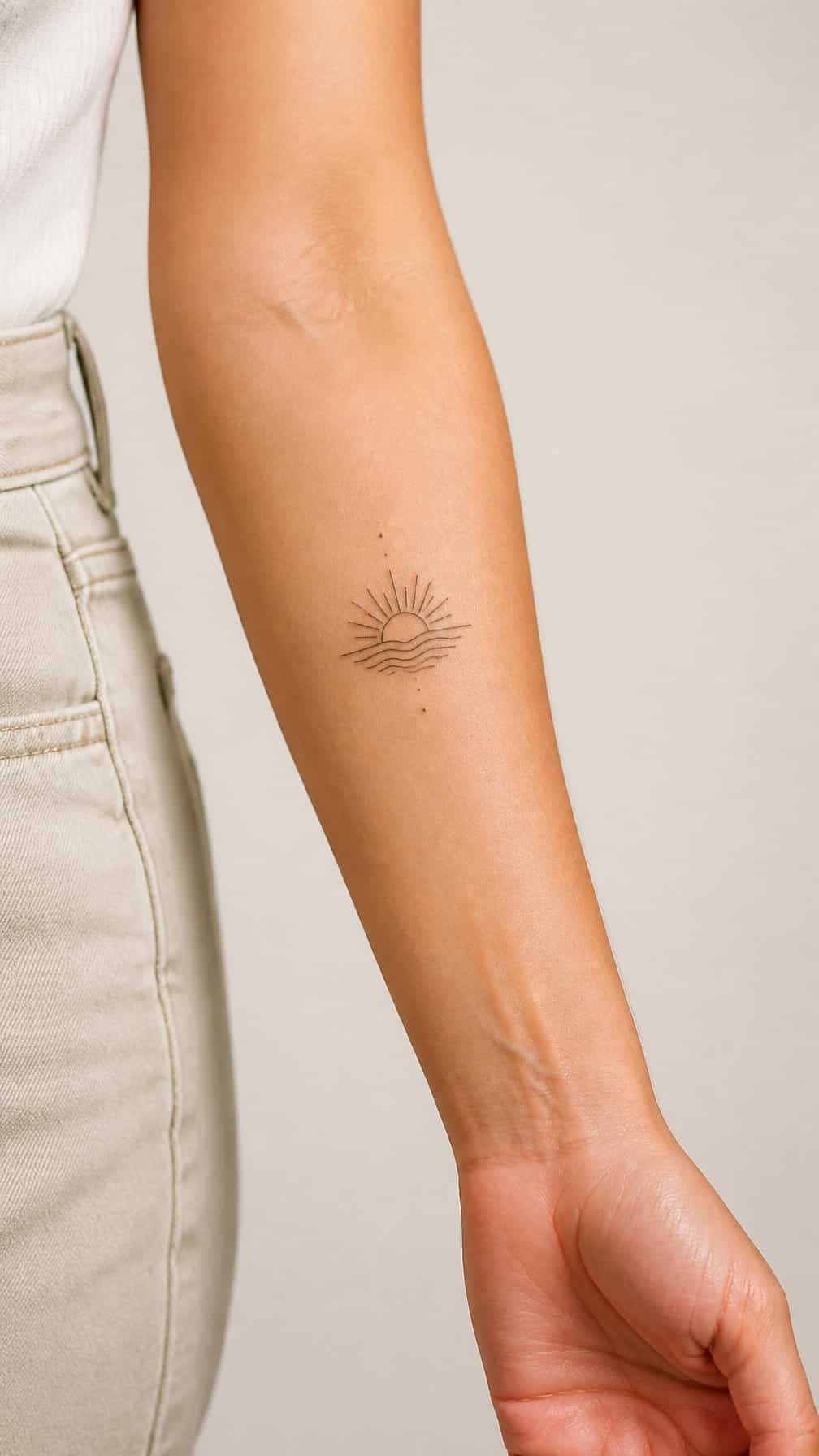
I like the outer forearm for a first tattoo because I can see the design without using a mirror. This placement suits simple symbols, lettering, botanical shapes, and other designs that benefit from a clear, relatively flat surface.
I would consider how often I want the tattoo visible at work or in formal settings. Short sleeves expose the area, while most long sleeves cover it, giving me some control over when I show it.
The forearm also gives me room to choose a smaller design without making it look cramped. I would ask the tattoo artist to check the design’s orientation while my arm rests naturally, since artwork can look different when I rotate my wrist.
3) Upper arm for a versatile first tattoo
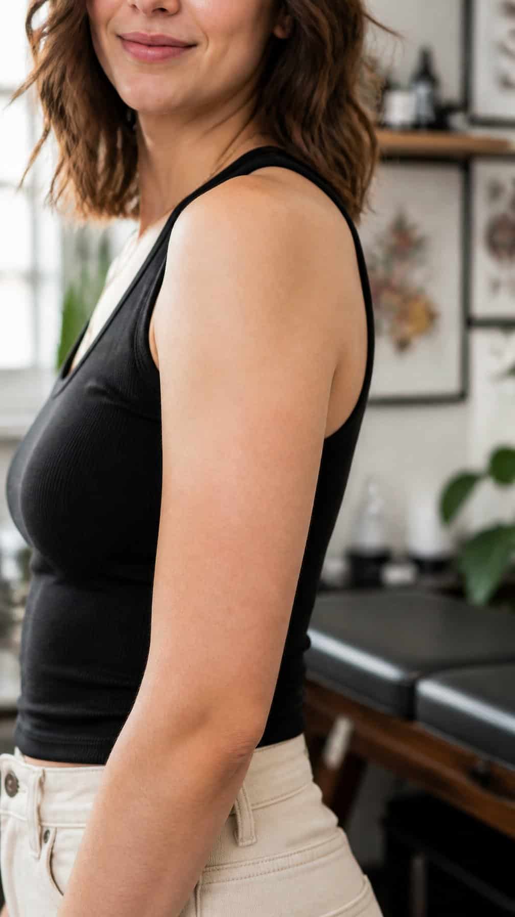
I like the upper arm because it gives me enough space for a small symbol, a detailed illustration, or a design that can expand later. The outer area usually provides a relatively even surface, which helps me plan the size and placement.
I can keep the tattoo visible with short sleeves or cover it with a shirt when needed. I also find this placement practical because I can inspect the healing skin and apply aftercare without much difficulty.
Before choosing a design, I consider how it will follow the arm’s shape. I avoid placing important details too close to the shoulder or elbow, where movement and body contours can affect the design’s appearance.
4) Shoulder blade for a discreet artistic piece
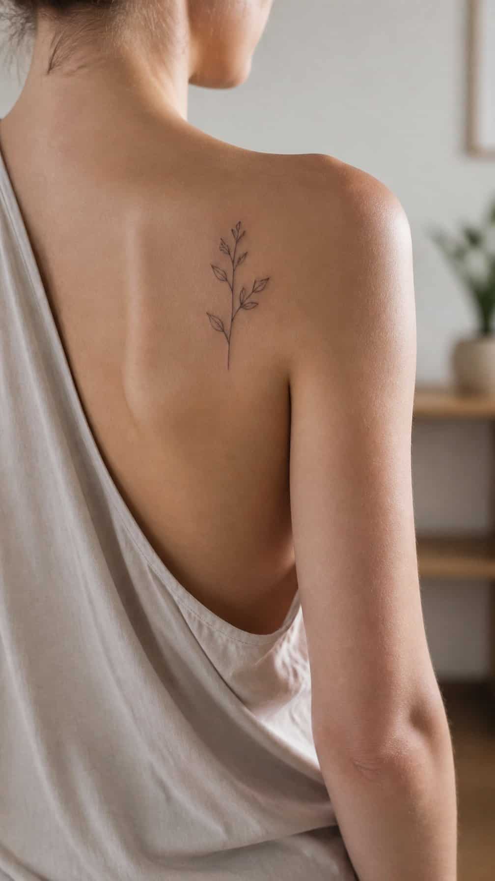
I like the shoulder blade for artwork that feels personal without staying visible all day. The broad, gently curved area suits line drawings, botanical forms, animals, and other designs that benefit from horizontal space.
I find this placement easy to cover with a T-shirt, button-up shirt, or dress, while open-back clothing can reveal the tattoo when I choose. I would confirm the design’s scale and position with my artist, since the shoulder blade’s movement can affect how the artwork sits.
The area may feel tender during a session because it lies close to bone. I would also avoid tight straps and friction while it heals, especially from bras, backpacks, or athletic clothing.
5) Collarbone for delicate lettering or linework
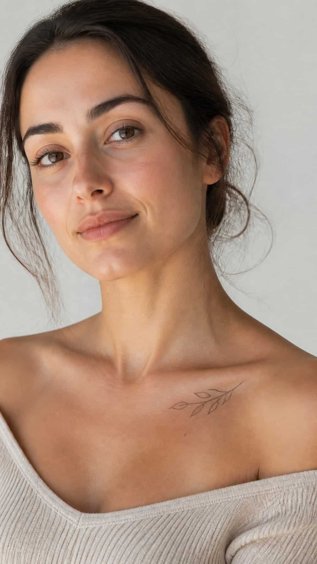
I like the collarbone for small lettering, fine lines, and designs that benefit from a horizontal layout. The area gives a tattoo a visible but easy-to-cover position, depending on the neckline you choose.
I would keep the design simple and check the lettering at its intended size before booking. Very small details can become difficult to read over time, especially if the lines sit close together.
The collarbone can feel sensitive because the skin lies near bone, and clothing may rub against it during healing. I would choose soft, loose tops and follow the artist’s aftercare instructions carefully.
6) Ribcage for a private personal design
I would choose the ribcage for a design that feels personal without needing constant visibility. The area suits meaningful symbols, short phrases, botanical details, and artwork that follows the natural curve of the body. I can keep it covered under most clothing and reveal it selectively.
The skin moves with breathing, and the ribs offer less padding than many other placements. I would expect a more intense tattooing experience and plan for steady aftercare, especially because clothing may rub against the area while it heals. Loose, soft fabrics can reduce irritation.
7) Ankle for a subtle minimalist tattoo
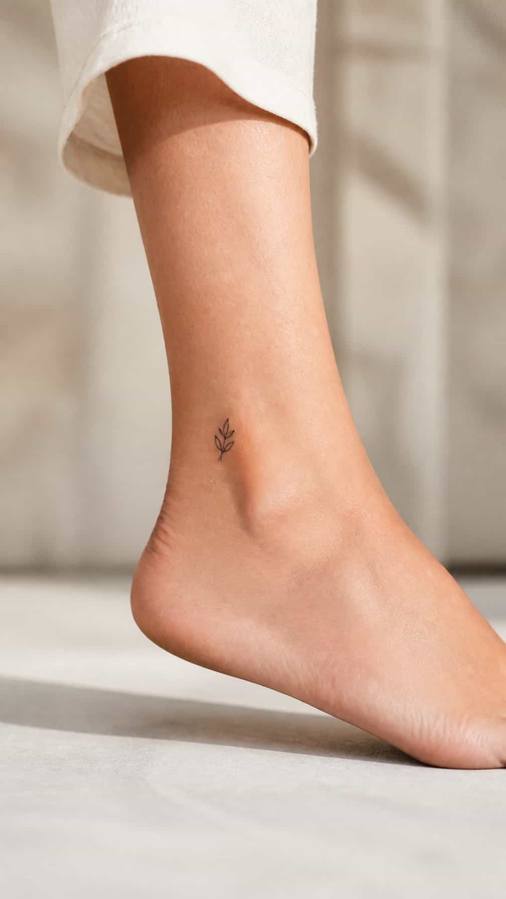
I consider the ankle a practical placement for a small, understated design. Its narrow shape suits fine lines, simple symbols, initials, and tiny botanical details without making the tattoo feel visually heavy.
I would choose the inner or outer ankle based on how visible I want the tattoo to be. Socks and shoes can cover either location, while low-cut footwear may leave it exposed. The area also gives me flexibility if I want a discreet design for work or formal settings.
The ankle can feel tender during tattooing because it has limited padding and sits close to bone. I would plan the appointment around comfortable footwear and avoid shoes that rub the area while it heals.
8) Behind the ear for a tiny understated tattoo
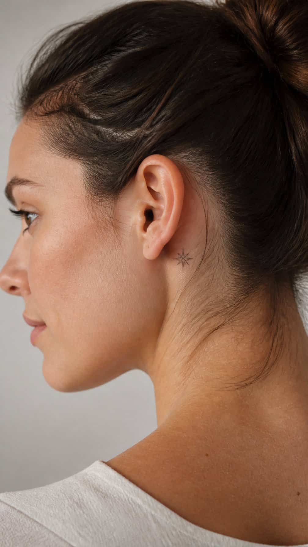
I like the area behind the ear for a small design that stays discreet when my hair covers it. Simple symbols, initials, stars, and fine-line shapes suit the limited space better than detailed artwork.
The skin can feel sensitive because the area is close to bone, and the curved surface gives the tattoo a compact appearance. I would choose an experienced artist who can place fine details accurately without overcrowding the design.
I also consider visibility at work and during healing. Hair products, headphones, and frequent rubbing may irritate fresh ink, so I keep aftercare gentle and follow my artist’s instructions.
9) Inner bicep for a personal design
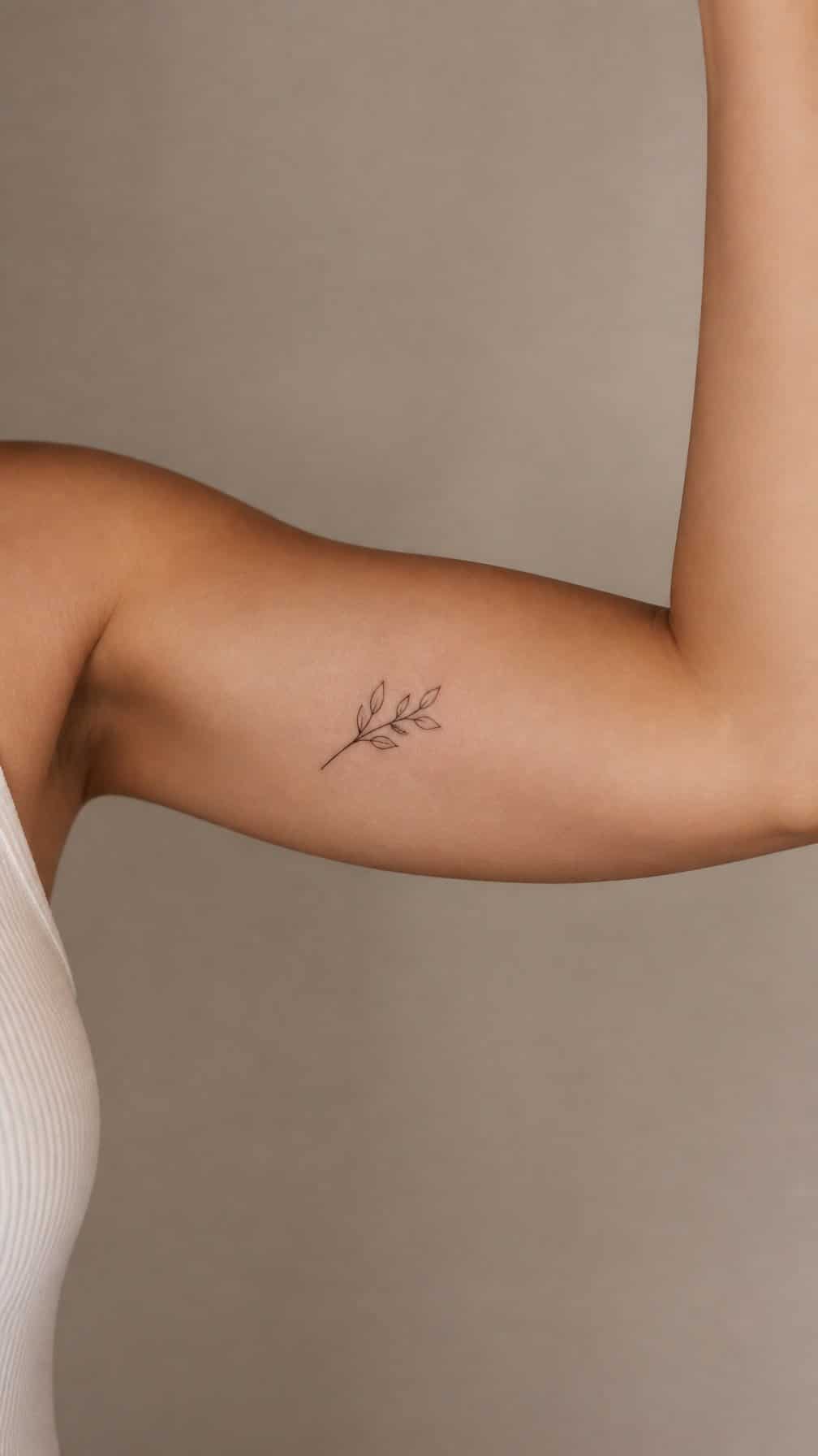
I like the inner bicep for designs that carry private meaning. The area stays mostly covered by short sleeves, so I can choose when to show the tattoo. It also offers enough space for names, dates, symbols, or fine-line artwork without forcing the design into a cramped shape.
I would consider how the skin folds when my arm bends and how the tattoo will look in both relaxed and flexed positions. This placement can feel sensitive during the session, and friction from tight sleeves may irritate fresh ink. Loose clothing and careful aftercare can help protect it while it heals.
10) Outer ankle for a simple symbol
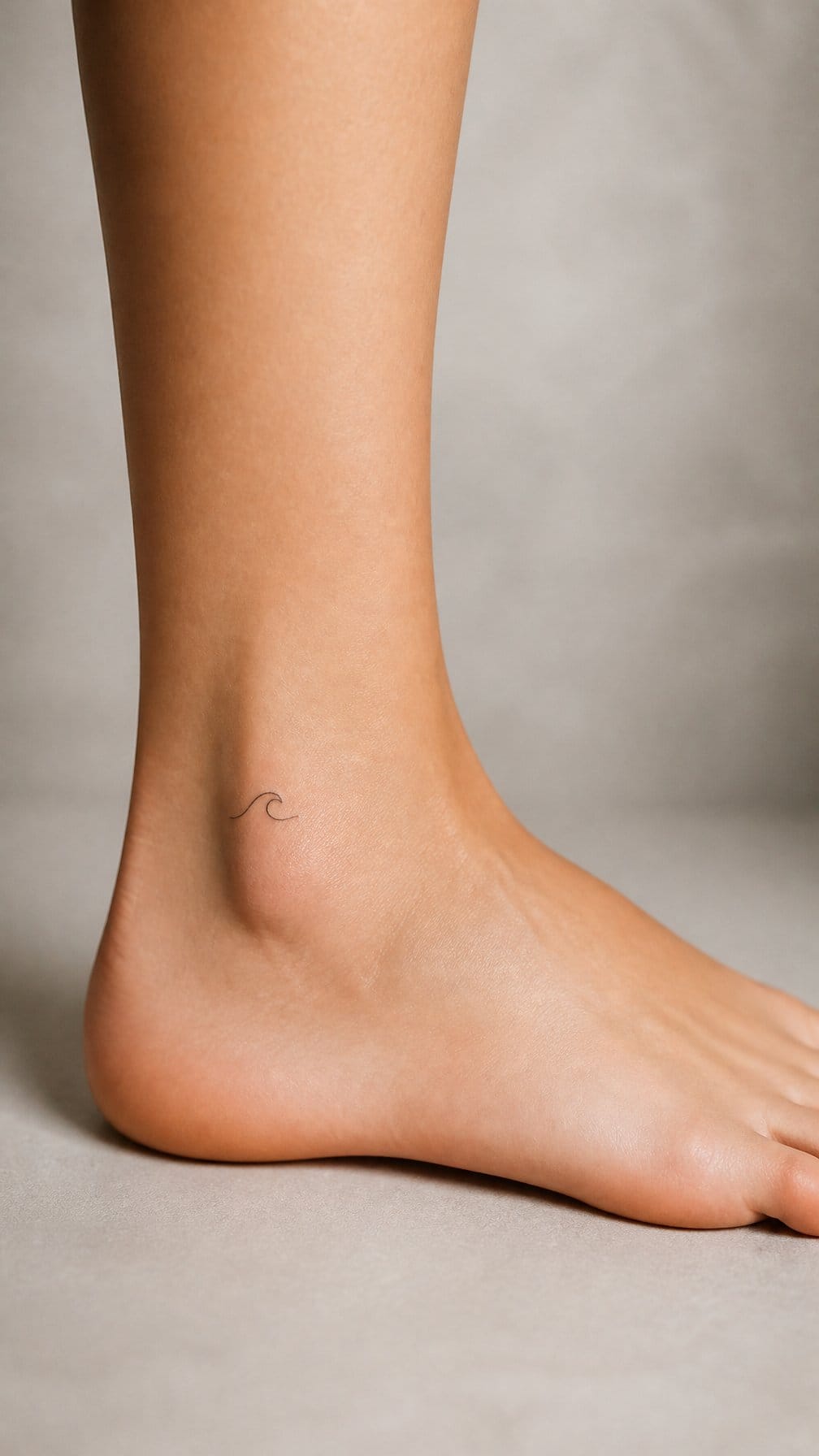
I like the outer ankle for a small symbol because it offers a defined, relatively flat area without taking up much visual space. A star, initial, leaf, or geometric mark can fit neatly above the ankle bone.
I would place the design slightly above the joint to reduce contact with footwear. Socks and shoes may rub this area during healing, so I would plan the appointment around a few days of loose, breathable clothing.
The skin can feel sensitive because the ankle has little cushioning. I would choose clean, bold lines and a modest size, since intricate details may be harder to maintain in a small tattoo.
11) Calf for a medium-sized illustrative tattoo
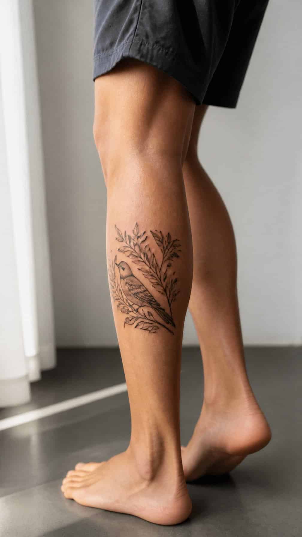
I like the calf for a medium-sized illustrative tattoo because its broad, gently curved surface gives the design room to develop. I can position the artwork vertically along the leg or center it on the fullest part of the muscle, depending on its shape.
The area usually offers enough space for recognizable linework and moderate detail without requiring an oversized design. I would ask the artist to account for the calf’s natural curve, since placement can affect how animals, plants, figures, or other illustrations appear when I stand and walk.
I would also consider how often I want the tattoo visible. Shorts reveal most of the calf, while trousers can cover it easily, making this placement practical for changing work or social settings.
12) Thigh for a larger, lower-pain placement
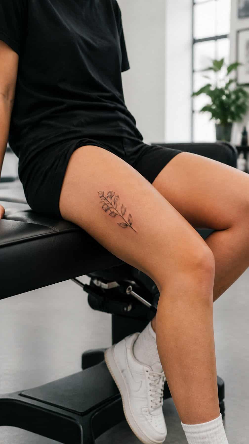
I consider the thigh a practical choice for a larger tattoo because it offers broad, relatively flat skin. I can place detailed artwork, lettering, or flowing designs without compressing the composition into a small area.
Many people find the outer thigh more comfortable than bonier locations because it has substantial muscle and soft tissue. I still expect sensitivity near the inner thigh and closer to the knee, where skin and nerves can make the session feel sharper.
I would choose clothing that does not rub the area during healing, such as loose shorts or soft trousers. I also keep the design’s size, sitting position, and future visibility in mind before committing to the placement.
13) Hip for a private decorative tattoo
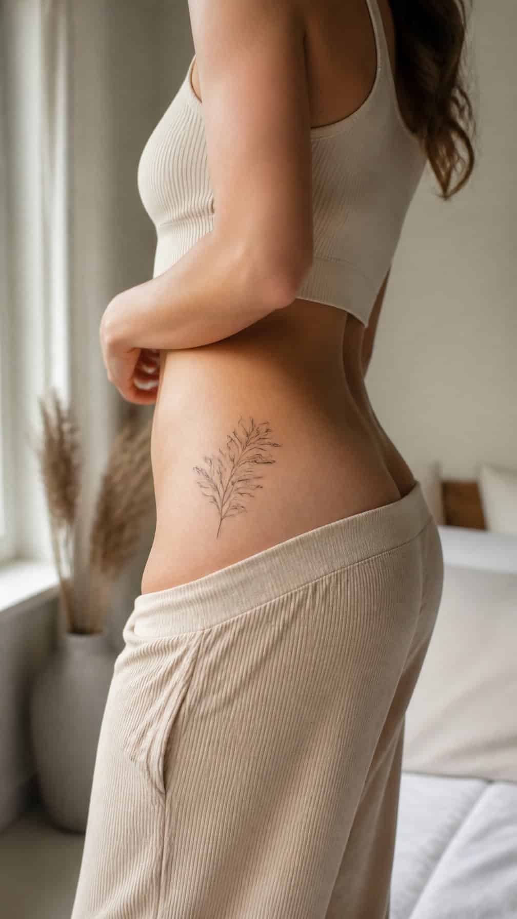
I like the hip for a decorative tattoo that I can keep covered or reveal selectively. The curved area suits designs such as flowers, ornamental shapes, vines, or small symbols, while its natural contour can guide the tattoo’s placement.
I would choose clothing carefully during healing because waistbands and fitted underwear may rub against the skin. The hip can also feel more sensitive than flatter areas, so I would discuss the design size, position, and expected discomfort with my tattoo artist before booking.
14) Upper back for a design with room to expand
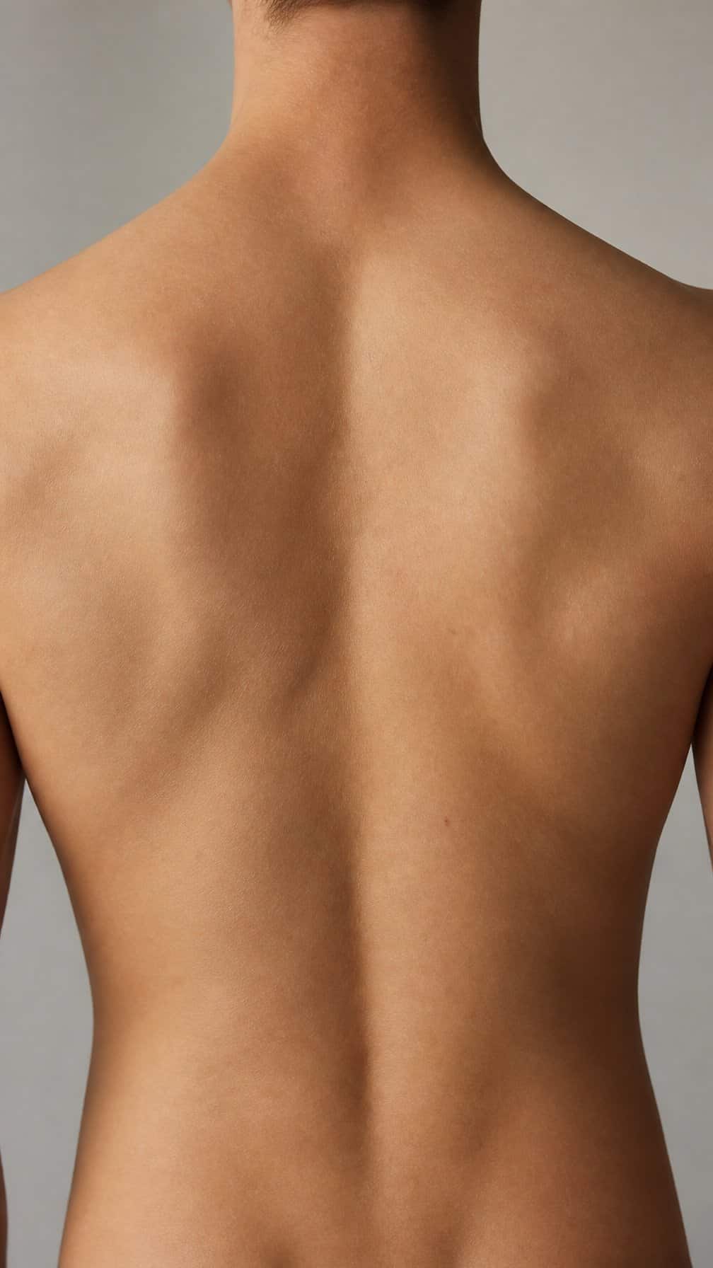
I like the upper back for a first tattoo when I want enough space for a detailed design or future additions. The broad, relatively flat area supports symmetrical artwork, lettering, animals, and nature-inspired compositions without forcing the image into a narrow shape.
I would place the design between the shoulder blades or extend it toward one shoulder, depending on its layout. The skin can shift with movement, so I would work with an experienced tattoo artist to position the stencil and check how it follows my posture.
I would also consider clothing and aftercare. Backpack straps, tight shirts, and frequent rubbing may irritate fresh ink, while reaching the area myself can make cleaning and moisturizing more difficult.
15) Nape of the neck for a small elegant tattoo
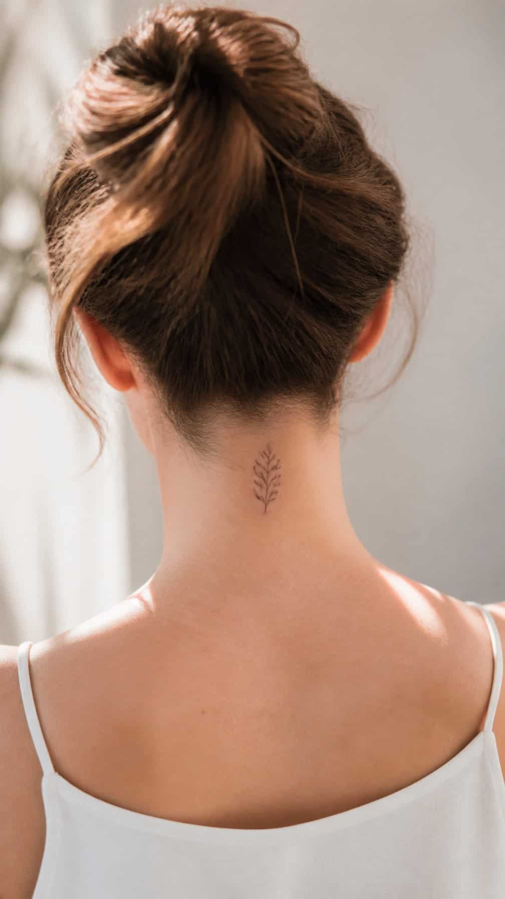
I like the nape of the neck for a discreet design that can remain hidden beneath longer hair or a collared shirt. Its narrow space suits fine-line symbols, initials, tiny botanical shapes, or short minimalist marks.
I would keep the artwork compact and avoid overly intricate details, since small lines can blur as the tattoo ages. The area may feel sensitive because the skin is close to the spine and contains little cushioning, so I would choose an experienced artist and follow aftercare instructions carefully.
Hair friction, shirt collars, and regular movement can irritate the area while it heals. I would plan the appointment when I can avoid tight collars and keep the tattoo clean, dry, and protected according to my artist’s guidance.
16) Side of the finger for minimal lettering
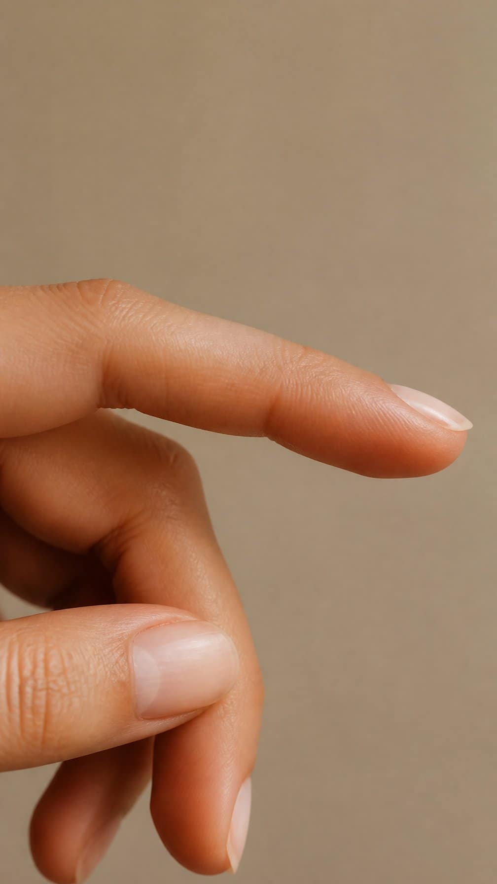
I like the side of the finger for a short word, initial, or small date because the placement stays discreet and easy to view. I would choose simple lettering with clean spacing, since the narrow surface limits detail and can make crowded designs difficult to read.
Finger tattoos often experience friction from washing, gripping, and daily contact with objects. I would discuss possible fading with my tattoo artist and follow aftercare instructions carefully. A design placed slightly away from the crease may reduce distortion when I bend my finger.
17) Back of the arm for a discreet placement
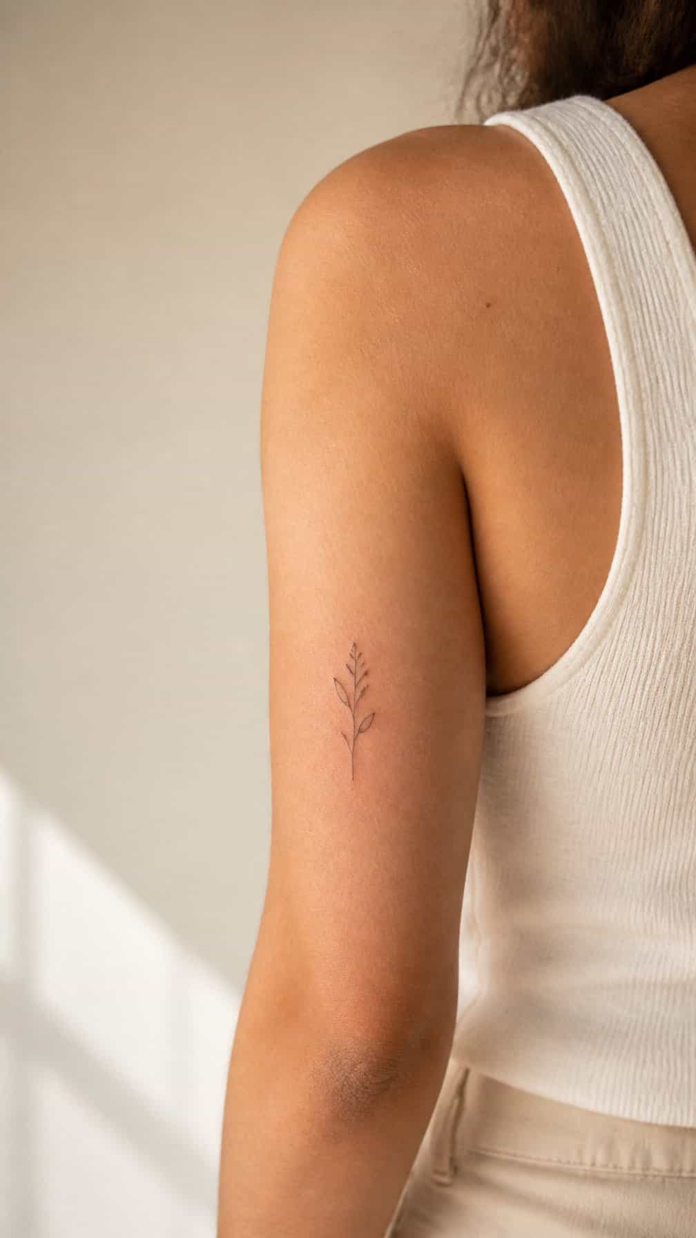
I like the back of the upper arm for a tattoo that stays easy to cover with short sleeves or a light layer. The relatively flat area suits small symbols, fine-line designs, and compact lettering, while its position gives the tattoo a more private feel than the forearm.
I would place the design where the arm keeps a consistent shape during movement, avoiding areas that crease sharply near the elbow. I would also check the size carefully: a very small design may lose detail over time, while a slightly larger piece can remain clearer and more balanced.
18) Chest for a meaningful personal tattoo
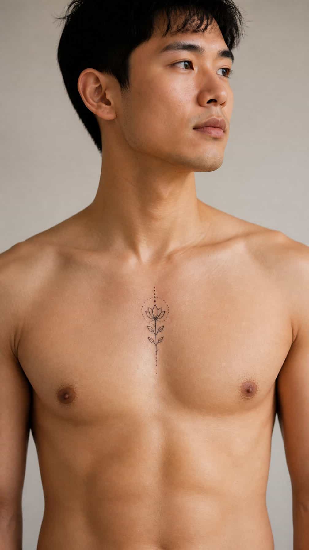
I consider the chest a strong choice for a tattoo tied to family, memory, or personal values. I can keep the design close to my heart or position it across the upper chest, depending on its size and meaning.
The area gives me enough space for lettering, symbols, or a detailed illustration. I should remember that the skin near the sternum and collarbone can feel more sensitive, while the outer chest may offer a more manageable experience.
I also need to think about visibility. I can cover a chest tattoo with most shirts, making it suitable for a private design or a piece I want to reveal selectively.
19) Sternum for symmetrical ornamental artwork
I like the sternum for balanced ornamental designs because its central position supports clear symmetry. I would consider mandalas, filigree, geometric motifs, or floral patterns that follow the breastbone and extend evenly across the chest.
This placement can feel sensitive, especially near the bone, so I would choose an experienced tattoo artist who can position the design carefully. I would also discuss how the artwork may sit with different necklines and body movements.
I would start with a size that preserves the fine details without crowding the surrounding area. A stencil helps me check the design’s alignment, scale, and relationship to my natural chest shape before the tattoo begins.
20) Spine for vertical lettering or imagery
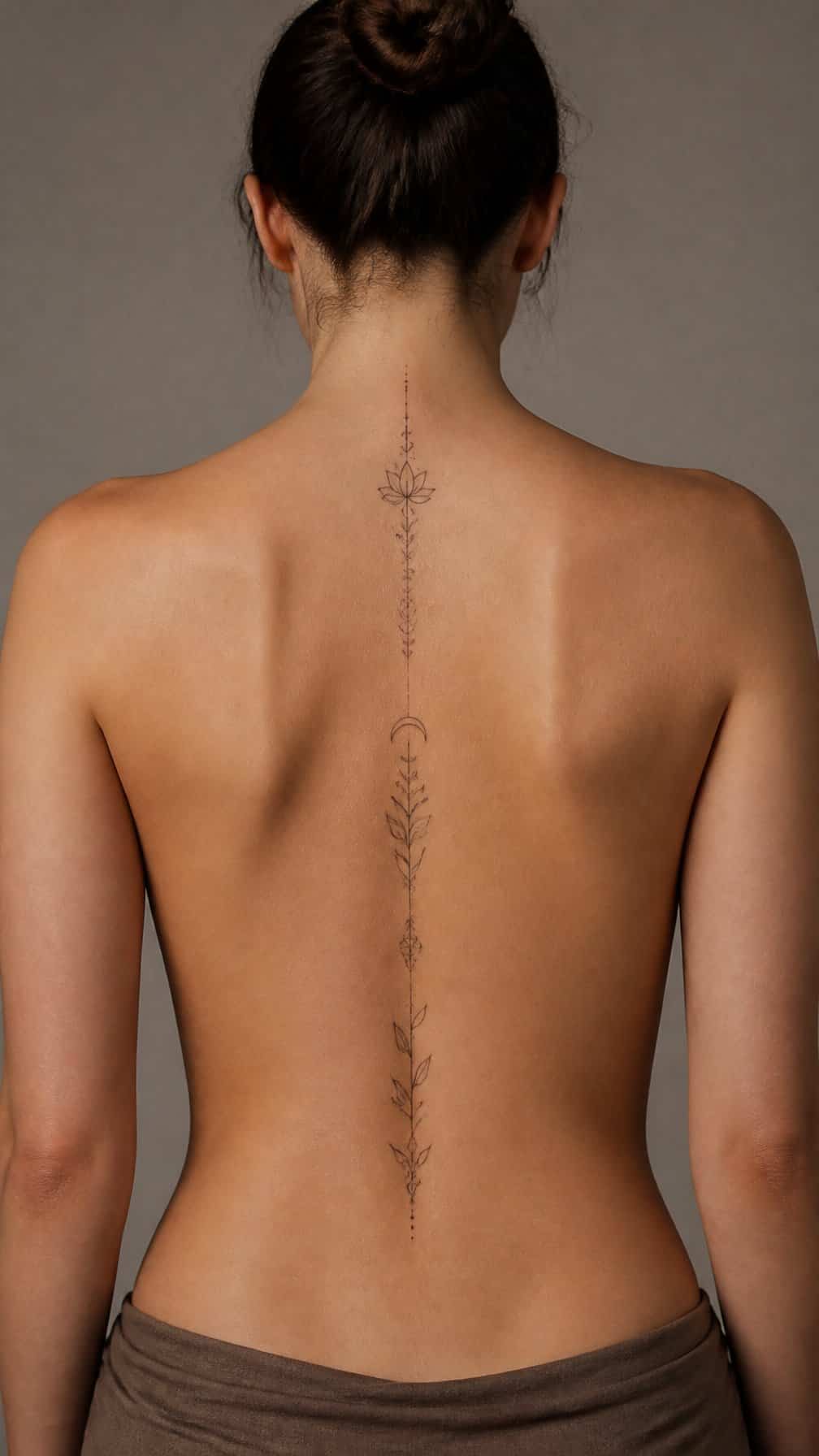
I use the spine for designs that benefit from a strong vertical flow, such as lettering, botanical stems, snakes, or narrow geometric patterns. This placement can make a long design feel balanced when it follows the natural centerline of the back.
The skin over the spine has limited width, so I choose lettering carefully and test the scale before tattooing. Small text may lose clarity over time, while larger spacing can improve readability.
I also consider movement, posture, and clothing. A spine tattoo may experience friction from waistbands or backpack straps, and the area can feel more sensitive than broader, fleshier locations.
21) Top of the foot for a visible delicate design
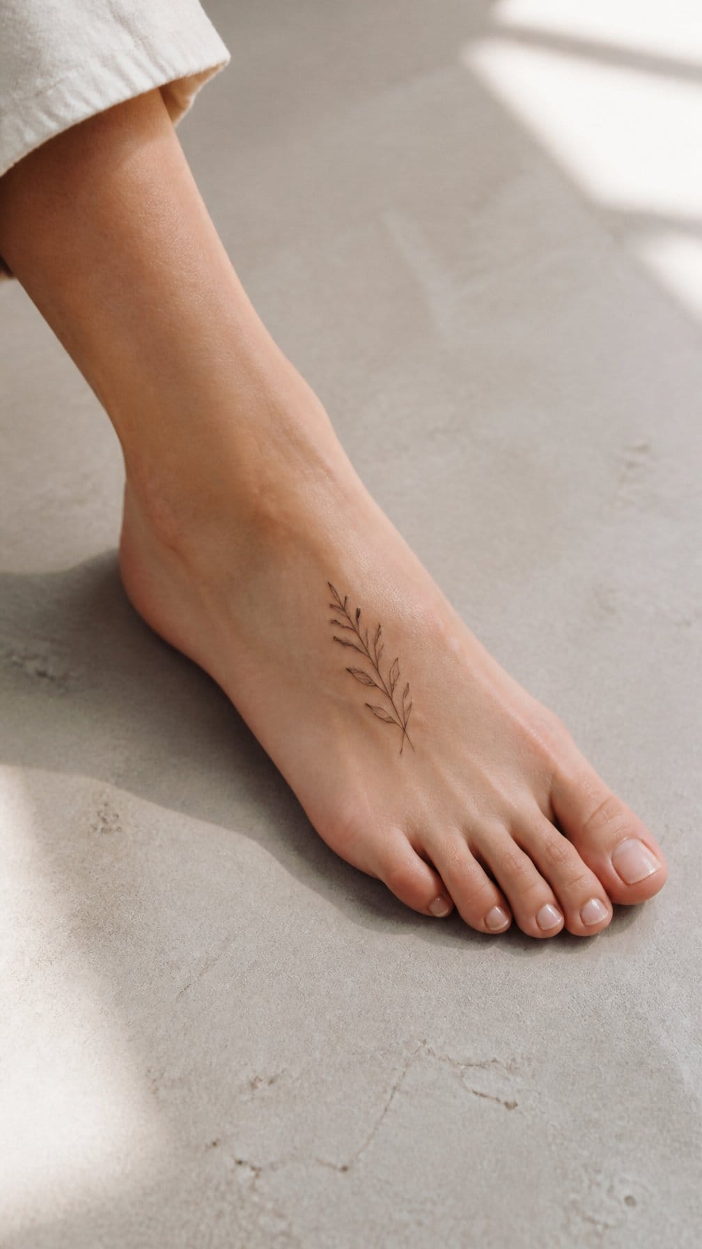
I like the top of the foot for small designs that I want to keep visible with sandals or low-cut shoes. Fine botanical lines, initials, stars, and simple symbols can fit neatly along the foot’s length without requiring a large area.
I would place the design where footwear will not rub against it during healing. Shoes can make this location uncomfortable, and walking may cause extra irritation, so I would plan several days for gentle care and reduced friction.
The skin can shift slightly over the foot’s contours, which makes a skilled artist important for clean, balanced lines. I would also remember that sun exposure may affect the tattoo’s appearance over time and use appropriate protection after it heals.
22) Elbow area for bold geometric linework
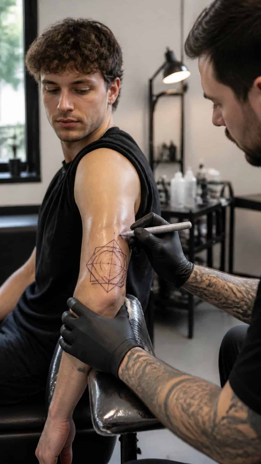
I like the elbow area for geometric designs that need movement and structure. Lines can follow the joint’s angles, while triangles, circles, grids, or bands create a deliberate pattern around it.
I would ask the artist to account for the elbow’s central crease and frequent bending. Designs placed directly over that fold may experience more friction and movement, so an experienced tattooer can adjust spacing and line weight for clearer aging.
This placement suits people who want a visible tattoo with a strong graphic quality. I would protect the fresh work from prolonged soaking, friction, and direct sun while it heals.
23) Knee area for a distinctive statement tattoo
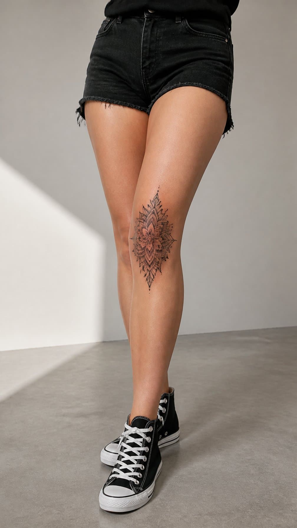
I would choose the knee area for a design that benefits from a central, visible position. The kneecap’s rounded shape can suit circular motifs, symmetrical patterns, flowers, eyes, or geometric artwork, while the surrounding area gives larger designs more room.
I would expect this placement to feel more uncomfortable than many fleshy areas because the skin sits close to bone and moves constantly. Healing can also require care, especially if clothing rubs against the tattoo or frequent bending creates irritation.
I would ask the artist to assess my knee’s shape and movement before finalizing the design. A skilled placement can follow the joint naturally and keep important details readable when my leg is straight or bent.
24) Lower back for a centered decorative design
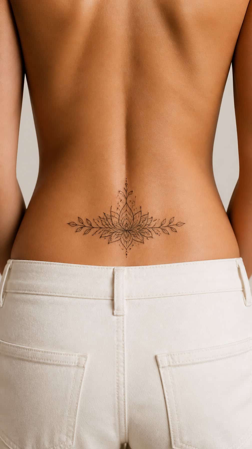
I would choose the lower back for a design that needs balanced placement across the body’s centerline. Floral ornaments, geometric motifs, ornamental arches, and symmetrical symbols can follow the natural width of the area without competing with the face or hands.
I would ask the artist to check the design while I stand and sit, since the skin shifts with posture. A stencil helps me judge the size, spacing, and alignment before the needle starts.
This placement usually stays covered by many shirts and trousers, but waistbands may rub during healing. I would wear loose clothing, follow the artist’s aftercare instructions, and avoid pressure or friction while the tattoo heals.