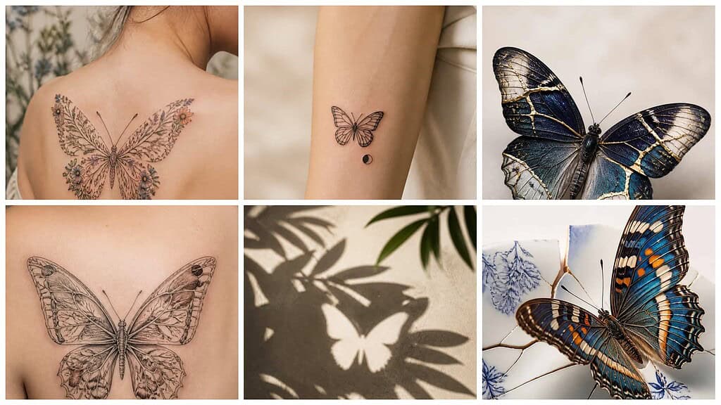
A butterfly tattoo can feel personal without relying on familiar, overused imagery. I’ll explore original approaches that use linework, geometry, nature, movement, and symbolism to help you find a design that suits your style.
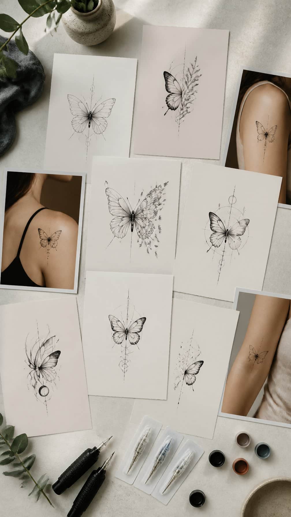
Save for later
Want to come back to this story? Save it with your email so it is easy to find again.
You can choose a butterfly tattoo that feels distinctive by focusing on thoughtful details, meaningful references, and a design that fits your preferences. I’ll also consider how placement, scale, color, and lasting quality shape the finished result.
Table of Contents
- 1 1) Abstract moth-wing butterfly with asymmetrical linework
- 2 2) Topographic butterfly with contour-map patterns
- 3 3) Blackwork butterfly dissolving into geometric fragments
- 4 4) Botanical butterfly featuring native wildflower details
- 5 5) Surreal butterfly with an eye-shaped wing marking
- 6 6) Fine-line butterfly paired with a tiny lunar eclipse
- 7 7) Kintsugi butterfly with gold-inspired fracture lines
- 8 8) Butterfly formed from delicate anatomical sketches
- 9 9) Negative-space butterfly hidden within leafy shadows
- 10 10) Monochrome butterfly with Art Deco wing geometry
- 11 11) Butterfly emerging from a cracked porcelain pattern
- 12 12) Two-tone butterfly using muted rust and slate blue
- 13 13) Butterfly with wings shaped like ocean waves
- 14 14) Minimalist butterfly made from one continuous line
- 15 15) Butterfly surrounded by abstract ink-brush strokes
- 16 16) Vintage scientific-illustration butterfly with modern accents
- 17 17) Butterfly mirrored against a fragmented reflection
- 18 18) Celestial butterfly with subtle constellation markings
- 19 19) Butterfly incorporating a meaningful handwritten word
- 20 20) Origami butterfly with crisp folded-plane shading
- 21 21) Butterfly with stained-glass wing sections
- 22 22) Butterfly transforming into drifting autumn leaves
- 23 23) Tiny butterfly paired with an abstract soundwave
- 24 24) Butterfly featuring Indigenous-inspired geometric symmetry
- 25 25) Butterfly with translucent wings and skeletal details
1) Abstract moth-wing butterfly with asymmetrical linework
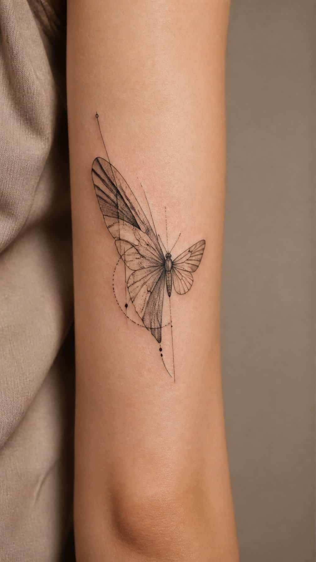
I like this design for its deliberate imbalance. One wing can use dense moth-inspired shading, while the other relies on sparse outlines, open space, and a few interrupted curves. The contrast gives the tattoo a graphic quality without relying on a standard symmetrical butterfly shape.
I would place it on the forearm, shoulder blade, or upper chest, where the uneven wings can follow the body’s natural contours. Fine lines suit the lighter side, while stippling or soft blackwork adds texture to the heavier wing.
I would keep the body simple and let the wings carry the visual interest. A muted accent, such as rust, blue-gray, or olive, can distinguish selected markings without making the design look overly decorative.
2) Topographic butterfly with contour-map patterns
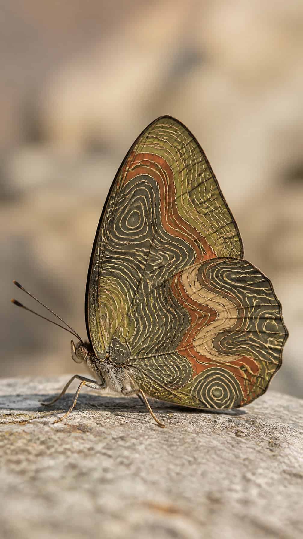
I like this design for its balance of structure and softness. Thin contour lines can follow each wing’s shape while remaining slightly irregular, creating a map-like pattern without making the butterfly look overly technical.
I would place the densest lines near the wing bases and let them spread farther apart toward the edges. Black ink keeps the design crisp, while muted green, brown, or blue can add a restrained geographic reference.
This approach works well as a medium-sized tattoo on the forearm, shoulder blade, or calf. I would avoid excessive detail at a very small scale, since closely packed lines may blur over time.
3) Blackwork butterfly dissolving into geometric fragments
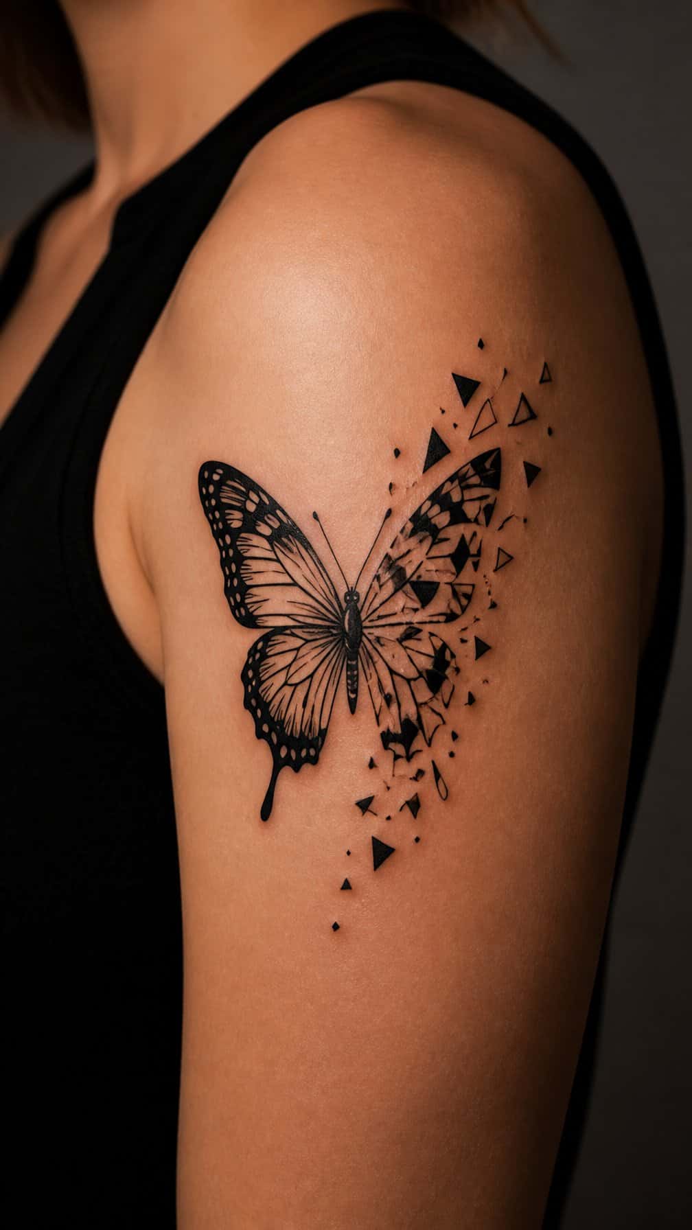
I like this design for its controlled transition from organic form to precise structure. Dense blackwork defines the butterfly’s body and nearest wing sections, while triangles, lines, and small polygons break apart toward the edges.
I would place the solidest detail near the center and let the fragments become smaller and more widely spaced. That arrangement keeps the silhouette readable without making the tattoo look like a standard butterfly outline.
I prefer a limited black-and-negative-space palette here. It gives the geometric pieces room to breathe and makes the dissolving effect depend on spacing rather than extra decoration. The forearm, upper arm, or shoulder blade provides enough surface for the pattern to spread naturally.
4) Botanical butterfly featuring native wildflower details
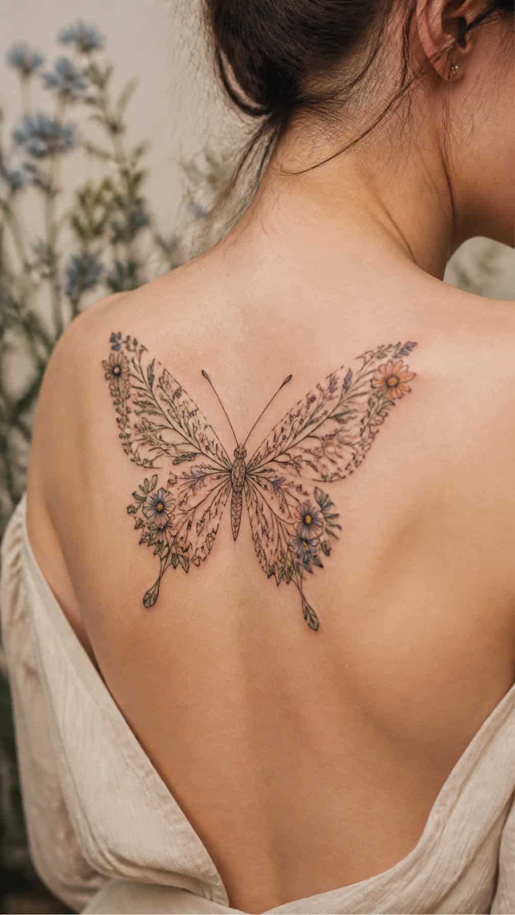
I would pair the butterfly with small native blooms, such as coneflowers, lupines, or black-eyed Susans, rather than generic roses. Fine stems can follow the wing’s outer curve, while leaves add structure without competing with the insect’s pattern.
I like this design in black and gray with one restrained color accent. A muted yellow flower or deep violet petal can echo the butterfly’s markings while keeping the composition natural. I would use delicate linework for veins and botanical texture, leaving enough open skin for clarity.
5) Surreal butterfly with an eye-shaped wing marking
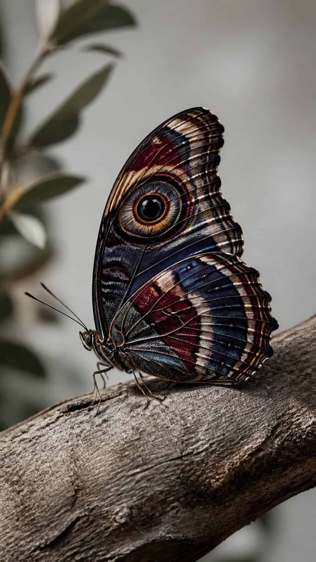
I like this design for its quiet sense of mystery. The butterfly can remain anatomically recognizable while one wing carries an eye-shaped marking, creating a focal point without relying on excessive detail.
I would place the marking slightly off-center and use fine lines to define the iris, pupil, and surrounding contours. Keeping the rest of the wings restrained helps the eye feel integrated rather than added as a separate symbol.
For a more surreal effect, I might pair muted blues, rust tones, or gray shading with a small area of stronger color around the marking. A side-facing butterfly or slight wing overlap can also make the composition feel less predictable.
6) Fine-line butterfly paired with a tiny lunar eclipse
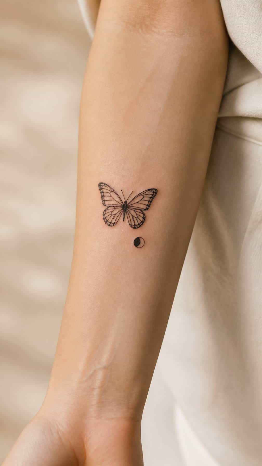
I like this pairing for its quiet contrast: the butterfly brings organic movement, while the lunar eclipse adds a precise geometric accent. I would place the eclipse near the wingtip or slightly above the butterfly, leaving enough space for both shapes to remain legible.
Fine-line work suits this concept because delicate outlines keep the design light and compact. I would use a small black circle with a narrow crescent of negative space, then echo that restraint in the butterfly’s unshaded wings.
I would choose a simple side or three-quarter butterfly rather than a highly detailed specimen. That approach preserves clarity as the tattoo ages and makes the lunar detail feel intentional instead of decorative.
7) Kintsugi butterfly with gold-inspired fracture lines
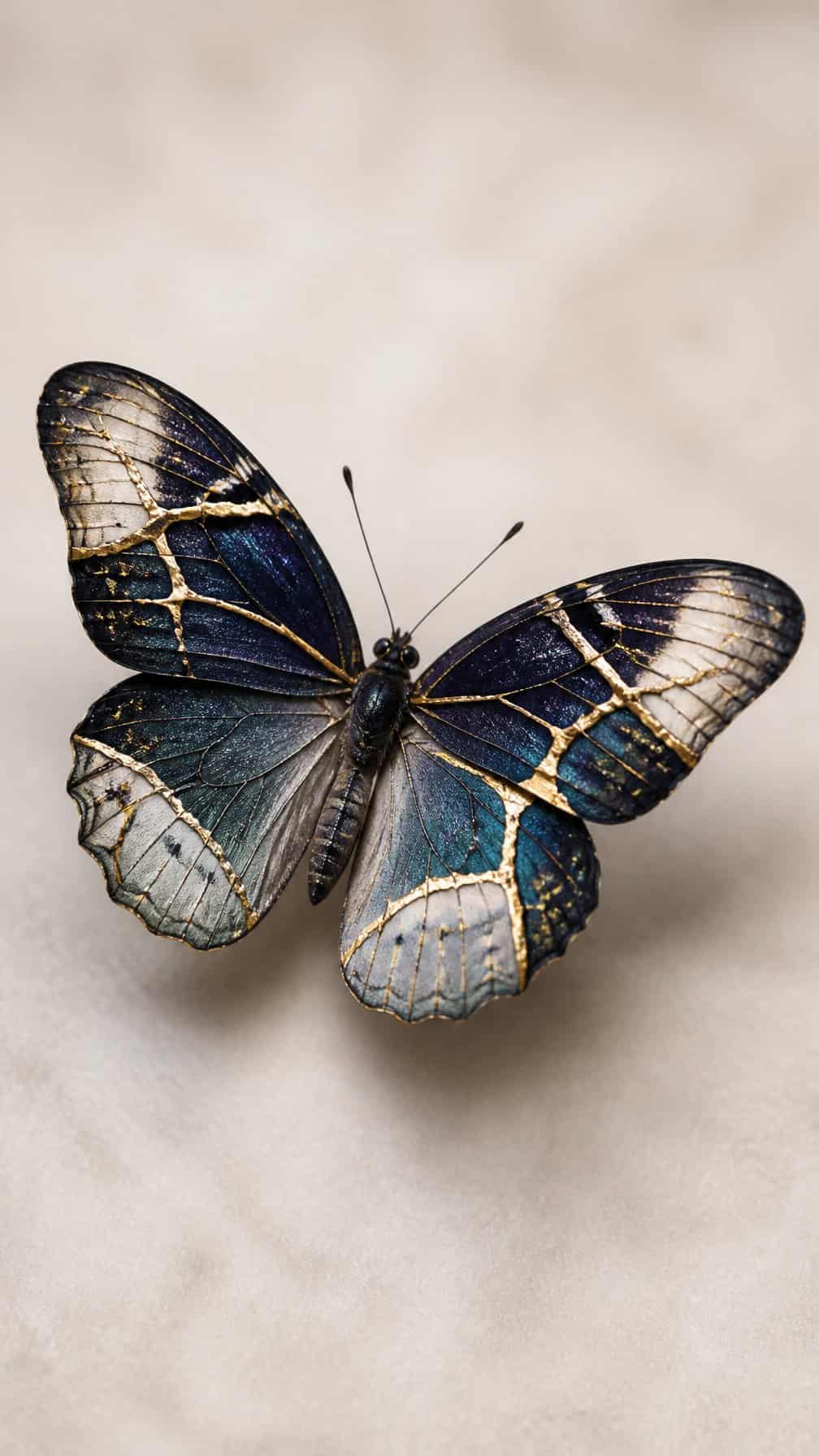
I like this design for its balance between fragility and repair. Fine, gold-inspired lines can trace one wing’s natural veins, then branch across the body or along the opposite wing as deliberate fracture marks.
I would keep the butterfly’s base mostly unfilled or use muted black and gray shading, allowing the metallic color to stand out without dominating the design. Warm ochre, antique gold, or soft yellow ink can suggest gilded seams while remaining practical for a tattoo palette.
I would place it on the shoulder blade, forearm, or upper chest, where the wing shape has enough space to stay readable. A slightly asymmetrical composition makes the repaired sections feel intentional rather than decorative.
8) Butterfly formed from delicate anatomical sketches
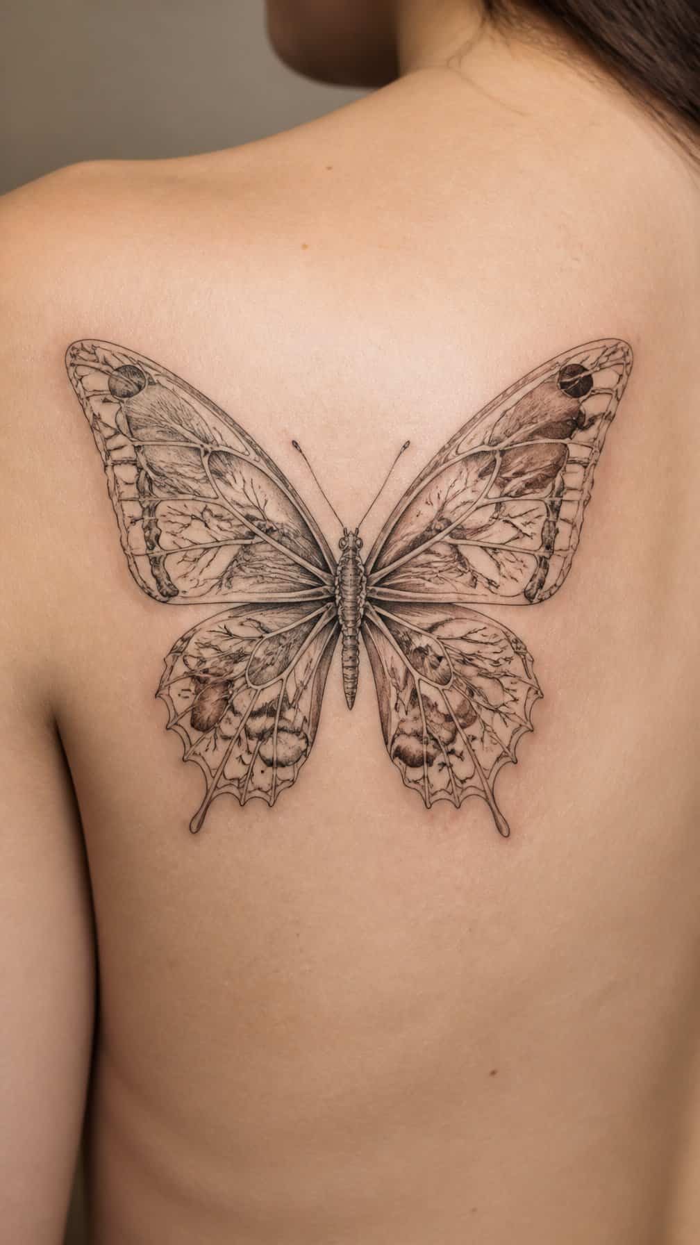
I like this design because it replaces solid wings with fine anatomical references, such as bone structures, veins, muscles, or botanical forms. Arranged symmetrically, these details can suggest a butterfly without relying on conventional patterns or heavy shading.
I would keep the linework thin and leave enough skin visible to prevent the composition from looking crowded. Small labels, measurement marks, or discreet scientific symbols can add an archival quality, while a limited amount of muted color can distinguish the wing sections.
Placement affects the design’s clarity. I find that the upper back, sternum, or forearm offers enough space for the mirrored details to remain readable, especially when the tattoo includes several small elements. The final layout should follow the body’s natural shape rather than forcing perfect symmetry.
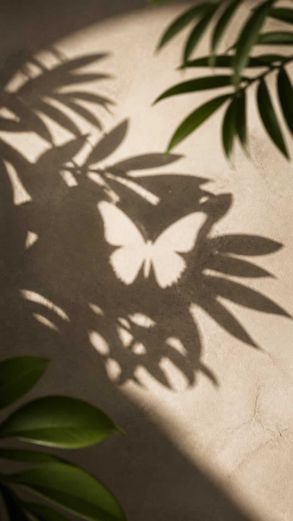
I like this design for its quiet contrast: dense leaves create the surrounding shape, while untouched skin forms the butterfly at the center. The wings appear through absence rather than ink, giving the tattoo a subtle effect that rewards closer viewing.
I would place the leaves along the forearm, shoulder blade, or ribs, where their natural curves can frame the silhouette. Fine-line veins and soft dotwork can add depth without filling the butterfly itself.
I would keep the negative space clean and give the wings enough room to remain recognizable as the tattoo ages. A black-and-gray palette suits the shadowed foliage, while a small accent of color on the body or antennae can draw attention without making the design feel conventional.
10) Monochrome butterfly with Art Deco wing geometry
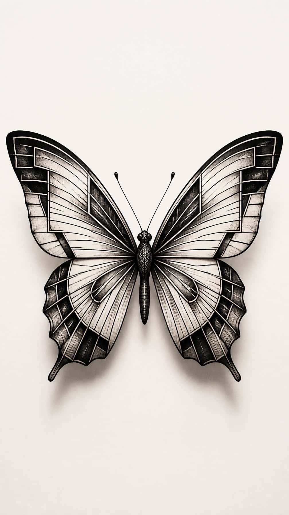
I would use crisp black lines to divide each wing into symmetrical panels, echoing Art Deco fan shapes, stepped edges, and precise arcs. The monochrome palette keeps the design structured, while varied line weights prevent the geometry from looking flat or overly mechanical.
I prefer placing this butterfly on the upper arm, sternum, or shoulder blade, where its balanced silhouette can remain clearly visible. Small areas of negative space between the sections add contrast and help the pattern age more cleanly than densely packed shading.
11) Butterfly emerging from a cracked porcelain pattern
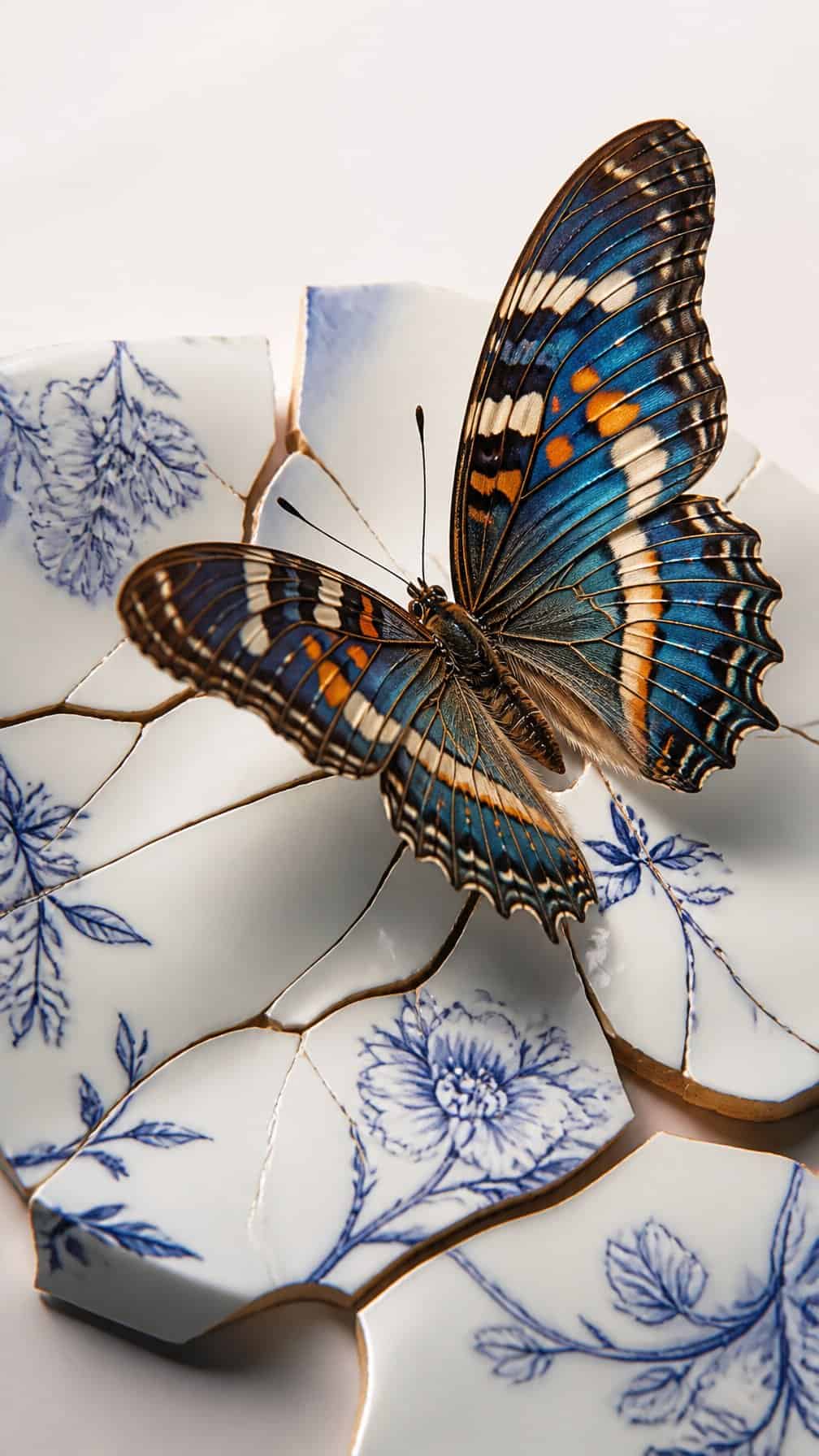
I would use fine lines to create a porcelain-like surface around the butterfly, with controlled cracks spreading through the design. The contrast between the rigid pattern and the insect’s delicate wings gives the tattoo a sense of transition without relying on common floral imagery.
I prefer a limited palette for this concept: black, soft gray, and one muted accent color on the wings. Placing the butterfly partly inside the fractured pattern makes the composition feel integrated, while leaving one wing unobstructed keeps its shape readable as the tattoo ages.
12) Two-tone butterfly using muted rust and slate blue
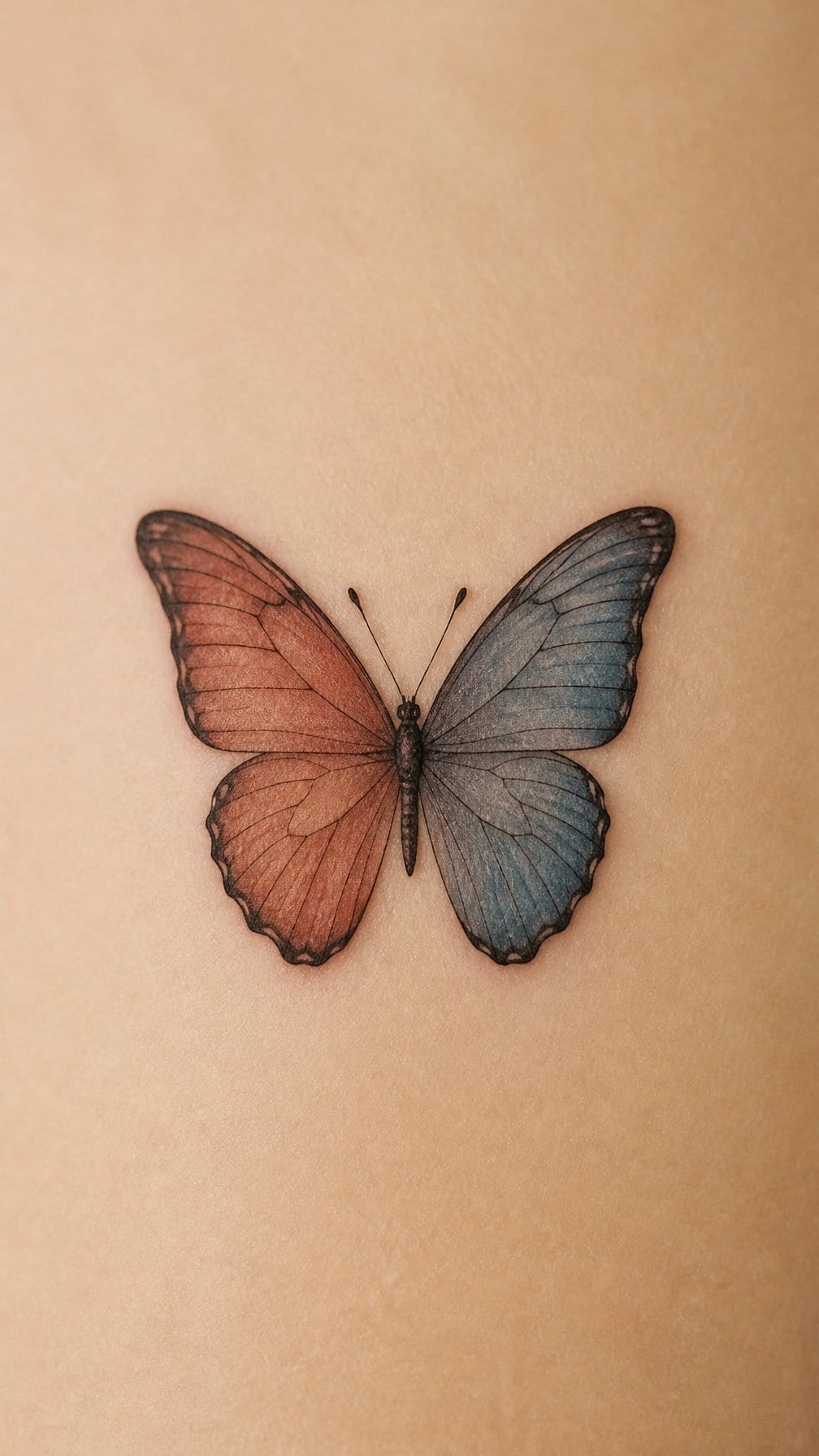
I like this palette for its restrained contrast. Muted rust gives the upper wings a warm, earthy presence, while slate blue adds a cooler tone along the lower wings or body. The combination feels considered without relying on bright, conventional butterfly colors.
I would keep the linework clean and let each shade occupy a defined section of the wings. Fine black outlines can separate the colors, while small areas of untouched skin preserve clarity as the tattoo ages. A slightly asymmetrical wing pattern can make the design feel more personal and less like a standard flash image.
13) Butterfly with wings shaped like ocean waves
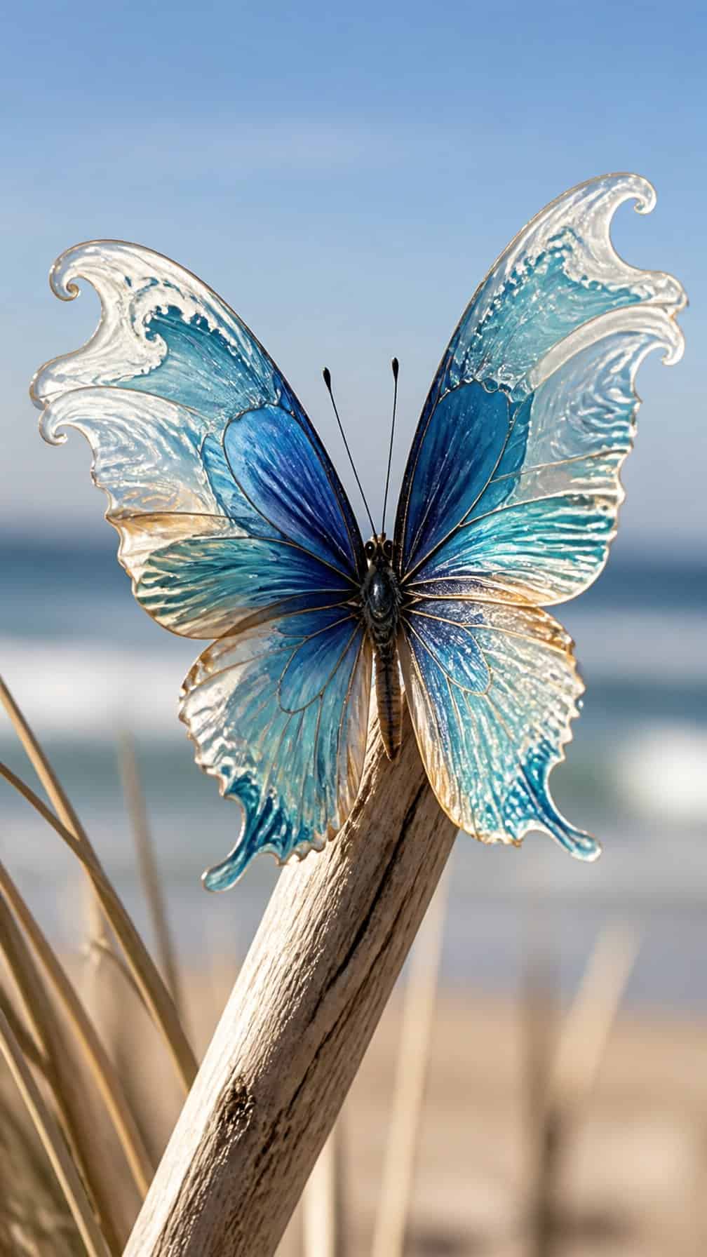
I would use flowing wing lines that rise and curl like gentle ocean waves, replacing the usual symmetrical patterns with a more fluid silhouette. Fine shading can suggest changing water depth, while a small crescent of negative space keeps the design open and readable.
I like this concept for its connection between movement and transformation. Blue ink can reinforce the aquatic theme, but blackwork, gray wash, or muted teal can create a subtler result. I would place it along the shoulder blade, forearm, or calf so the wing curves follow the body naturally.
14) Minimalist butterfly made from one continuous line
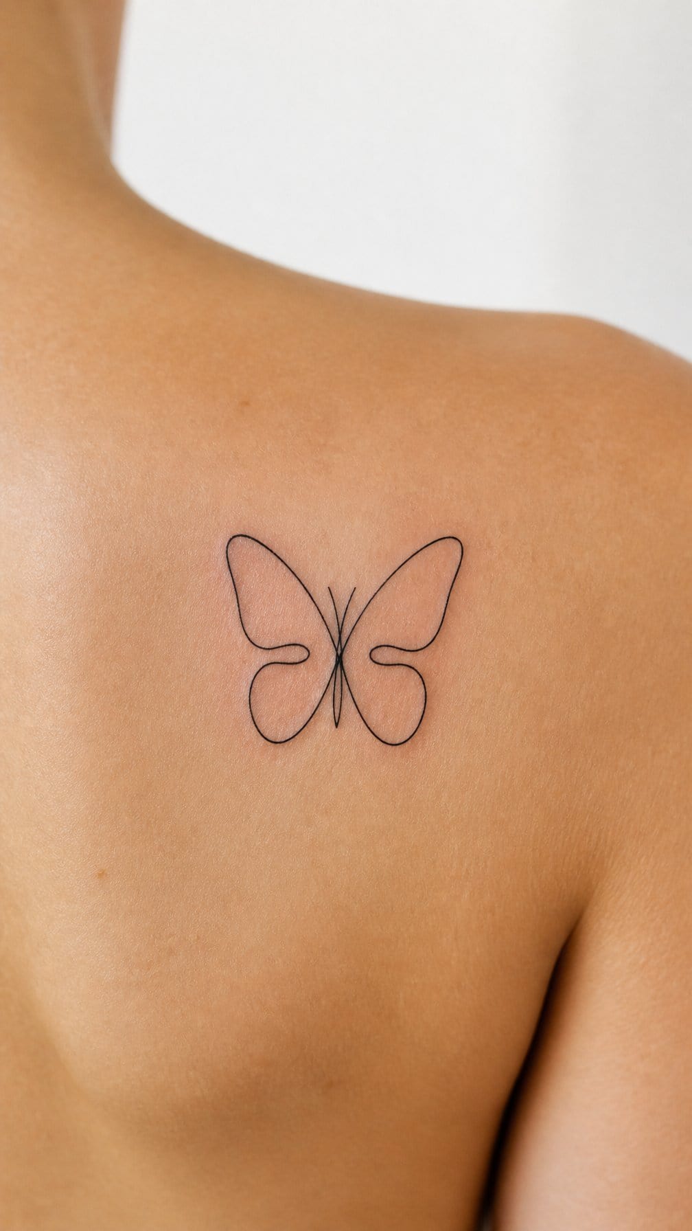
I like this design for its controlled simplicity: one unbroken line forms the wings, body, and antennae without shading or filled areas. The result looks precise while retaining the irregular character of hand-drawn ink.
I would place it on the wrist, inner forearm, ankle, or behind the ear, where its narrow shape can follow the body’s natural lines. A small size keeps the design delicate, but the line needs enough spacing to remain readable as it ages.
I would ask the artist to balance consistent line weight with slight curvature in the wings. That detail prevents the butterfly from looking mechanical while preserving its clean, minimalist structure.
15) Butterfly surrounded by abstract ink-brush strokes
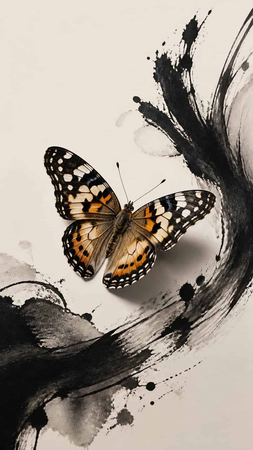
I like this design for its contrast between the butterfly’s recognizable form and the loose movement of ink-brush strokes. The surrounding marks can suggest motion without copying natural wings or flowers, giving the tattoo a more graphic, contemporary character.
I would keep the butterfly relatively precise and let the brushwork remain uneven. Varied stroke widths, broken edges, and small splatters create visual tension while preserving a clear focal point.
Black ink suits the concept, though a restrained accent color can define the body or one wing. I would place it where the strokes have room to spread, such as the shoulder, upper back, thigh, or rib area.
16) Vintage scientific-illustration butterfly with modern accents
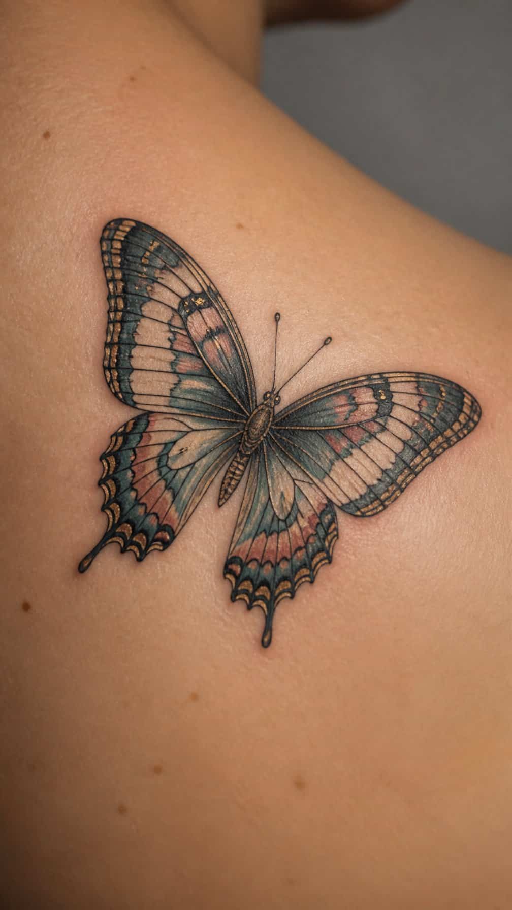
I like the precision of an antique natural-history plate: fine contour lines, labeled wing sections, and restrained shading can make the butterfly feel studied rather than decorative. I would keep the anatomy accurate while simplifying the surrounding details for a cleaner tattoo.
Modern accents can sharpen the design without losing its archival character. I might add one small geometric shape, a single saturated color on the wings, or a thin metallic-style line in the background. Black ink suits the engraved effect, while muted ochre, rust, or blue-gray create controlled contrast. Placement on the forearm, shoulder blade, or upper chest gives the illustration enough space for its delicate lines.
17) Butterfly mirrored against a fragmented reflection
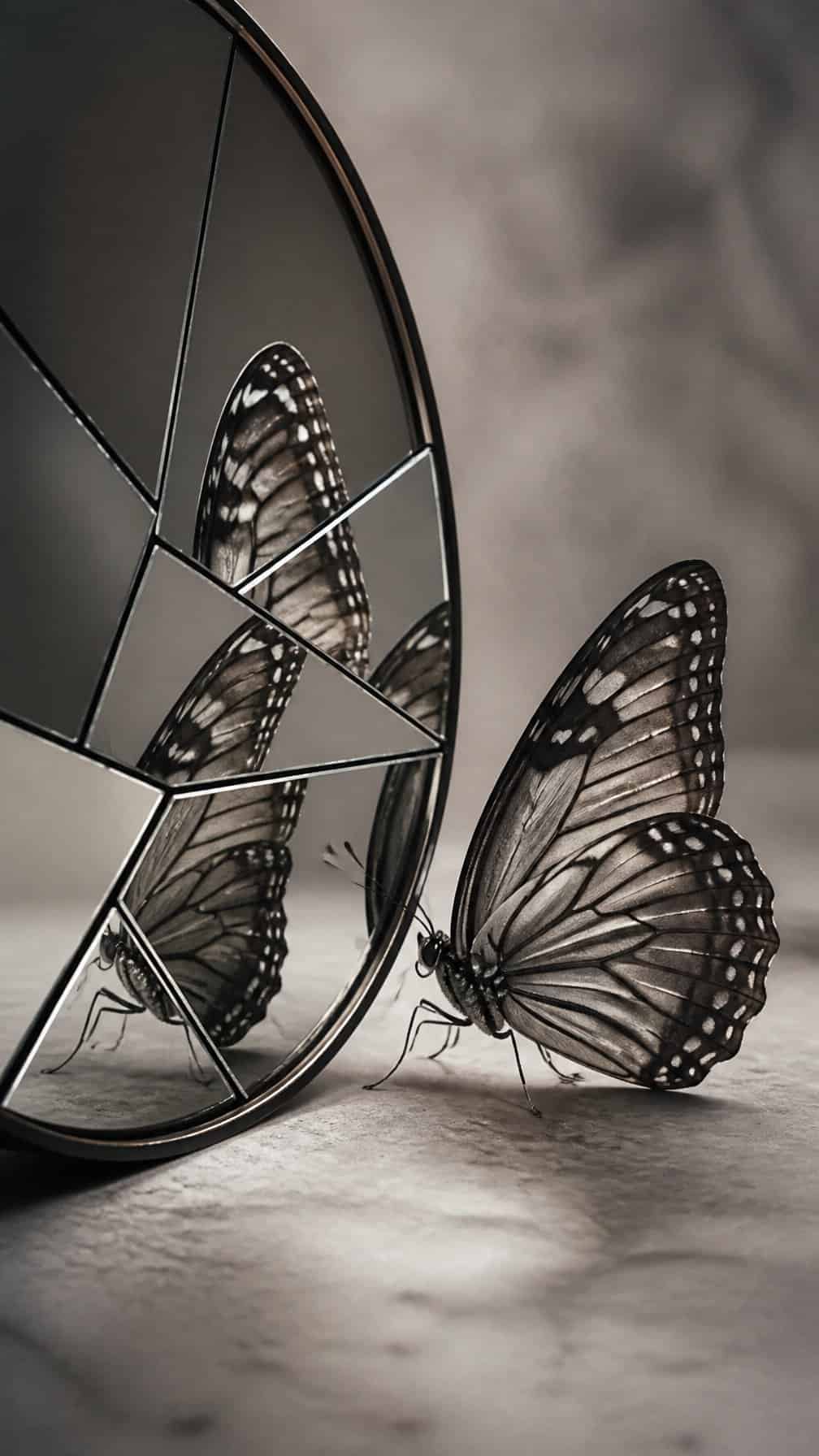
I would place the butterfly beside a broken mirror image rather than copying its shape perfectly. The reflected version could split into angular sections, with small gaps that suggest cracked glass while keeping the butterfly recognizable.
I like this design for its balance between softness and structure. I would use fine lines for the wings and sharper geometry for the reflection, creating a controlled contrast without making the tattoo feel crowded.
A limited palette would keep the composition clear. I might choose black and gray for the mirror fragments, then add one muted color to the original butterfly so the visual distinction remains immediate.
18) Celestial butterfly with subtle constellation markings
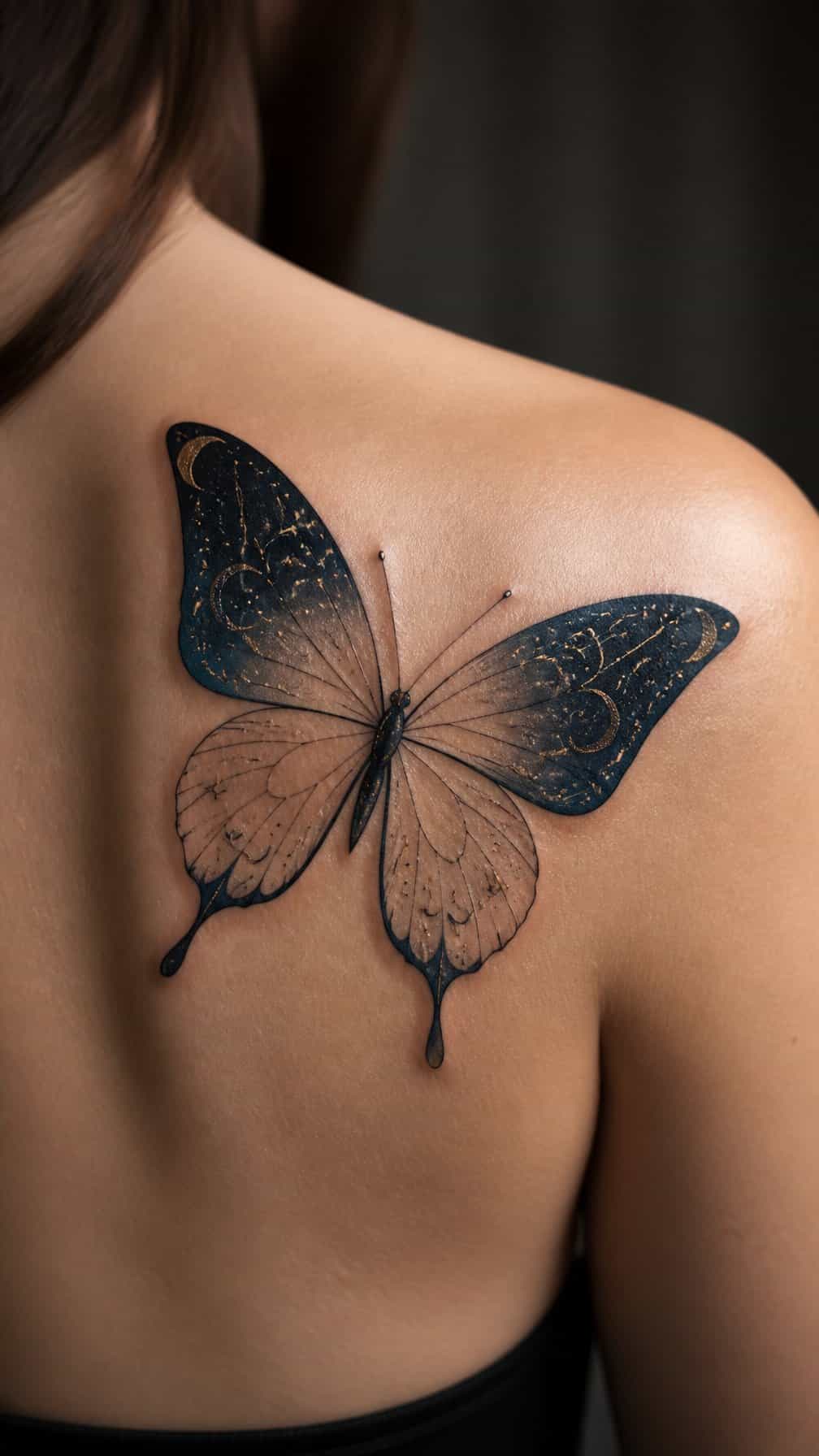
I like this design for its restrained balance between natural and celestial details. I would keep the butterfly’s wings finely outlined, then place small constellation points along the veins or near the outer edges. Thin connecting lines can suggest a star map without competing with the insect’s shape.
I would choose a limited palette, such as black ink with a few muted blue or violet accents. A small crescent, scattered dots, or a single recognizable constellation can add context while preserving a clean appearance. This approach works well on the shoulder, forearm, upper back, or ribs, where the wing pattern remains easy to follow.
19) Butterfly incorporating a meaningful handwritten word
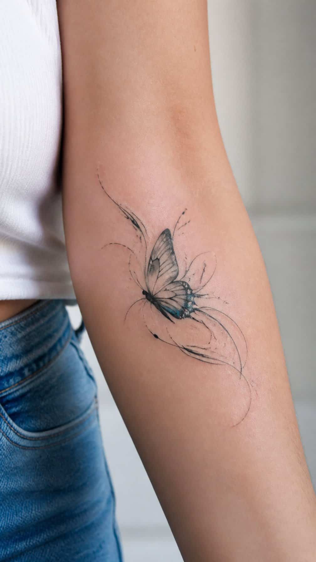
I would use a real handwritten word from a letter, journal, or card rather than a standard typeface. The butterfly can cross through the lettering, rest above it, or carry the word along one wing. This placement keeps the design personal without making the text dominate the image.
I prefer short words such as a name, “breathe,” “home,” or “always,” especially when the original handwriting holds emotional meaning. A fine-line tattoo preserves the natural irregularities of the script, while a slightly bolder outline keeps both the butterfly and word readable as they age.
I would place the design on the inner forearm, ribs, collarbone, or upper arm, depending on the desired visibility. Small details in the handwriting may need enlargement, so I would prioritize legibility over copying every tiny mark exactly.
20) Origami butterfly with crisp folded-plane shading
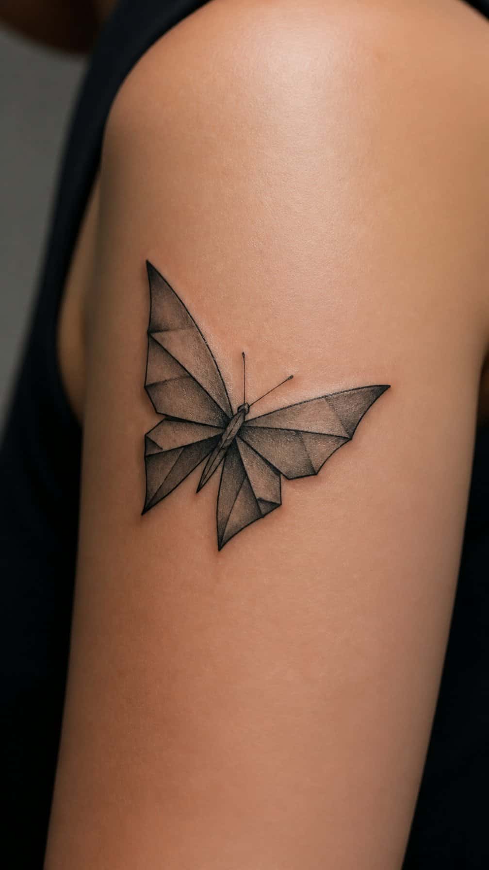
I would use angular outlines and clean interior planes to make the butterfly resemble folded paper rather than a natural specimen. Each facet can hold a different shade of the same color, creating structure without relying on heavy gradients or ornamental detail.
I prefer placing the darkest tone beneath overlapping wings and along the central body. Fine, deliberate linework keeps the design readable at a small scale, while a limited palette—such as black, muted blue, and soft gray—preserves its geometric character.
I would position it on the forearm, shoulder blade, or upper chest, where the wing shape has enough space to remain balanced. A slight tilt can suggest motion without adding extra flourishes.
21) Butterfly with stained-glass wing sections
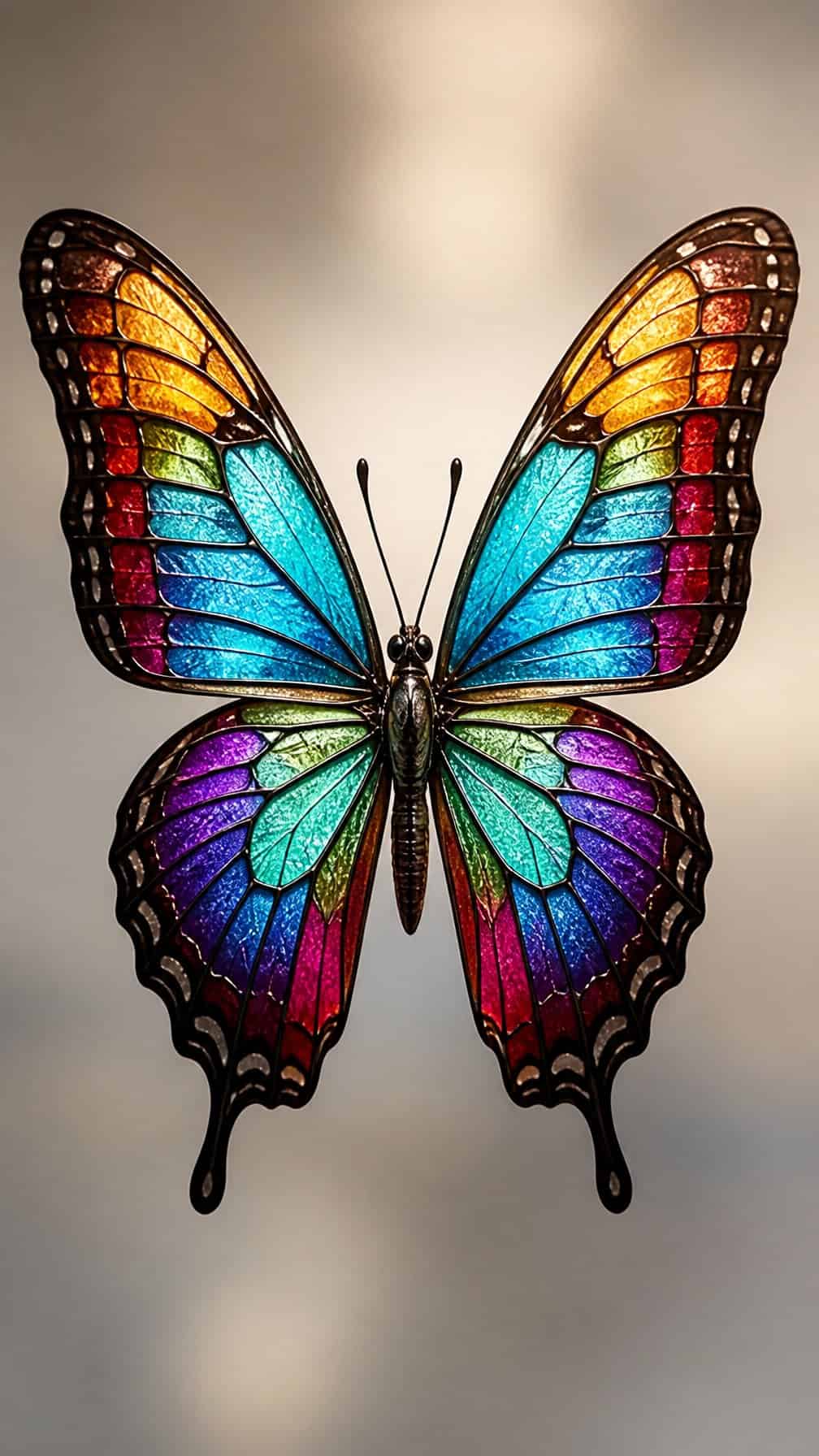
I like this design for its structured use of color. Thin black lines divide each wing into geometric panels, while muted blues, amber, green, or red create the appearance of stained glass without copying a traditional butterfly pattern.
I would place it on the shoulder, forearm, or upper back, where the wing shape can remain open and readable. A fine-line outline keeps the tattoo refined, while slightly heavier borders between sections help the colors stay distinct as the ink settles.
For a less familiar look, I would use asymmetrical panel shapes or leave a few sections unfilled. Soft shading around the edges can suggest reflected light without making the design overly ornate.
22) Butterfly transforming into drifting autumn leaves
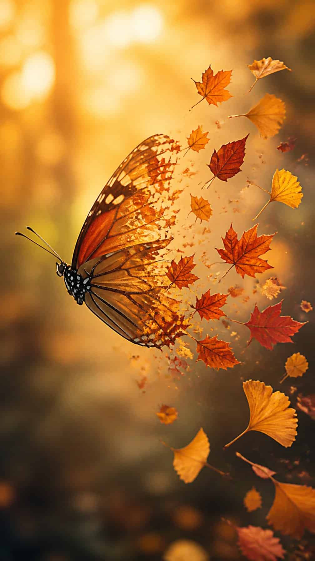
I like this design for its gradual transition from a defined butterfly into separate autumn leaves. The changing shapes can suggest movement without relying on a standard floral background, while russet, ochre, and muted brown tones create a seasonal palette.
I would place the butterfly near the shoulder, upper arm, or rib area so the leaves can trail naturally along the body. Fine outlines keep the image light, while selective color on the leaves adds contrast and prevents the tattoo from becoming visually dense.
I might use one wing with crisp detail and let the opposite side dissolve into leaves. That asymmetry gives the composition a personal, unfinished quality and makes the transformation feel integrated rather than decorative.
23) Tiny butterfly paired with an abstract soundwave
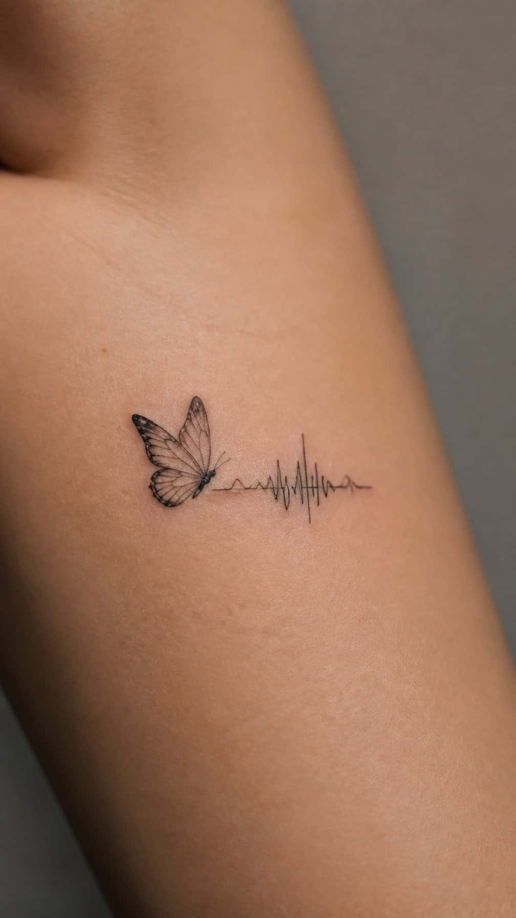
I like pairing a tiny butterfly with an abstract soundwave because the contrast feels personal without becoming literal. The butterfly adds a recognizable organic shape, while the uneven line introduces movement and visual rhythm.
I would keep both elements fine-lined and compact, placing the soundwave beneath the butterfly or letting it trail behind one wing. A short waveform can suggest a meaningful voice, song, or moment without displaying text or an obvious symbol.
I think black ink works best for this understated design, though one muted accent color could define the butterfly’s wings. The clean spacing matters: too much detail may blur as the tattoo ages, especially at a very small scale.
24) Butterfly featuring Indigenous-inspired geometric symmetry
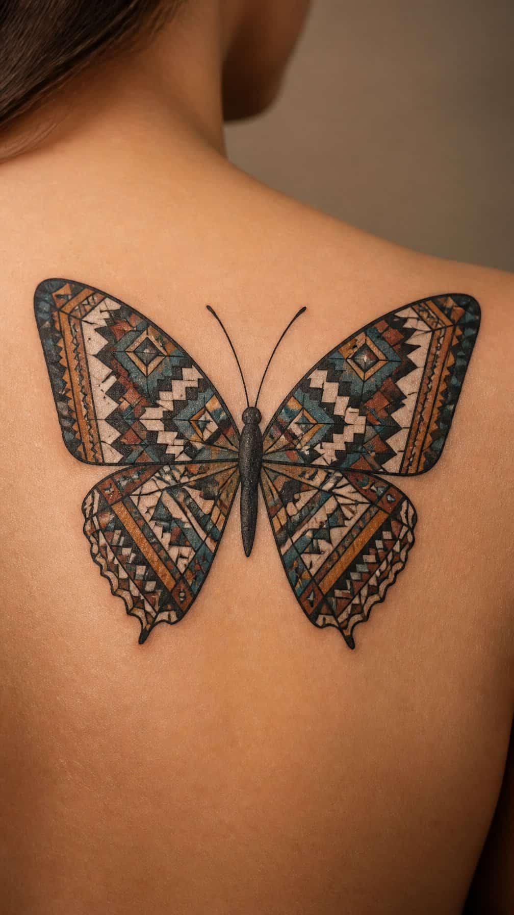
I would use balanced geometric forms to structure the butterfly’s wings, with repeated lines, diamonds, or stepped shapes creating visual rhythm. Rather than copying sacred motifs, I would work with a tattoo artist who understands the specific Indigenous tradition and can distinguish respectful inspiration from cultural appropriation.
I might keep the body and wing outline simple, then place the geometry inside each wing as a mirrored pattern. Black ink suits the design’s precision, while restrained color can highlight selected shapes without weakening the symmetry.
I would also consider the tattoo’s placement carefully. The upper back, sternum, or outer thigh provides enough space for clean alignment and allows the artist to preserve fine details as the tattoo ages.
25) Butterfly with translucent wings and skeletal details
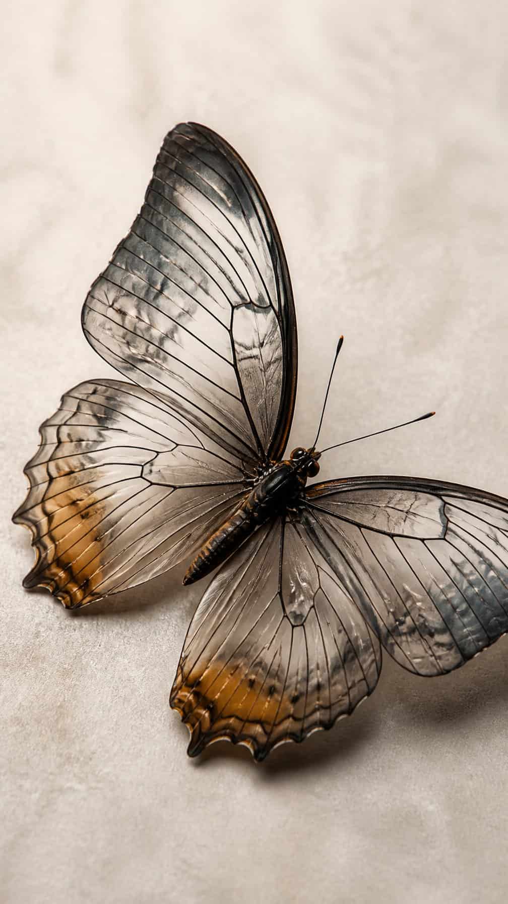
I would use fine linework to suggest transparent wings, leaving open skin between the veins and skeletal framework. This approach keeps the design light while giving it a more anatomical character than a standard butterfly silhouette.
I prefer placing the darker details near the body and along the primary wing veins, then fading them toward the edges. Soft gray shading can add depth without making the wings look heavy, while small breaks in the outline preserve the translucent effect.
I think this design works well on the forearm, shoulder blade, or upper chest, where the wing shape can follow the body’s natural contours. A limited black-and-gray palette keeps the structure clear and makes the open areas central to the composition.