A behind-the-ear tattoo lets you choose a small design with personal meaning while keeping it easy to conceal. This placement suits clean, thoughtful artwork, but size, line quality, and daily care can affect how the tattoo looks over time.

Save for later
Want to come back to this story? Save it with your email so it is easy to find again.
You can find a lasting design by considering simple shapes, balanced detail, suitable placement, and consistent aftercare. I’ll explore 25 small ideas that offer different styles, symbols, and levels of visibility, followed by practical guidance for keeping your tattoo looking clear and flattering.
Table of Contents
- 1 1) Tiny black crescent moon
- 2 2) Fine-line four-point star
- 3 3) Minimalist single fern leaf
- 4 4) Small Roman numeral date
- 5 5) Tiny outline heart
- 6 6) Delicate mountain silhouette
- 7 7) Small lavender sprig
- 8 8) Fine-line wave symbol
- 9 9) Tiny paper airplane
- 10 10) Minimalist sun outline
- 11 11) Small olive branch
- 12 12) Delicate butterfly outline
- 13 13) Tiny geometric diamond
- 14 14) Simple Saturn planet
- 15 15) Small paw-print outline
- 16 16) Fine-line compass star
- 17 17) Tiny lightning bolt
- 18 18) Minimalist crescent and star
- 19 19) Small eucalyptus sprig
- 20 20) Delicate infinity symbol
- 21 21) Tiny anchor outline
- 22 22) Simple birth-flower outline
- 23 23) Small constellation pattern
- 24 24) Fine-line feather
- 25 25) Tiny bee outline
- 26 Choosing A Placement That Stays Flattering
- 27 Understanding Skin Changes Around The Ear
- 28 Selecting A Size And Line Weight For Longevity
- 29 Aftercare And Long-Term Maintenance
- 30 Healing Considerations For Behind-The-Ear Ink
- 31 Sun Protection And Touch-Up Expectations
1) Tiny black crescent moon

I like a tiny black crescent moon for its clean shape and limited detail. Placed behind the ear, it can follow the ear’s natural curve without competing with glasses, earrings, or longer hair.
I would choose solid black ink and a simple crescent with smooth edges. Avoiding fine shading helps the design remain legible as the tattoo ages, while a slightly thicker outline can reduce the risk of delicate details fading into the skin.
I would ask the artist to assess the available space first, since behind-the-ear placement varies. Keeping the crescent small but not overly thin creates a balanced design that stays discreet and easy to maintain.
2) Fine-line four-point star

I like a fine-line four-point star for its simple geometry and balanced shape. Its narrow lines create a quiet detail behind the ear without adding visual weight, making it suitable for a small tattoo that remains easy to style around.
I would keep the design symmetrical and use consistent line spacing so the points stay distinct as the tattoo settles. A slightly open center can also preserve clarity better than dense shading in such a small area.
I would place it just behind the ear’s upper curve or closer to the hairline, depending on how visible I want it to be. Regular sunscreen helps protect the ink from unnecessary fading.
3) Minimalist single fern leaf

I like a single fern leaf for its clean outline and natural shape. Its narrow profile fits neatly behind the ear, while the simple fronds add enough detail to remain recognizable without making the design feel busy.
I would choose fine black linework and a size that follows the ear’s curve without extending too close to the hairline. Keeping the design small but not overly delicate can help preserve its definition as the tattoo ages.
I would also place the stem toward the earlobe or neck, depending on whether I want the leaf to point upward or downward. A professional artist can adjust the spacing between fronds to suit the skin and maintain clarity.
4) Small Roman numeral date

I like a short Roman numeral date behind the ear because it carries personal meaning without looking overly decorative. I would choose a milestone that will remain relevant, such as a birth date, anniversary, or graduation year, and keep the characters evenly spaced.
The narrow placement suits a compact design, but I would avoid making the numerals too tiny. Fine lines can soften with age, so I prefer a simple typeface, clear spacing, and black ink for lasting legibility. A tattoo artist can adjust the size to fit the ear’s shape while preserving each numeral.
5) Tiny outline heart

I like a tiny outline heart behind the ear because its simple shape stays readable without needing much ink. I would choose clean, balanced lines and place the design slightly below the ear’s curve, where it remains discreet but easy to reveal.
My preferred version uses a fine black outline without shading or interior detail. Minimal ink reduces visual clutter, while a modest size gives the lines enough space to remain distinct as the tattoo naturally ages.
I would ask the artist to account for the skin’s movement and use a design that fits the area rather than forcing a perfect, oversized shape. Regular sun protection can also help preserve the contrast over time.
6) Delicate mountain silhouette

I like a fine-line mountain silhouette behind the ear because its simple geometry stays readable without needing much space. A single ridge or two overlapping peaks can create a recognizable scene while keeping the design quiet and easy to place.
I would choose an experienced tattooer who can maintain consistent line weight at a small scale. Black ink usually provides the clearest result, while a tiny sun, moon, or dot pattern can add personal meaning without crowding the tattoo. Over time, I would protect the area from strong sun and follow careful aftercare to help preserve the fine details.
7) Small lavender sprig

I like a small lavender sprig behind the ear for its slender shape and restrained detail. A fine stem with a few narrow leaves fits naturally along the curve behind the ear without needing much space.
I would choose a simple outline or limited shading, since tiny details can soften as tattoo ink ages. Muted purple may lose definition sooner than black, so I prefer black linework with a small amount of color or gentle gray shading. Its vertical form also remains easy to cover with hair when needed.
8) Fine-line wave symbol

I like a fine-line wave behind the ear because its simple curve stays readable without needing much space. I would choose a smooth, single-line design with moderate spacing rather than several tight turns, which can blur as the ink settles and the skin changes over time.
I find black ink the most practical choice for this placement. A tattoo artist can adjust the wave’s length and height to follow the ear’s shape, while placing it slightly away from the hairline may reduce friction from regular trimming, headphones, or mask straps.
9) Tiny paper airplane

I like a tiny paper airplane behind the ear because its clean outline stays readable without taking up much space. I would choose a simple silhouette with two or three sharp lines rather than detailed folds, which can blur as the tattoo ages.
A black or dark gray design gives the shape steady contrast against the skin. I would place the nose toward the hairline or neck, depending on the angle I want when the ear sits naturally.
I would keep the tattoo small but not excessively fine-lined. The area behind the ear experiences some friction from hair, collars, and masks, so I would follow careful aftercare and expect a possible touch-up over time.
10) Minimalist sun outline

I like a small sun outline behind the ear because its simple shape stays readable without demanding much space. Thin rays create a clean focal point, while a compact circle keeps the design balanced against the ear’s natural curve.
I would choose evenly spaced rays and a line weight that suits my skin and tattoo artist’s technique. A slightly bolder outline may retain definition better over time than an extremely fine line, especially in an area exposed to hair, friction, and skincare products.
Black ink gives me the clearest, most consistent result, while muted warm tones can create a softer appearance. I would place the design just behind the ear rather than directly in the fold, where movement and rubbing may affect how it heals and ages.
11) Small olive branch

I like a small olive branch behind the ear because its slim shape follows the area’s natural curve. I would choose a simple outline with a few evenly spaced leaves, keeping the design legible without adding unnecessary detail.
The branch can sit horizontally along the hairline or angle slightly toward the neck. I prefer black or muted green ink for this placement, since strong contrast helps the leaves remain recognizable as the tattoo softens with age.
I would also consider the branch’s length carefully. A compact design with clear spacing usually stays easier to read than a tightly packed version, especially in this narrow area.
12) Delicate butterfly outline

I like a fine-line butterfly outline behind the ear because its open shape stays light and understated. I would choose simple wings with balanced curves and minimal interior detail, which helps the design remain readable as the ink settles over time.
I find black ink the most practical choice for this placement, especially in a small size. I would ask for slightly varied line weights rather than extremely thin lines, since delicate tattoo lines can soften with age. A centered design follows the ear’s natural shape, while a slight angle can make it feel more dynamic.
13) Tiny geometric diamond

I like this design for its clean lines and compact shape. A small diamond can sit neatly behind the ear without competing with glasses, earrings, or longer hair. I would choose a simple outline or two intersecting lines, since fine details may soften as the tattoo ages.
Placement affects how clearly the shape remains visible. I would ask the artist to leave enough space between the lines and use a size that suits the skin in that area. Black ink offers strong definition, while a softer gray can create a subtler effect.
14) Simple Saturn planet

I like a simple Saturn tattoo behind the ear because its ringed shape remains recognizable at a very small scale. I would use a fine black outline with one narrow ring and minimal interior detail, keeping the design clear as the ink softens with age.
The placement suits a compact planet, especially when the tattoo sits slightly below the ear rather than directly in the crease. I would choose a restrained size and avoid dense shading, since limited detail makes touch-ups easier and helps the design retain its clean structure.
15) Small paw-print outline
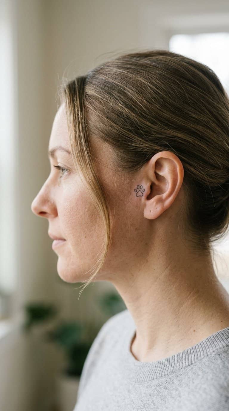
I like a small paw-print outline behind the ear because it carries personal meaning without requiring much space. I can connect it to a current or past pet, a love of animals, or a simple reminder of companionship.
I would choose clean, rounded lines and limit the interior detail. A compact design with evenly shaped pads tends to remain legible as the tattoo ages, while heavy shading can blur in this small area.
I would also place it slightly below or behind the ear rather than directly in the crease. That position gives the outline enough separation from the ear’s natural folds and makes future touch-ups easier if the ink softens.
16) Fine-line compass star

I like a fine-line compass star behind the ear because its slim geometry stays readable without taking up much space. I would choose four primary points with a few shorter accents, keeping the design balanced and easy to scale.
The area behind the ear has limited room, so I would avoid excessive shading and tightly packed details. A black or dark gray line can provide clear contrast, while careful spacing helps the shape remain distinct as the tattoo ages.
I would place the center slightly below the ear’s curve, where the design can follow the natural contour. My preferred version uses consistent line weight and minimal decoration, giving the tattoo a clean, understated appearance.
17) Tiny lightning bolt

I like a tiny lightning bolt behind the ear because its compact shape fits the narrow space without requiring fine detail. I would choose a simple outline or solid black design, depending on how much visual weight I want.
I would place the bolt slightly below the ear for a discreet look, or closer to the hairline if I want it hidden more often. Keeping the angles clean and the design modest helps it remain readable as the tattoo softens with age.
18) Minimalist crescent and star

I like the clean balance of a slim crescent paired with one small star. Behind the ear, this design stays subtle while its simple shapes remain easy to recognize. I would choose fine, consistent lines and leave enough space between the elements to prevent them from blending as the tattoo ages.
I find black ink the most practical choice for this placement because it keeps the design legible without adding visual weight. I would also avoid excessive detail, tiny shading, or tightly packed dots, which can soften over time. A slightly larger design may preserve its shape better than an ultra-small version.
19) Small eucalyptus sprig

I like a small eucalyptus sprig behind the ear because its narrow leaves create a clean shape without requiring much space. I would use a simple stem with two or three rounded leaves, keeping the linework light and evenly spaced.
A black or muted green design can suit this placement, depending on how subtle I want the tattoo to look. I would avoid tiny interior details, since they may soften as the ink ages. Slightly larger leaves and clear gaps help the sprig remain legible over time.
20) Delicate infinity symbol

I like a fine-line infinity symbol behind the ear because its continuous shape feels balanced without taking up much space. I would choose a simple black outline with smooth curves and minimal detail, which helps the design remain legible as the tattoo ages.
I would place it slightly behind the earlobe or along the lower hairline, depending on how visible I want it to be. A skilled tattoo artist can adjust the line weight and scale to suit my anatomy while avoiding overly tight curves that may blur over time.
21) Tiny anchor outline

I like a tiny anchor outline for its simple shape and balanced proportions. Behind the ear, I would keep the design around 0.5–1 inch tall, with a clean shaft, short crossbar, and gently curved base.
I would choose fine black lines without shading or small interior details. This approach leaves enough space between the lines to reduce visual crowding as the tattoo ages, while the compact placement keeps it easy to cover with hair when needed.
I would position the anchor vertically along the natural space behind the ear. My artist can adjust the width and line weight to suit my skin, ear shape, and preference for a softer or more defined look.
22) Simple birth-flower outline

I like a simple birth-flower outline for its personal meaning and restrained shape. I can choose the flower linked to my birth month, then reduce it to a few clean lines that fit naturally behind the ear.
The design works well at a small scale because its defining features—petals, stem, and leaf shape—remain easy to recognize without added shading. I would ask for consistent line weight and enough spacing between details to help the tattoo stay legible as the ink softens over time.
I can place the bloom vertically along the curve behind my ear or angle it slightly toward the neck. A black outline keeps the look adaptable, while a small color accent adds personality without making the design visually busy.
23) Small constellation pattern

I like a small constellation behind the ear because its simple dots and fine connecting lines create a balanced design without taking up much space. I can choose a familiar star pattern or arrange the points in a custom layout that reflects a personal interest.
I would keep the linework thin but not excessively delicate, since slightly clearer spacing can remain readable as the tattoo ages. Black ink offers the most consistent contrast, while three to five stars usually provide enough detail without crowding the narrow area.
24) Fine-line feather

I like a fine-line feather behind the ear for its narrow shape and quiet detail. I would choose a simple outline with a few interior strokes, keeping the design small enough to follow the ear’s natural curve without crowding it.
I find that black ink and moderate spacing help the feather remain legible as the lines soften with time. I would avoid excessive shading or tightly packed barbs, which can blur together and make the tattoo harder to read.
The placement also makes sizing important. I would ask my tattoo artist to preserve clear negative space and use a needle configuration suited to delicate work.
25) Tiny bee outline

I like a tiny bee outline for its simple shape and recognizable details. Thin wings, a rounded body, and two short antennae create a compact design that fits naturally behind the ear without needing heavy shading.
I would choose clean, moderate line weight rather than an ultra-fine style. Lines that remain visible give the tattoo a better chance of retaining its form as the ink settles and the skin changes over time.
I prefer placing the bee slightly below the ear’s curve, where the design has enough space to breathe. A black outline keeps the look versatile, while a small yellow accent can add color if I want a less minimal finish.
Choosing A Placement That Stays Flattering

I prioritize locations that keep the design visible without placing it directly in a crease or high-friction area. Skin movement, sun exposure, jewelry, headphones, and line weight all affect how an ear tattoo looks over time.
Understanding Skin Changes Around The Ear
I look for flatter areas behind the ear, such as the upper mastoid region, because they usually provide more consistent surface support than the fold directly behind the ear. The crease can collect moisture and experience repeated movement, which may affect healing and make fine details harder to maintain.
I also consider sun exposure and daily friction. Hair, mask straps, glasses, helmet straps, and headphone bands can repeatedly rub the area. I avoid placing delicate details exactly where these items sit. During healing, I keep the tattoo clean, limit friction, and protect it from direct sunlight after the skin fully closes.
A design placed slightly below the hairline may remain discreet, while one closer to the outer edge may show more clearly with short hair or an updo. I choose the position based on both visibility and the wearer’s usual hairstyle.
Selecting A Size And Line Weight For Longevity
I avoid compressing complex artwork into a space smaller than its details can support. Tiny lettering, narrow gaps, and multiple outlines may soften as the ink settles, so I favor simple shapes with enough open skin between elements.
For small behind-the-ear tattoos, I typically recommend clear silhouettes, restrained detail, and consistent line weight. A slightly thicker line often remains more legible than an ultra-fine line, especially when the design sits near hair, folds, or accessories.
I also check the tattoo from several angles before final placement. A symbol that looks balanced from the side may appear crowded when viewed from behind or below. I leave enough margin around the design to prevent it from visually merging with the ear’s natural contours.
Aftercare And Long-Term Maintenance

I protect the tattoo during healing by reducing friction, moisture, and sun exposure. Once the skin settles, I use daily sunscreen and monitor fading so I can arrange a professional touch-up when needed.
Healing Considerations For Behind-The-Ear Ink
I follow my tattoo artist’s cleaning instructions, usually washing the area gently with lukewarm water and fragrance-free soap. I pat it dry with a clean towel instead of rubbing, then apply only the recommended thin layer of aftercare product.
Because hair, glasses, headphones, and mask straps can brush the area, I keep contact to a minimum during the first several days. I avoid swimming, soaking, tight headwear, and products such as perfume, hair spray, and styling gel until the surface heals.
Mild redness, tenderness, flaking, and itching can occur. I do not scratch or peel the skin. I contact a healthcare professional if I notice spreading redness, worsening pain, significant swelling, pus, or fever.
Sun Protection And Touch-Up Expectations
I protect healed ink with a broad-spectrum, water-resistant SPF 30 or higher whenever the tattoo may receive direct sunlight. I apply it after the skin fully heals and reapply during extended outdoor exposure, especially around the ears where hair may provide uneven coverage.
Small tattoos can lose fine detail as pigment fades or the skin changes. I check the design after several months rather than judging it during active healing. If lines look lighter, uneven, or less defined, I ask the original artist whether a touch-up would improve clarity.
I also limit unnecessary friction from headphones and jewelry. Regular sunscreen, gentle cleansing, and periodic professional assessment help preserve the tattoo without altering its original proportions.