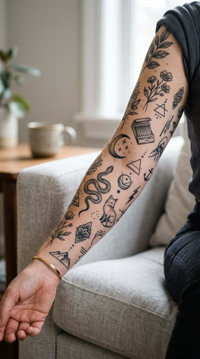
A patchwork tattoo gives you room to build a personal collection over time. You can combine small botanical, celestial, traditional, and everyday motifs without committing to one large design or filling an entire area at once.
Save for later
Want to come back to this story? Save it with your email so it is easy to find again.
You can create a cohesive look by balancing size, spacing, line weight, and placement as your collection grows. I’ll explore 22 ideas that suit different styles, along with practical guidance for planning a connected sleeve and managing timing, care, and future additions.
Table of Contents
- 1 1) Tiny botanical sprigs
- 2 2) Miniature celestial symbols
- 3 3) Delicate blackwork stars
- 4 4) Small vintage matchbox
- 5 5) Tiny lucky horseshoe
- 6 6) Miniature swallow in flight
- 7 7) Fine-line crescent moon
- 8 8) Small wildflower cluster
- 9 9) Tiny traditional dagger
- 10 10) Miniature red heart
- 11 11) Delicate snake winding
- 12 12) Small ornamental eye
- 13 13) Tiny mushroom trio
- 14 14) Miniature honeybee
- 15 15) Fine-line coffee cup
- 16 16) Small classic skull
- 17 17) Tiny shooting star
- 18 18) Miniature anatomical heart
- 19 19) Delicate fern frond
- 20 20) Small koi fish
- 21 21) Tiny ornamental key
- 22 22) Miniature sunburst
- 23 Planning A Cohesive Patchwork Sleeve
- 24 Choosing A Unifying Theme
- 25 Balancing Sizes, Shapes, And Placement
- 26 Care, Timing, And Long-Term Expansion
- 27 Healing Gaps Between Sessions
- 28 Working With Multiple Artists
1) Tiny botanical sprigs
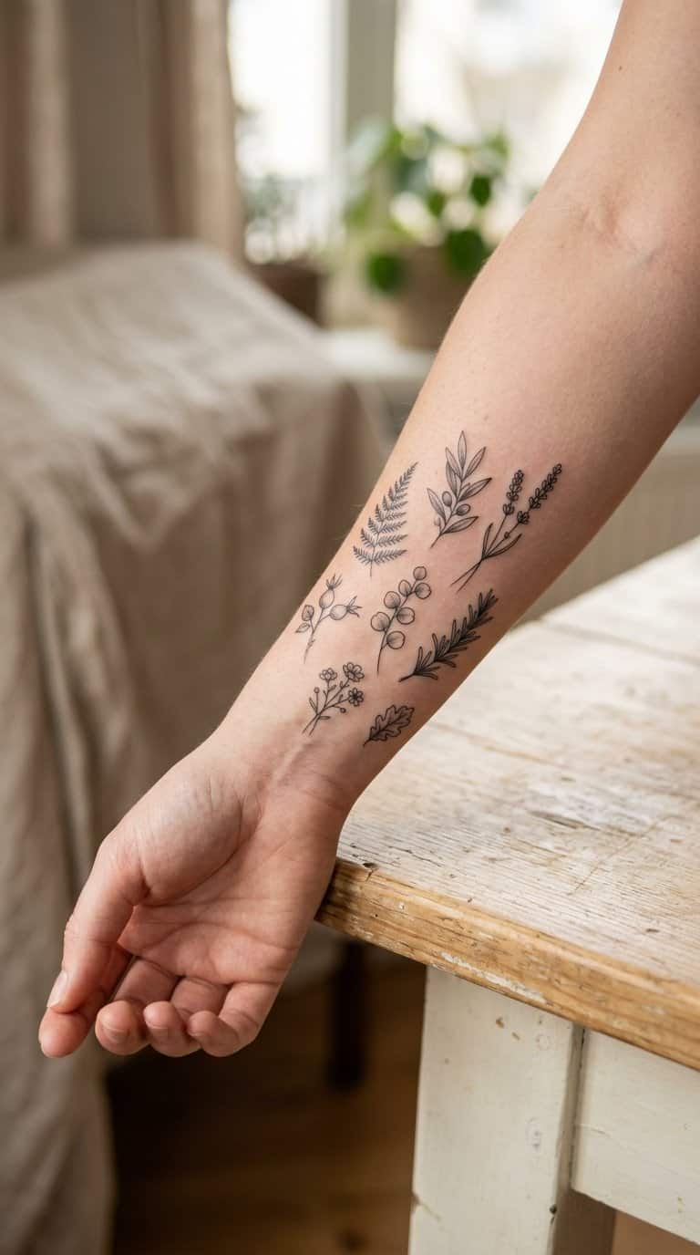
I like tiny botanical sprigs because their narrow shapes fit naturally into open spaces between larger tattoos. I can use leaves, stems, buds, or small flowers to add detail without making the patchwork arrangement feel crowded.
I often place each sprig at a different angle to create gentle movement across the skin. Fine lines suit delicate plants, while slightly heavier outlines help the design remain visible as the collection grows.
I can also vary the plant types to mark personal interests or meaningful places. Keeping a consistent scale or limited color palette helps separate additions look connected.
2) Miniature celestial symbols
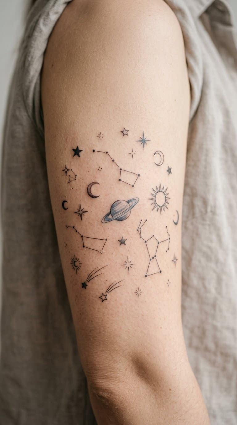
I like miniature moons, stars, planets, and constellations because they give a patchwork sleeve a quiet visual rhythm. I can place each symbol in a separate open area, using fine lines and small differences in scale to keep the arrangement from looking uniform.
A crescent moon can anchor the group, while tiny stars or a simple Saturn shape fill nearby gaps. I usually keep the designs black and gray when the surrounding tattoos already use varied colors, or add one muted tone to create a controlled accent.
These symbols also work well across the wrist, forearm, shoulder, or ankle. I can add them gradually, allowing each new tattoo to respond to the spacing, line weight, and subject matter of the existing pieces.
3) Delicate blackwork stars
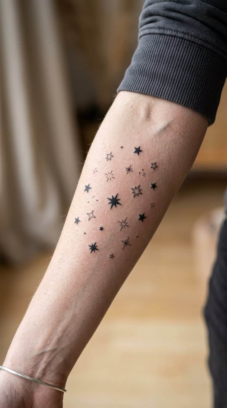
I like delicate blackwork stars for their clean shape and flexible placement. Small five-point stars, four-point sparkles, and tiny outlined constellations can sit between larger tattoos without competing for attention.
I would keep the line weight consistent and leave enough space around each design to preserve its definition. A scattered arrangement can follow the wrist, collarbone, or forearm, while varied sizes create a natural patchwork rhythm.
I also find these stars useful as visual links between unrelated pieces. Adding them gradually lets me respond to the spacing and shapes already on the skin, rather than planning every detail at once.
4) Small vintage matchbox
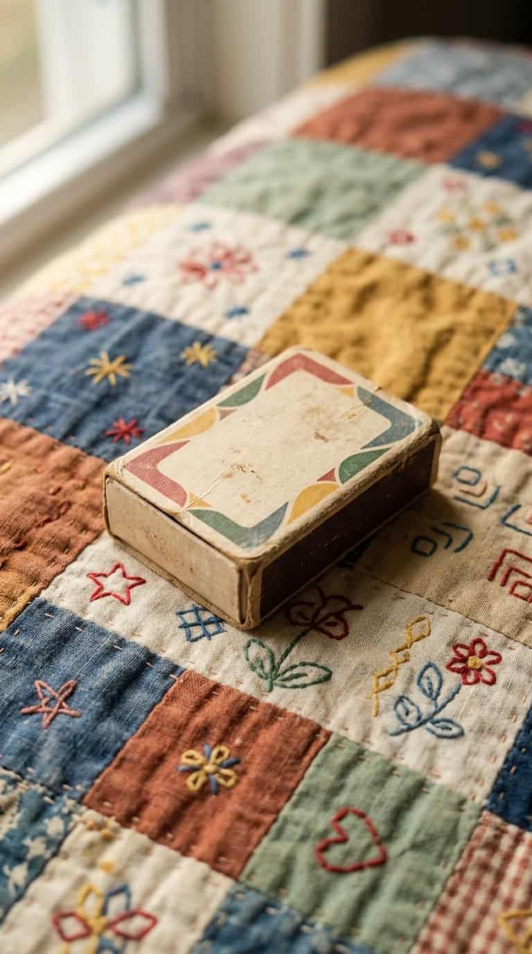
I like a small vintage matchbox tattoo for its compact shape and old-fashioned detail. I can add a tiny label, curved lettering, a border, or a few illustrated matches without making the design feel crowded. Its rectangular outline also fits neatly beside other small tattoos.
I would place it on the forearm, upper arm, ankle, or calf, depending on how visible I want it to be. As I build a patchwork collection, I can surround it with related objects such as a candle, playing card, key, or flower while keeping each piece visually distinct.
5) Tiny lucky horseshoe
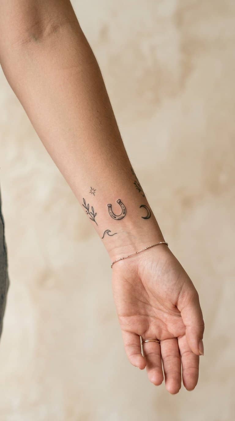
I like a tiny horseshoe for its compact shape and clear symbolism. I usually place it near other small icons, such as stars, flowers, or a four-leaf clover, so the design can grow without losing its simple outline.
A traditional horseshoe works well in black ink, while a fine outline gives it a lighter, more delicate look. I would position the opening upward for a classic arrangement, or turn it downward if I prefer a less familiar orientation.
Its small scale makes spacing especially important. I leave a little room around the tattoo so future additions can sit beside it rather than crowding the curved edges.
6) Miniature swallow in flight

I like a miniature swallow for its clean silhouette and sense of movement. I can place it near the wrist, collarbone, ankle, or another small tattoo, where its outstretched wings add direction without crowding the design.
Its shape works well in black ink, with a few fine lines defining the wings and tail. I might pair it with tiny stars, initials, or botanical marks as the patchwork grows, while keeping enough space around each element for the details to remain clear.
7) Fine-line crescent moon
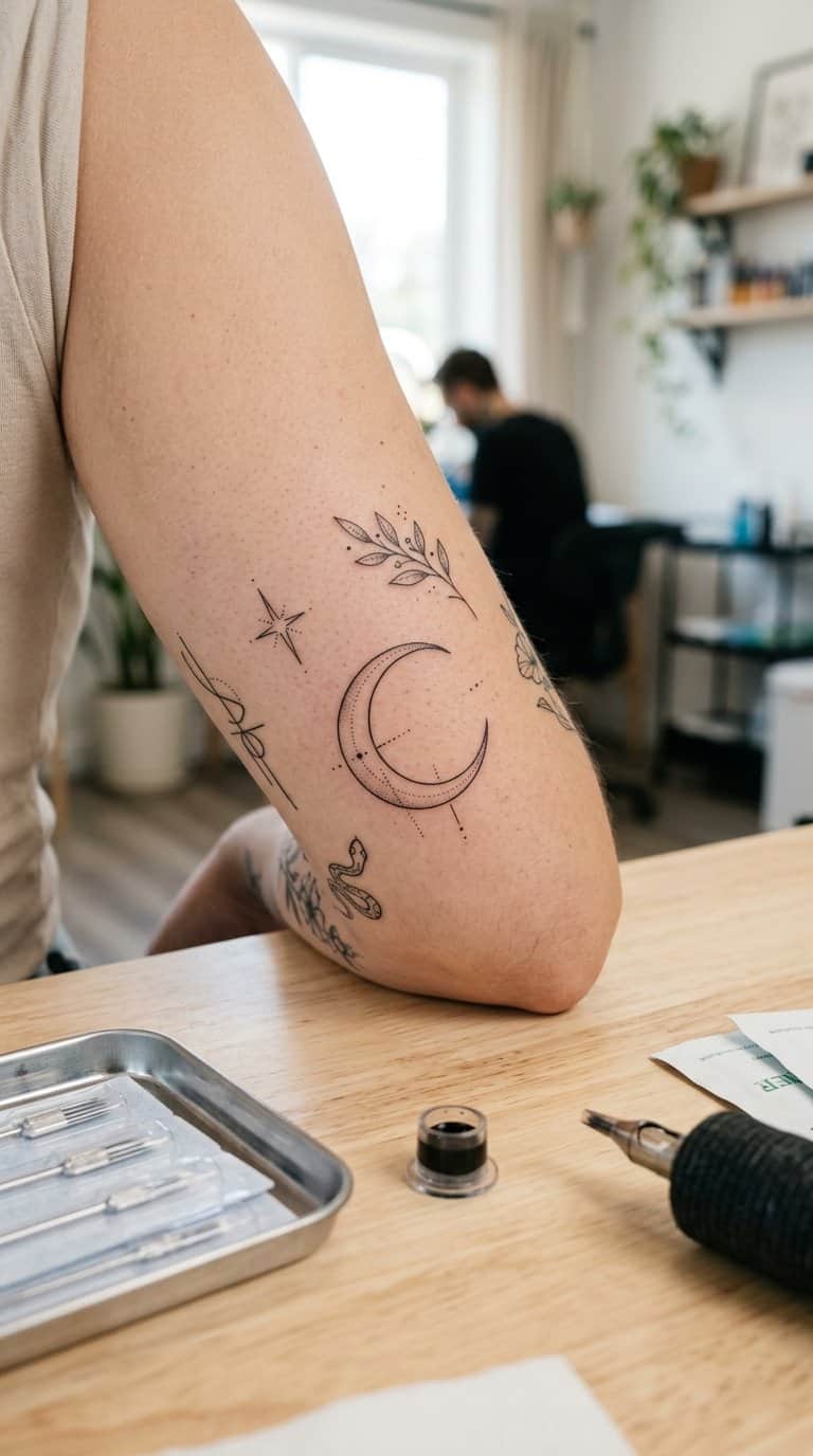
I like a fine-line crescent moon because its narrow shape fits naturally into small gaps between existing tattoos. I can place it near a flower, star, or tiny planet without making the surrounding designs feel crowded.
Its simple outline also gives me room to build a personal patchwork theme. I might add dots, short rays, or a small constellation later, while keeping the original moon visually light.
I would choose a placement with enough skin space for the curve to remain clear, such as the wrist, forearm, ankle, or upper arm. Thin lines can soften over time, so I would select an experienced tattoo artist and follow careful aftercare.
8) Small wildflower cluster
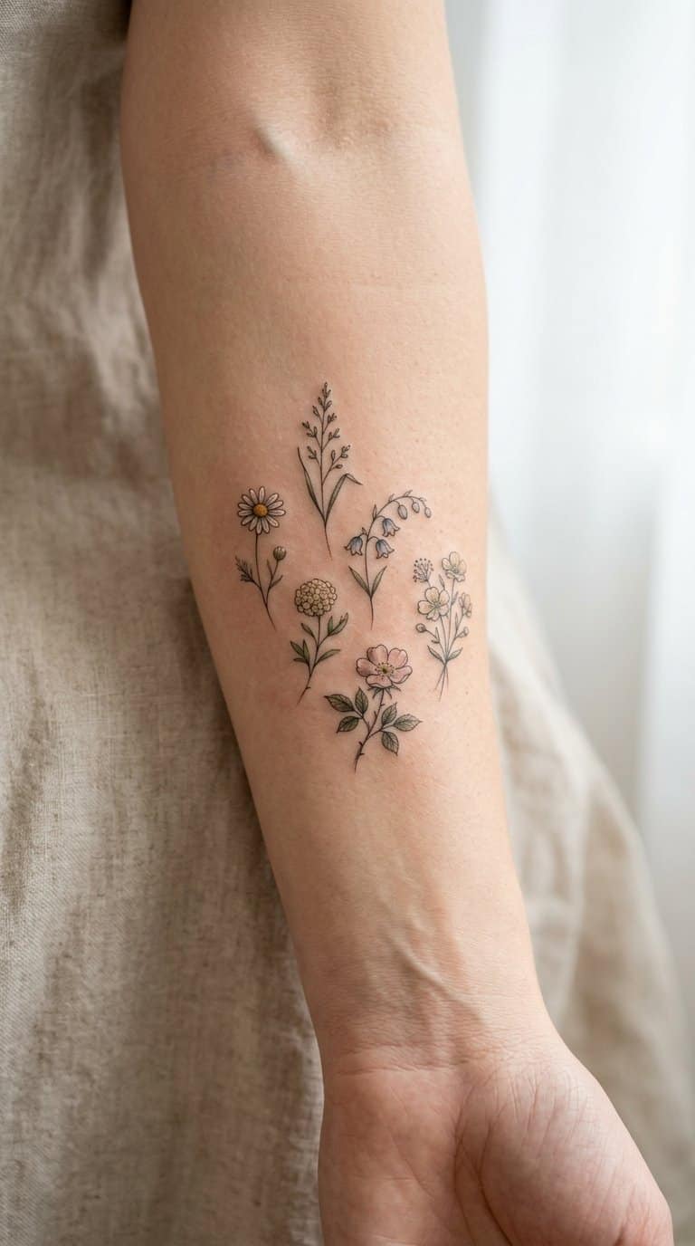
I like small wildflower clusters because they fit naturally into open spaces between larger tattoos. I can use fine lines, simple petals, and varied stem lengths to create a loose arrangement without making the patchwork look crowded.
I usually place one or two blossoms near existing pieces, then add another flower when the layout needs balance. Black ink keeps the cluster cohesive, while muted color can distinguish each bloom without overpowering nearby designs.
I can also vary the scale slightly so the group feels assembled rather than repeated. A few leaves, dots, or short stems help connect the flowers while preserving the separate-sticker quality that defines patchwork tattooing.
9) Tiny traditional dagger
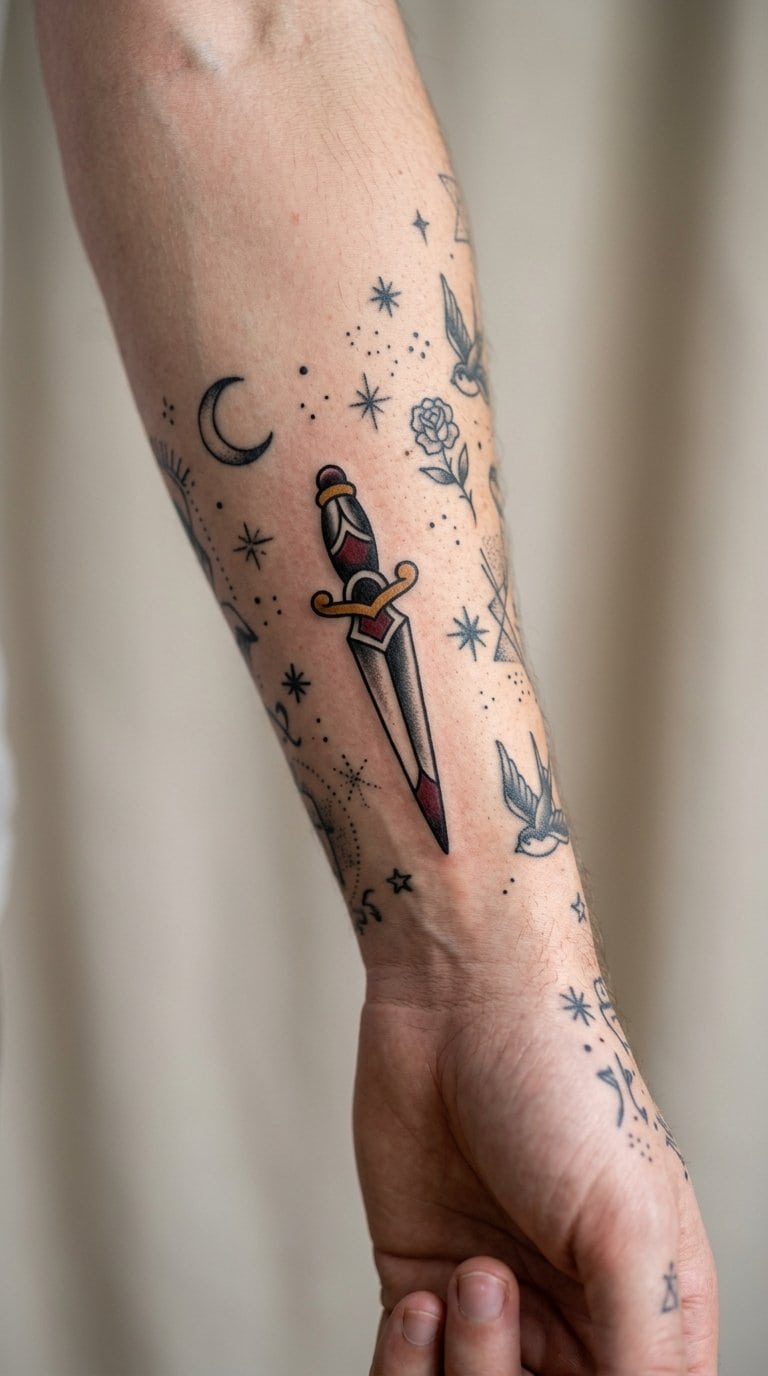
I like a tiny traditional dagger because its narrow shape fits naturally between existing patchwork tattoos. Bold black outlines, a compact blade, and a small handle keep the design readable even at a modest size.
I would place it near floral pieces, stars, or other traditional symbols to create contrast without disrupting the collection. A slight tilt can follow the body’s natural lines, while a simple red or blue accent adds color without making the tattoo feel crowded.
10) Miniature red heart
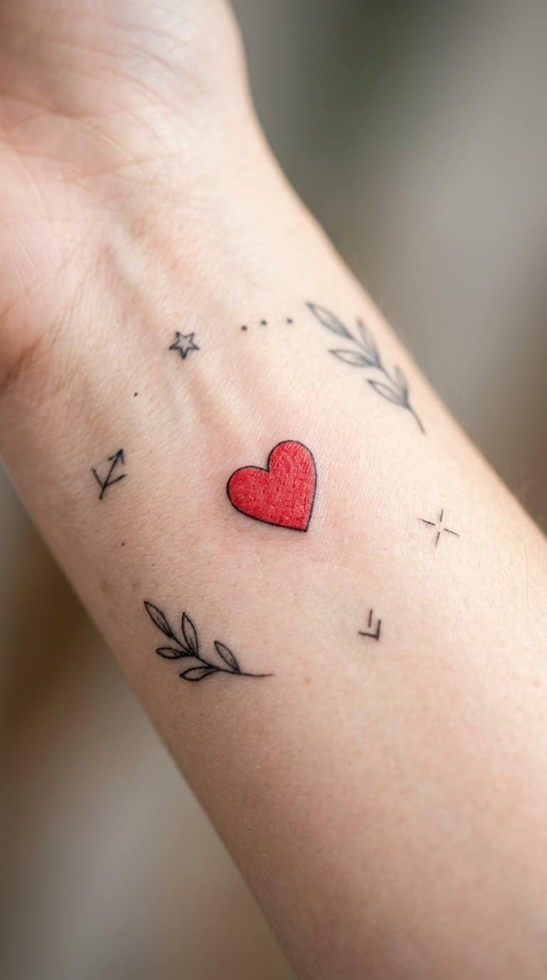
I like a miniature red heart as a simple anchor in a growing patchwork collection. Its solid color and compact shape create a clear focal point without overpowering nearby designs.
I can place it near black linework, small symbols, or muted botanical pieces to introduce controlled contrast. A traditional red fill keeps the image recognizable, while a slightly softer shade gives it a quieter, vintage feel.
I would choose the placement based on the surrounding spacing. On the wrist, ankle, or upper arm, this small design can mark a personal detail while leaving room for future additions.
11) Delicate snake winding
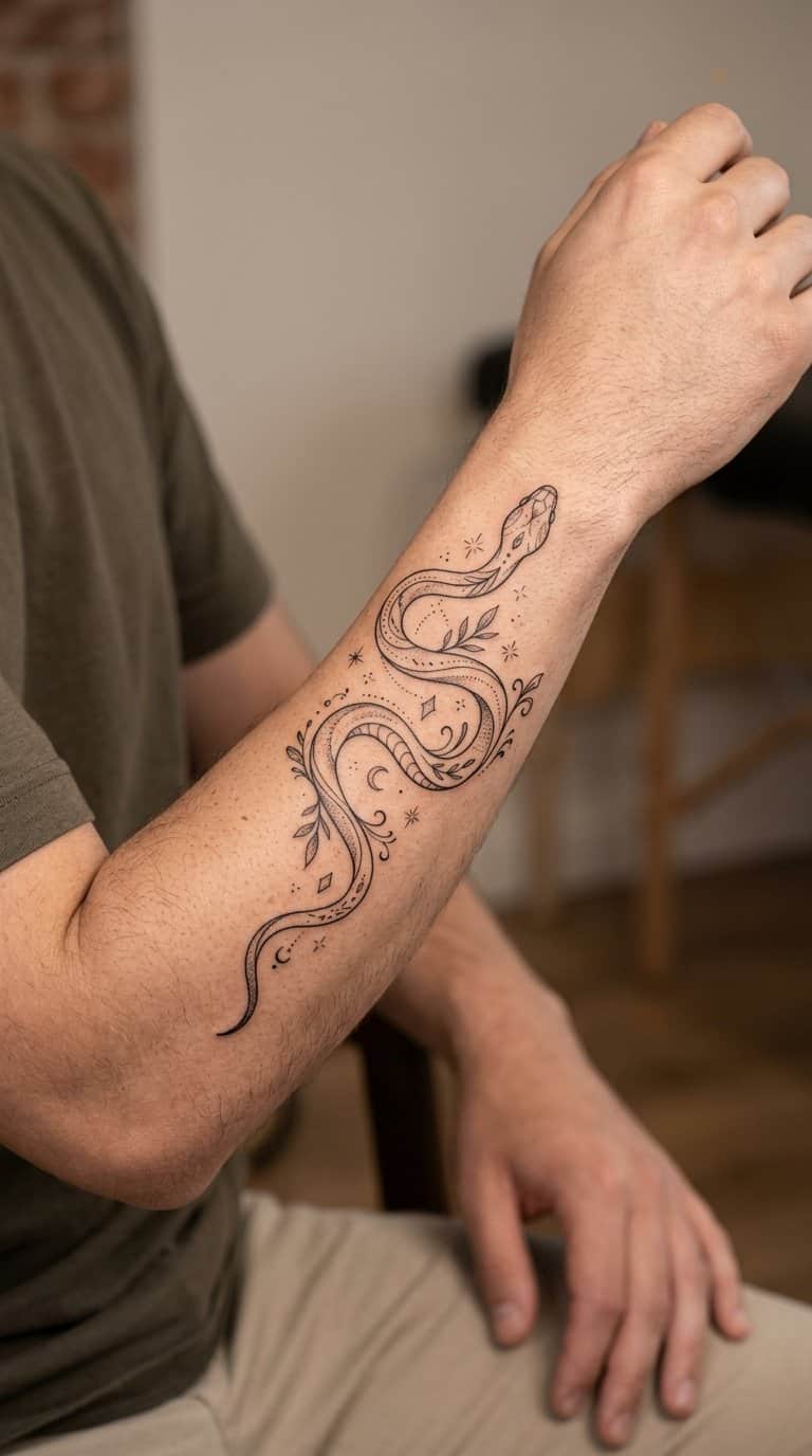
I like a fine-line snake that curves naturally around nearby tattoos, such as small flowers, stars, or geometric shapes. Its narrow body creates movement without overpowering the surrounding pieces, while subtle scales or a tiny forked tongue add definition.
I would place the head near the wrist, ankle, or elbow and let the body follow the available space. As I add more tattoos, I can extend the composition with leaves, moons, or small ornamental details that complement the snake’s winding shape.
Black ink keeps this design crisp and easy to build around. I prefer consistent line weight, restrained shading, and enough open skin to preserve the delicate appearance as the patchwork collection grows.
12) Small ornamental eye
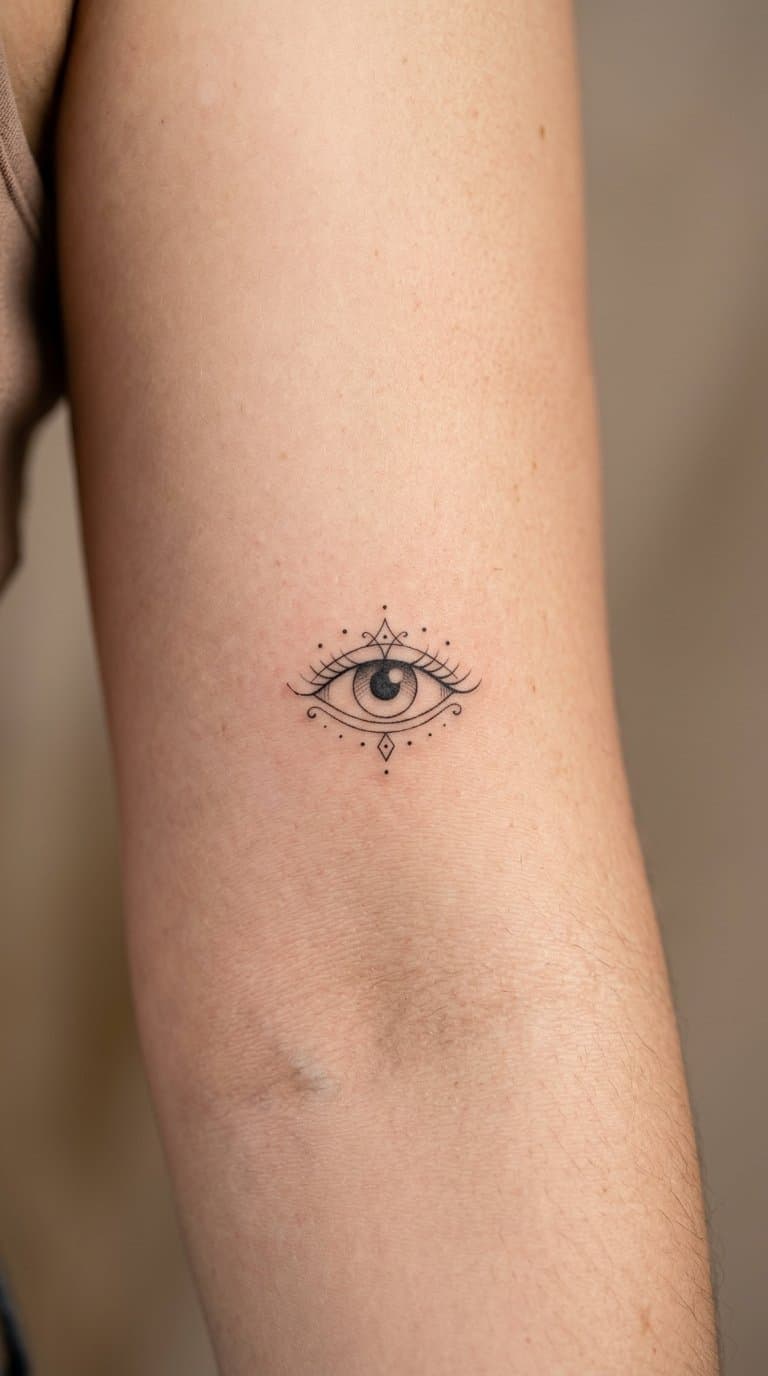
I like a small ornamental eye because it combines a recognizable symbol with delicate decorative detail. Fine lines, tiny rays, dots, or curved flourishes can give it a refined appearance without taking much space.
I would place this design near other small tattoos, such as stars, moons, florals, or geometric marks. Its compact shape makes it easy to add surrounding pieces later while keeping the patchwork arrangement balanced.
I prefer black ink for crisp contrast, though muted color can highlight the iris or ornamental accents. A simple design also tends to remain readable as the tattoo ages.
13) Tiny mushroom trio
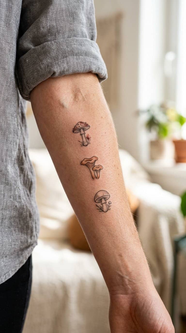
I like placing three tiny mushrooms together as a compact patchwork motif. I can vary their cap shapes, stem lengths, and earthy colors while keeping each design small enough to combine with unrelated tattoos later.
A simple trio works well on the wrist, ankle, forearm, or behind the arm. I would leave narrow gaps between the mushrooms so each one stays readable as the collection grows.
I can also give each mushroom a different treatment: fine-line shading, muted color, or a small surrounding detail such as dots or leaves. These changes create variety without making the group feel disconnected.
14) Miniature honeybee
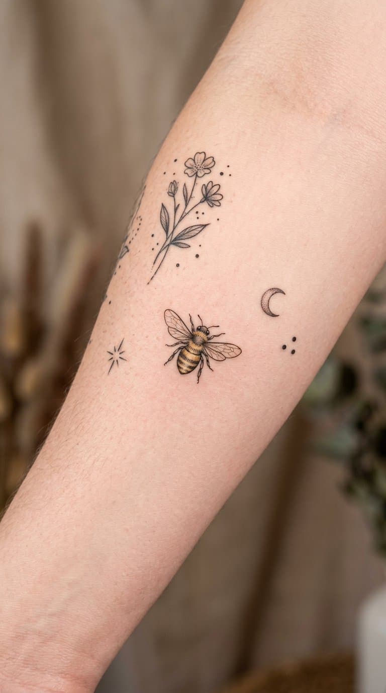
I like miniature honeybees because their compact shape fits naturally into a growing patchwork collection. I can place one near floral, botanical, or geometric tattoos without making the arrangement feel crowded.
Fine lines define the wings, striped abdomen, and small legs, while a touch of yellow adds contrast. I prefer simple shading so the design remains readable as it ages and stays visually lighter than larger animal tattoos.
I can use the bee as a small connector between separate pieces, especially when nearby tattoos share warm tones or nature-inspired details. Its direction also gives me flexibility: it can face inward toward the collection or point toward an open area for future additions.
15) Fine-line coffee cup

I like a fine-line coffee cup because its simple shape fits naturally into a growing patchwork collection. I can keep the design small, using delicate outlines for the cup, saucer, steam, or a takeaway lid without adding heavy visual weight.
I would place it near other everyday objects, such as books, flowers, or kitchenware, and let the surrounding tattoos build the story. A tiny accent—like a heart-shaped steam curl or a single shaded coffee surface—adds personality while preserving the clean, understated look.
The design also works well in open areas between larger pieces. I can add subtle details later, but the cup remains recognizable even when kept minimal.
16) Small classic skull
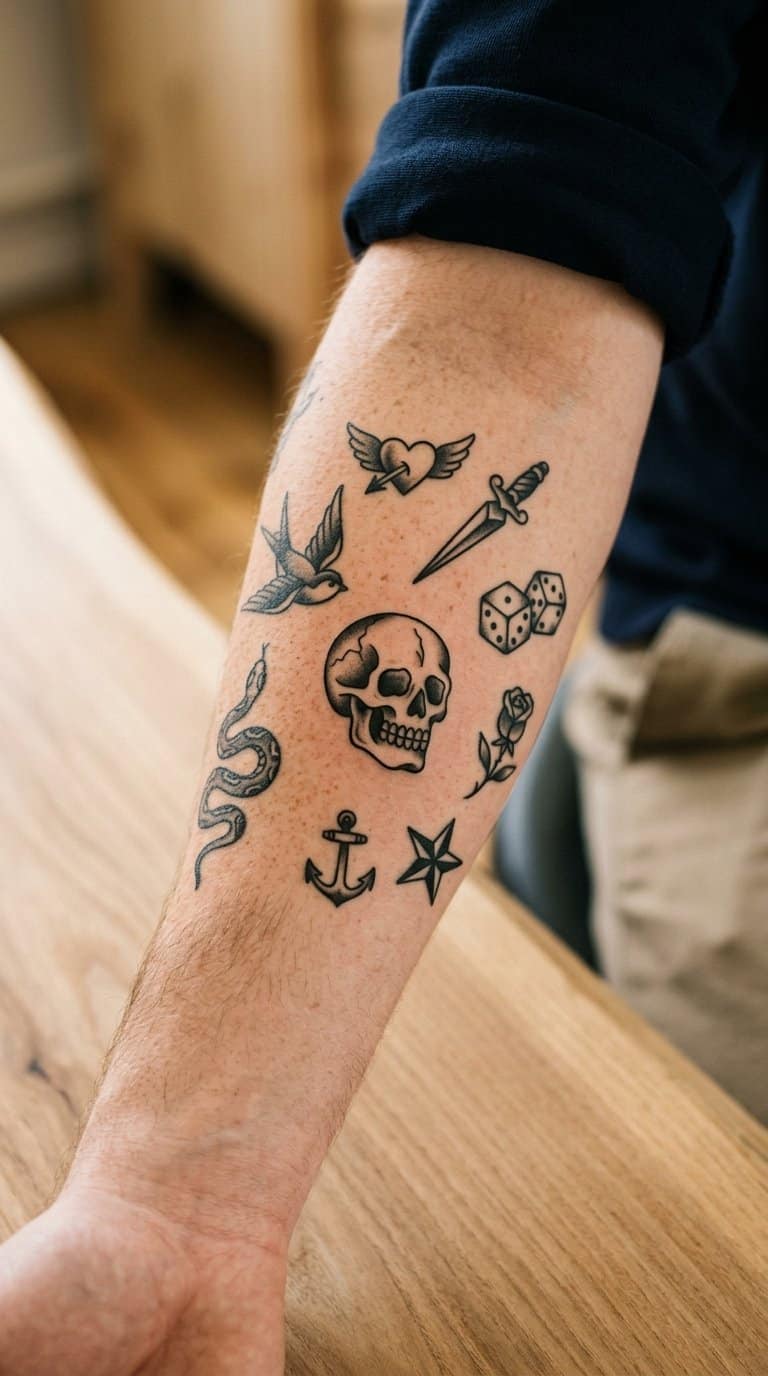
I like a small classic skull as an easy starting point for a patchwork sleeve. Its compact shape fits neatly beside stars, flowers, daggers, or simple lettering without taking over the surrounding space.
I would keep the design traditional, using clean outlines, dark eye sockets, and limited shading. That approach helps the tattoo remain readable as I add nearby pieces with different subjects and styles.
A skull also gives the collection a slightly darker focal point while leaving room for lighter designs around it. I can place it on the forearm, wrist, upper arm, or ankle, depending on how much space I want to build around it.
17) Tiny shooting star
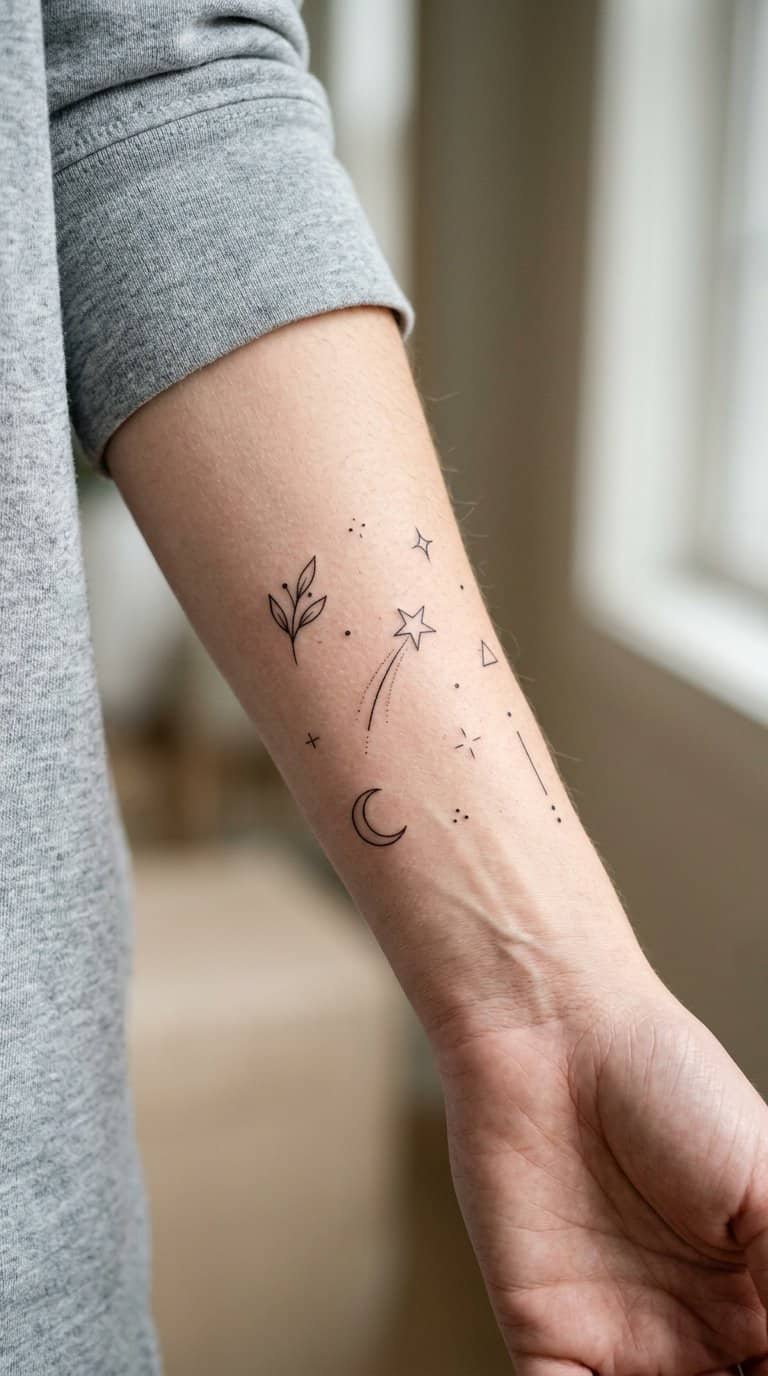
I like a tiny shooting star because its slim shape fits naturally into small gaps between larger patchwork tattoos. I can place it near the wrist, ankle, collarbone, or behind the ear without overwhelming nearby designs.
I would keep the star and trail simple, using fine lines or a small amount of black shading. A short trail can point toward another tattoo, helping connect separate pieces while leaving enough skin visible to preserve the patchwork spacing.
18) Miniature anatomical heart
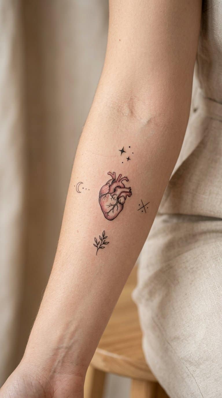
I like a miniature anatomical heart because its detailed shape adds visual interest without taking up much space. I would place it on the forearm, ankle, or upper arm, where future pieces can frame it without overwhelming the design.
Black ink keeps the valves, vessels, and curved contours crisp at a small scale. I might add a single muted color, such as dark red, while keeping nearby tattoos in the same restrained style.
This motif works well beside botanical sprigs, medical symbols, or tiny insects. I would leave narrow gaps between each piece so the patchwork arrangement stays readable as more tattoos join it.
19) Delicate fern frond
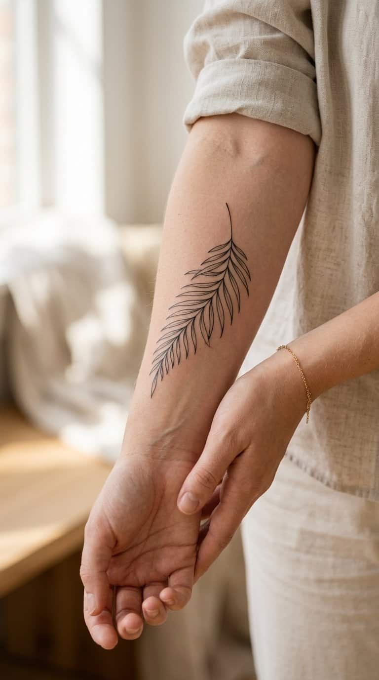
I like a delicate fern frond for its narrow shape and fine, branching details. I can place it along the forearm, collarbone, ribs, or ankle, where its natural curve follows the body without overwhelming nearby tattoos.
Its open structure also makes it easy to build around. I might add small leaves, dots, a moth, or a second frond later while keeping the original design visible. Fine black lines create a quiet look, while muted green can give the foliage a subtle change in tone.
20) Small koi fish
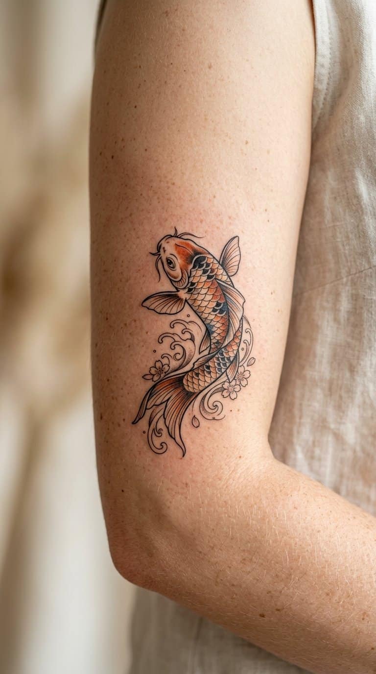
I like small koi fish tattoos for the way their curved bodies fit neatly into narrow spaces. I can place one near the wrist, ankle, or collarbone, then add water lines, lotus petals, or small leaves as the collection grows.
A koi’s direction can also shape the arrangement. I might angle it upward beside existing botanical pieces or let it swim horizontally between smaller symbols. Black ink keeps the design consistent with most patchwork tattoos, while restrained orange or red adds a focused accent without overpowering nearby work.
21) Tiny ornamental key
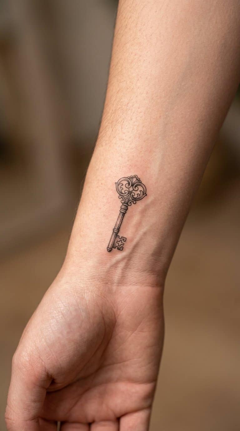
I like a tiny ornamental key as a precise starting point for a patchwork collection. Fine teeth, a rounded bow, and small engraved details give it enough structure to stand alone without taking up much space.
I would place it near the wrist, ankle, or inner arm, leaving room for nearby pieces to build around it. Floral sprigs, a lock, a ribbon, or small stars can extend the theme while preserving the key’s delicate scale.
I prefer black ink for crisp edges, though muted color can highlight the bow or handle. A simplified design usually ages more cleanly than dense ornament, especially at a very small size.
22) Miniature sunburst
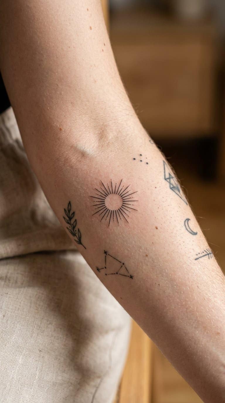
I like miniature sunbursts for the way their fine rays add direction without overwhelming nearby tattoos. I would place one between existing pieces, where its compact shape can fill a narrow gap while keeping the overall patchwork layout balanced.
I prefer simple black lines or a small touch of muted color, depending on the surrounding designs. Short, evenly spaced rays keep the image readable at a small scale, while slight variations in length give it a hand-drawn quality.
Planning A Cohesive Patchwork Sleeve

I plan a patchwork sleeve around a clear visual direction, then use size, spacing, and placement to keep each tattoo distinct. Repeating colors, line weights, or subject details can connect varied designs without making them look like one continuous image.
Choosing A Unifying Theme
I start with a subject category that gives the sleeve a consistent identity, such as botanical studies, traditional symbols, insects, travel motifs, or small personal references. I do not need every tattoo to match; I need each piece to fit the same visual language.
A limited palette creates cohesion quickly. Blackwork suits bold icons and fine-line illustrations, while muted red, green, or blue can highlight selected details without making the sleeve look crowded. I also repeat small elements, such as stars, leaves, ribbons, or geometric accents, to connect unrelated designs.
I save reference images that share similar line quality and shading. Before booking, I ask my tattoo artist to review the collection and identify conflicting styles, such as highly realistic portraits beside delicate single-needle pieces.
Balancing Sizes, Shapes, And Placement
I place larger tattoos first because they determine the sleeve’s visual structure. I usually reserve broad areas, such as the upper arm or outer forearm, for designs with strong silhouettes, then fit smaller symbols into gaps around them.
Shape affects how naturally each tattoo follows the arm. Vertical designs suit the forearm, horizontal pieces can sit across the bicep, and compact circular motifs work well near the elbow or shoulder. I avoid placing several similarly sized tattoos in a straight row because the arrangement can look rigid.
I leave intentional skin gaps between pieces so each design remains readable. My artist can use small fillers—dots, stars, leaves, or short lines—but I choose them after the main tattoos rather than using filler to solve poor spacing.
Care, Timing, And Long-Term Expansion
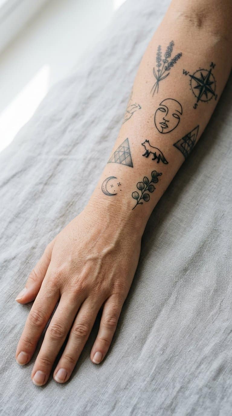
I plan new pieces around healing time, available skin, and the visual balance of the existing collection. I also keep placement records and share clear references so every artist can add detail without disrupting the larger arrangement.
Healing Gaps Between Sessions
I wait until each tattoo has fully healed before placing a new piece nearby. Most tattoos need about two to four weeks for surface healing, but deeper soreness, peeling, redness, or sensitivity means I give the area more time.
I avoid scheduling sessions that overlap irritated skin. Fresh tattoos need gentle washing, light moisturizing, and protection from direct sun, swimming, friction, and picking. I also leave enough untouched skin between designs for swelling and future additions, especially around joints and areas that bend frequently.
Before expanding a patchwork collection, I photograph healed work and mark planned placements on a simple body map. This helps me track spacing, identify visual gaps, and prevent rushed decisions based on temporary redness or swelling.
Working With Multiple Artists
I keep a consistent record of each tattoo’s artist, date, placement, size, needle style when available, and healed appearance. I show this information during consultations so a new artist can match the collection without copying another person’s exact approach.
Different artists can add useful contrast, but I coordinate key details such as line weight, shading density, color palette, and scale. I bring healed photos rather than relying only on fresh images, since healed ink gives a more accurate reference for saturation and texture.
I also decide which areas need visual continuity before booking. For example, I may reserve a specific limb for bold blackwork while using smaller color pieces elsewhere, giving each artist room to work while keeping the full patchwork layout intentional.