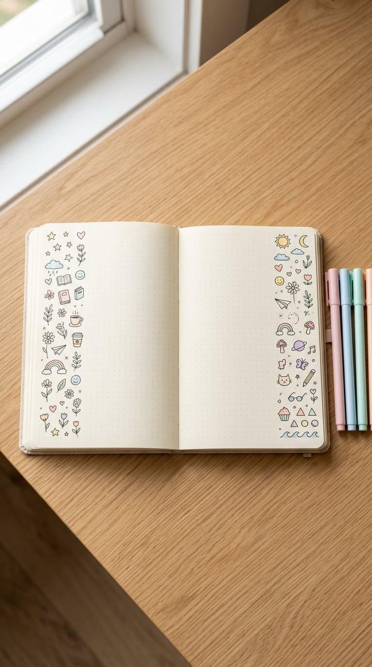
Notebook margins give me a small, low-pressure space to draw while I take notes, plan tasks, or pause between ideas. With a few simple lines, I can add personality without filling the page or interrupting its purpose.
Save for later
Want to come back to this story? Save it with your email so it is easy to find again.
I can use these easy doodles to make ordinary notebook pages more personal, enjoyable, and visually engaging. The collection covers cheerful objects, nature-inspired shapes, tiny characters, and practical techniques that help me create cleaner designs and adapt each idea to my own style.
Table of Contents
- 1 1) Tiny smiling sun
- 2 2) Four-leaf clover
- 3 3) Potted cactus
- 4 4) Simple mountain range
- 5 5) Coffee cup with steam
- 6 6) Open book
- 7 7) Paper airplane
- 8 8) Hanging crescent moon
- 9 9) Cloud with raindrops
- 10 10) Small rainbow
- 11 11) Daisy flower
- 12 12) Lavender sprig
- 13 13) Cute mushroom
- 14 14) Sleeping cat
- 15 15) Waving ghost
- 16 16) Friendly whale
- 17 17) Little bumblebee
- 18 18) Butterfly outline
- 19 19) Snail with a spiral shell
- 20 20) Hot-air balloon
- 21 21) Stack of books
- 22 22) Hanging light bulb
- 23 Simple Techniques for Cleaner Margin Art
- 24 Choosing Pens, Pencils, and Markers
- 25 Using Shapes, Lines, and Repetition
- 26 Keeping Designs Within Narrow Spaces
- 27 Making Notebook Doodles Your Own
- 28 Matching Designs to Your Notes
- 29 Adding Color Without Creating Clutter
- 30 Building a Consistent Personal Style
1) Tiny smiling sun
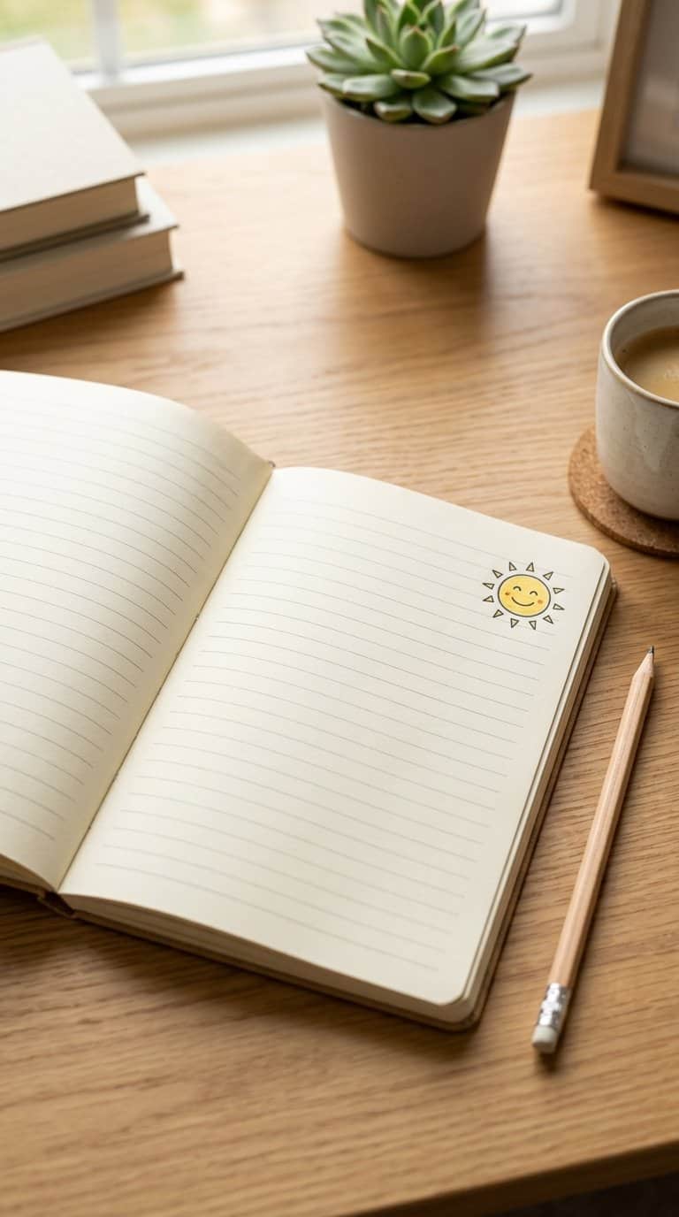
I draw a small circle near the edge of the page, then add short rays around it. Two dots and a curved line create a simple face without taking much space.
I vary the rays to match the available margin, using longer lines at the top and shorter ones along the sides. I use a fine pen for clean details or a pencil when I want a softer look.
This doodle works well beside headings, reminders, or empty corners. I can add tiny clouds, sunglasses, or a few dots without making the design crowded.
2) Four-leaf clover
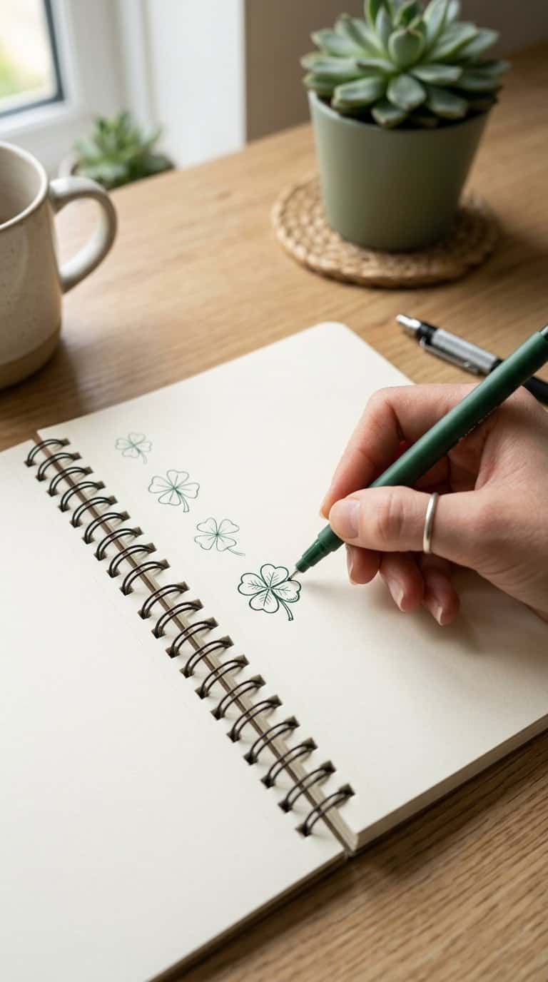
I draw four rounded leaves around a small center, keeping the shapes slightly uneven for a hand-drawn look. I add a short stem below and use the notebook lines as a guide for spacing.
For a simpler version, I make each leaf with two curved strokes that meet at a point. I can fill the leaves with light shading, add tiny vein lines, or leave the shape as an open outline.
I place this doodle beside reminders, headings, or empty corners. When I want variety, I draw several clovers at different sizes and tilt their stems in different directions.
3) Potted cactus

I sketch a small pot using a rounded rectangle, then add a cactus with two short arms. I keep the shapes simple and use curved lines to suggest soft, padded growth rather than sharp detail.
For texture, I place a few evenly spaced dots or tiny dashes across the cactus. I add a narrow rim to the pot and shade one side with light diagonal strokes. This doodle fits neatly into a corner or beside a heading.
4) Simple mountain range
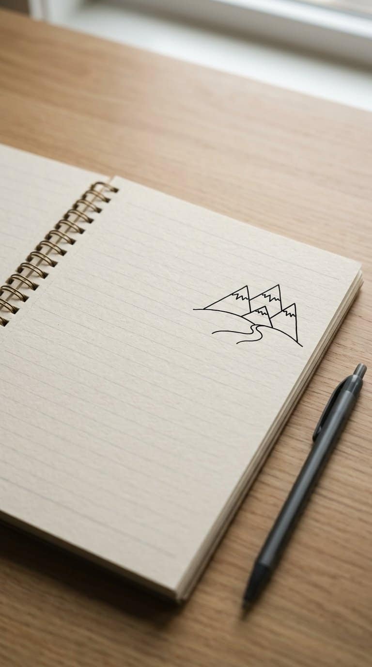
I start with a low, uneven line of peaks, keeping the shapes simple enough to fit beside a paragraph. I vary the heights slightly so the range looks natural without taking up much space.
For extra detail, I add a second line of smaller peaks behind the first. Short, angled strokes can suggest snowy caps, while a few curved lines below the peaks create gentle slopes.
I often place a small sun, moon, or cluster of clouds above the range. Using a fine pen keeps the drawing neat, and leaving some areas unfilled gives the mountains a clean, open appearance.
5) Coffee cup with steam

I start with a small oval for the cup’s opening, then add two slightly curved sides and a rounded base. A simple C-shaped handle gives the doodle its shape without taking much space.
I draw two or three thin steam lines above the cup, varying their height and curve. I keep the lines light and uneven so they look like rising warmth rather than rigid decoration.
For extra detail, I add a narrow band near the rim, a few short marks suggesting coffee, or a tiny saucer beneath the cup. I place it near a page corner or between notes, where its compact shape fits naturally.
6) Open book

I draw two slightly curved pages meeting at the center, then add a narrow spine beneath them. Short, uneven lines suggest printed text without crowding the shape. I keep the outline simple so the doodle fits neatly beside notes.
To add dimension, I curve the lower edges outward and include a few page corners that do not align perfectly. A tiny bookmark or leaf makes the drawing personal, while light shading near the spine gives it depth. I use this design when I want a quiet reading-themed detail in my notebook margin.
7) Paper airplane

I sketch a simple paper airplane with a long center fold, two angled wings, and a short tail. I use light lines first, then darken the edges that define its shape.
For a more active margin, I draw several airplanes at different sizes and angles. I add short motion lines behind each one, keeping the spacing loose so the design does not crowd my notes.
I also vary the perspective by showing one airplane from above and another from the side. A few small triangles or dotted paths can suggest direction without requiring detailed shading.
8) Hanging crescent moon
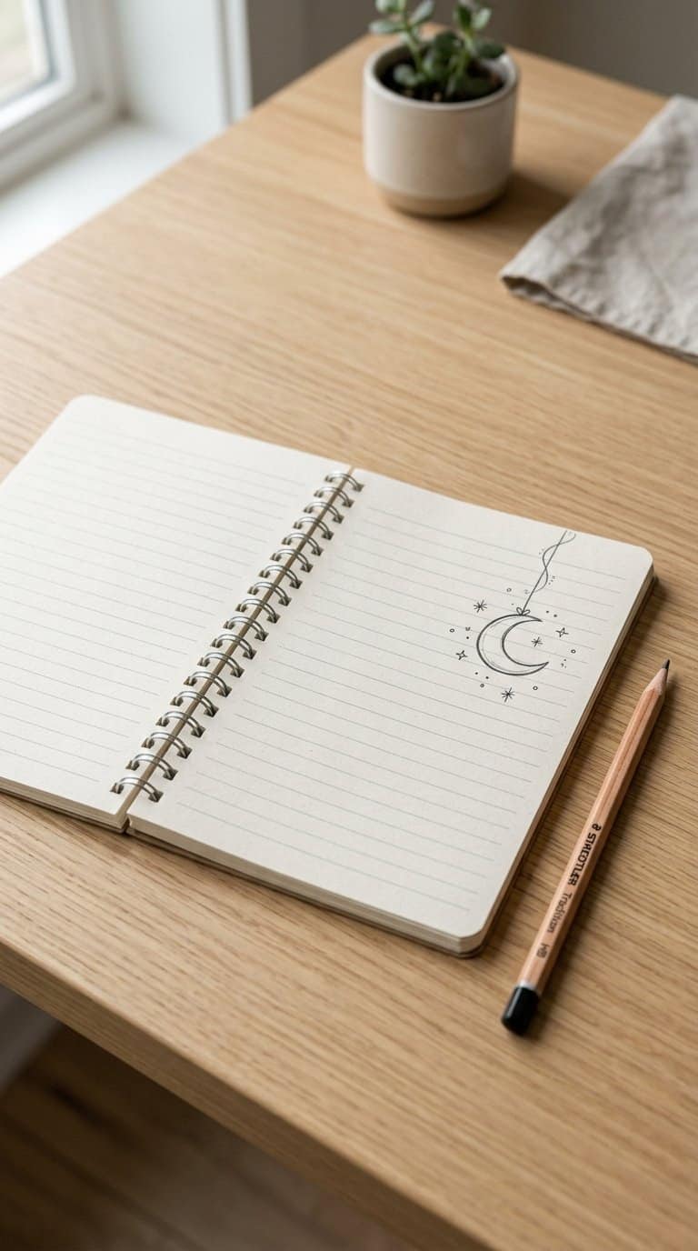
I start with a small crescent moon, then add a short curved line above it to suggest a thread. A tiny loop or star at the top makes the design feel suspended without requiring much space.
I use uneven curves to give the moon a hand-drawn look. Small dots, stars, or a few wispy lines can fill the surrounding margin, while leaving enough blank space keeps the doodle easy to read.
For a simple variation, I draw the moon inside a small circle or attach it to a short string of beads. I keep the shapes compact so the design fits neatly beside notes without distracting from the page.
9) Cloud with raindrops
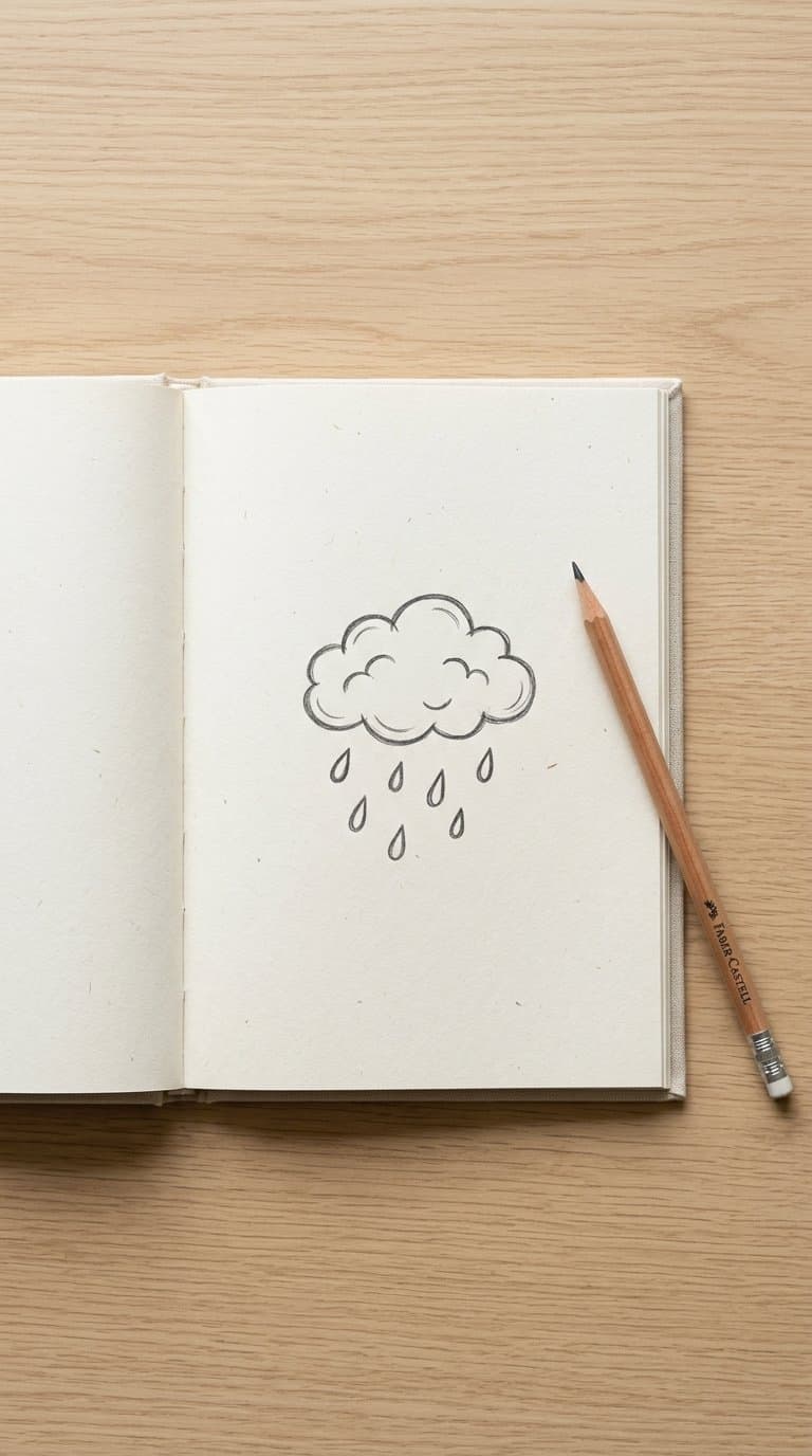
I start with a small, rounded cloud made from connected bumps rather than perfect circles. Beneath it, I add three or four raindrops, spacing them unevenly to give the doodle a natural appearance.
I keep the outline light and use short curved marks inside the cloud to suggest texture. For a simple variation, I fill the raindrops with blue ink or shade one side of each drop with diagonal lines.
When I have little space, I draw only the cloud’s lower edge and two drops. I can also add a tiny puddle beneath them, using an oval with a broken outline so the design stays quick and uncluttered.
10) Small rainbow
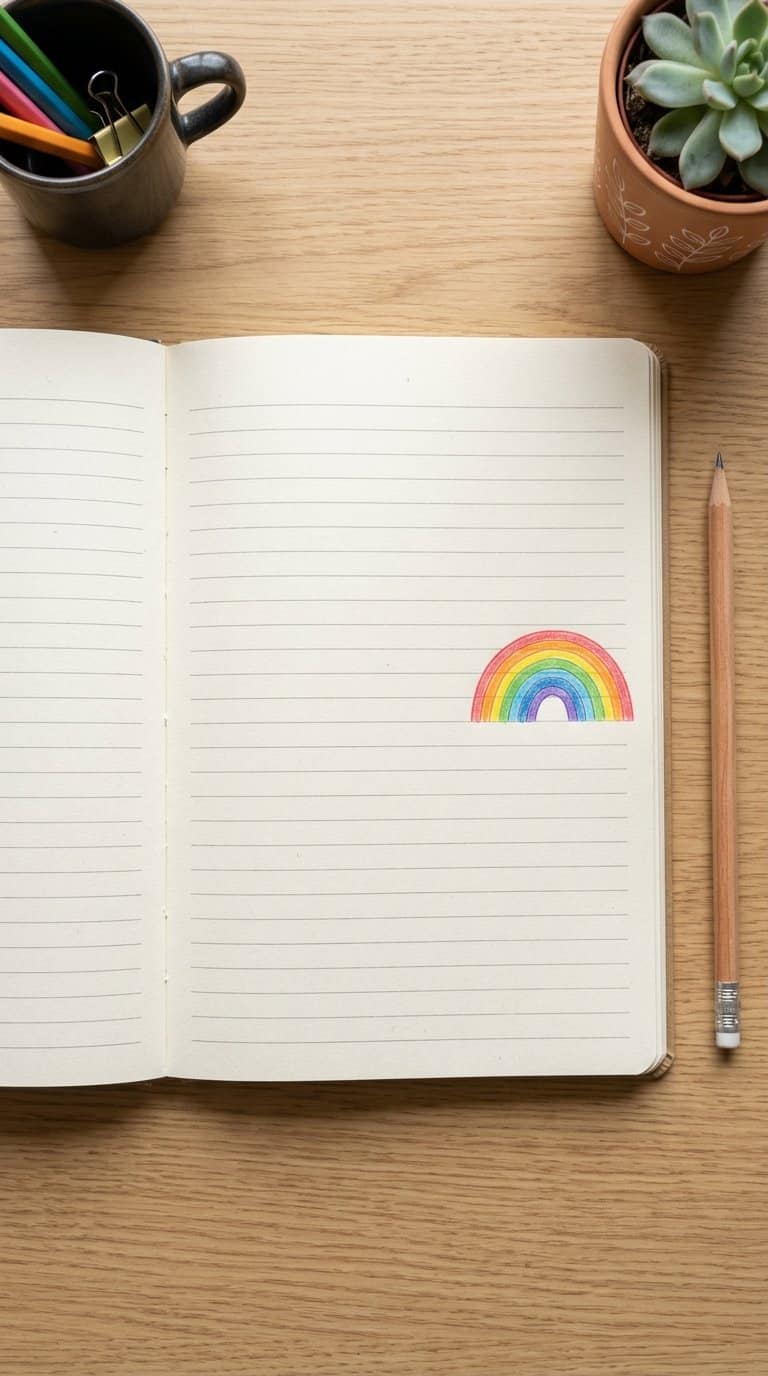
I draw a small rainbow with three or four curved bands, keeping the shape low and narrow so it fits neatly beside my notes. I use simple arcs rather than perfect geometry, which makes the doodle quick to repeat.
I leave the ends open or add two tiny clouds beneath them. For color, I choose a few bright pencils or use alternating patterns when I want to keep the page monochrome.
I place this design near headings, reminders, or empty corners. Its compact shape adds color without covering nearby writing, and I can adjust the number of bands to match the available space.
11) Daisy flower
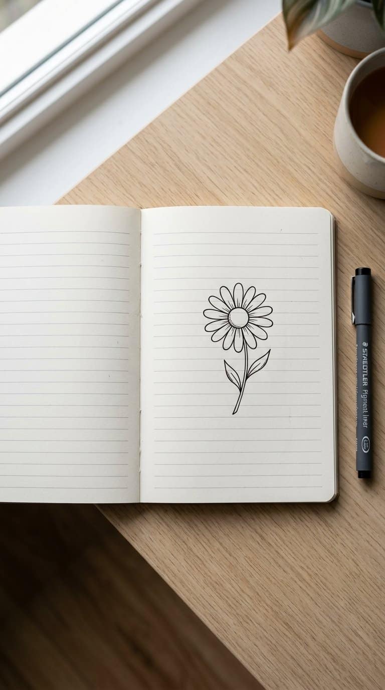
I draw a small circle for the center, then surround it with evenly spaced oval petals. Keeping the petals slightly varied makes the flower look hand-drawn rather than mechanical. I use a short stem and two simple leaves to complete the shape.
For a quicker margin doodle, I make the center a dot and reduce the flower to five petals. A fine-tip pen works well for outlines, while a yellow pencil or highlighter can add color without covering nearby notes.
I also like drawing several daisies at different angles. Tilting one flower, shortening another stem, or showing a side view creates a small natural-looking cluster.
12) Lavender sprig

I draw a slender, slightly curved stem first, then add pairs of narrow leaves along its length. Small oval buds cluster near the top, with each pair angled in a different direction to keep the sprig natural.
I use light pencil pressure for the outline and add short strokes to suggest texture. A few diagonal lines around the buds create a simple shaded effect without making the doodle look crowded.
For a softer margin design, I repeat the sprig at different heights and tilt each one slightly. I leave enough space between them so the page stays clean and the shapes remain easy to recognize.
13) Cute mushroom
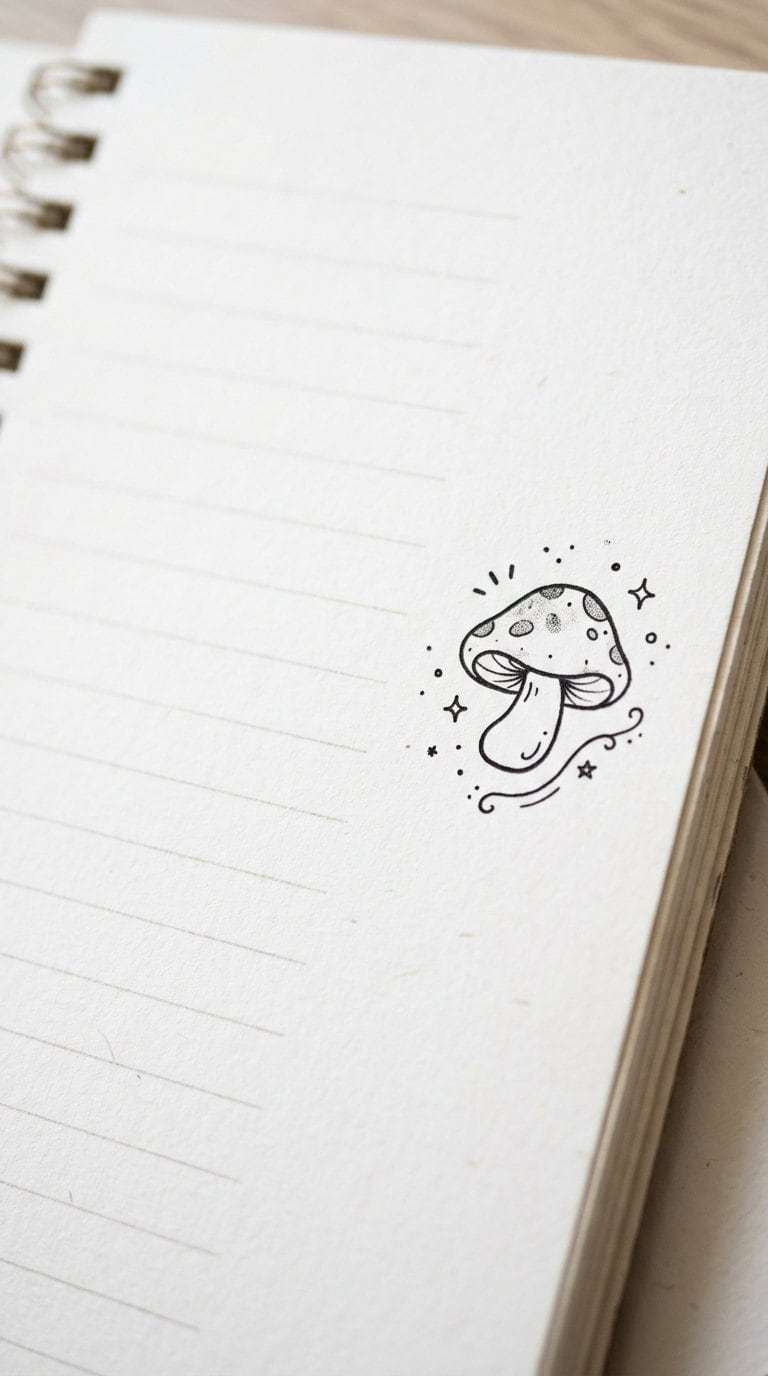
I start with a short, curved stem and place a rounded cap above it. I divide the cap from the stem with a simple line, then add small circles or oval spots across the top.
To give it character, I draw two tiny eyes and a small smile on the stem. I sometimes add short grass lines, leaves, or scattered dots around the base, keeping the details small enough for a notebook margin.
I use a fine black pen for the outline and add one or two muted colors, such as red for the cap and brown for the stem. Varying the cap shape creates different mushrooms without changing the basic drawing.
14) Sleeping cat
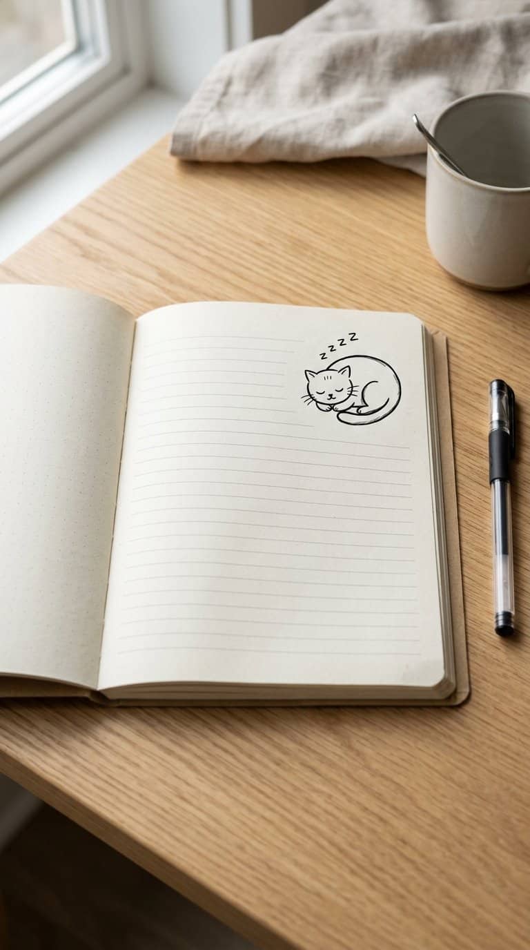
I draw a sleeping cat as a small curled shape, using a rounded back, tucked paws, and a tail wrapped around the body. Two short arcs suggest closed eyes, while a tiny triangle adds the nose without crowding the design.
I keep the outline simple and leave plenty of white space around it. A few short lines beneath the body can suggest a soft surface, and small “z” marks add a playful detail when I want the doodle to look more expressive.
For a quicker version, I sketch only the curved back, ears, and tail. I vary the ear position or tail shape to create several cats that fit neatly along a notebook margin.
15) Waving ghost
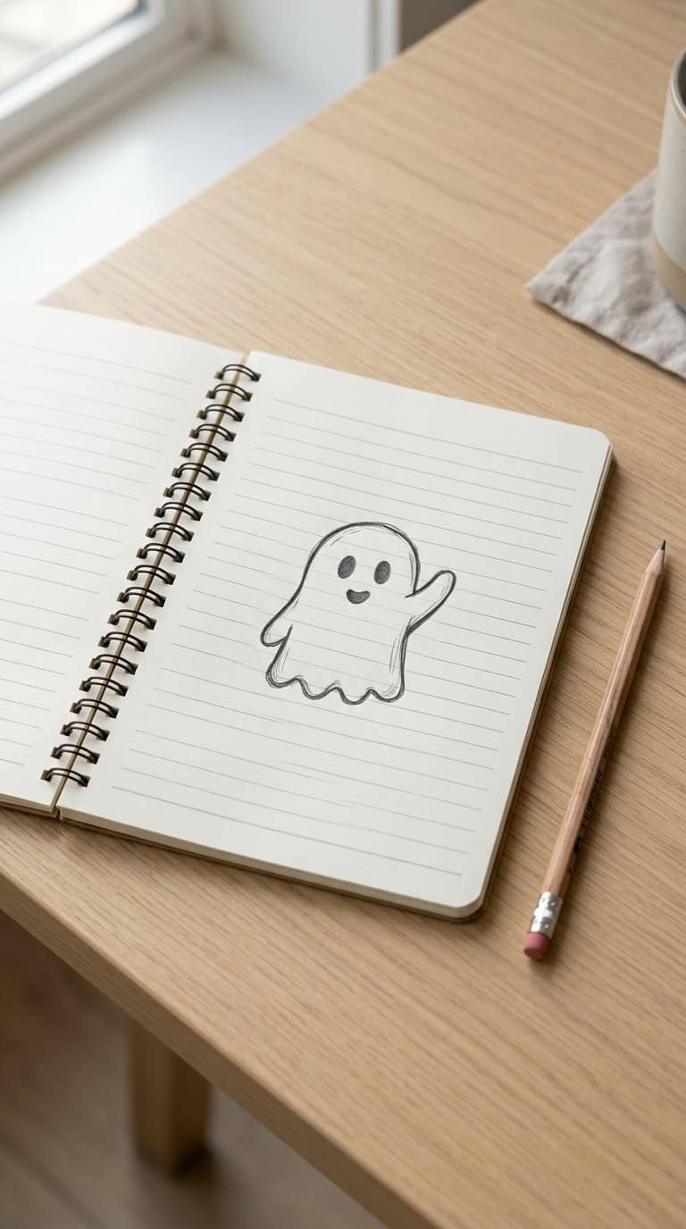
I draw a small rounded figure with two raised arms, keeping the outline loose and friendly. Two oval eyes and a tiny open mouth give it a simple expression without adding much detail. I usually leave the bottom edge slightly uneven to suggest a floating sheet.
For extra character, I add short motion lines beside one hand or place a tiny star nearby. I use a pen, pencil, or highlighter, and I vary the face to create different moods. The doodle fits neatly beside headings, reminders, and short notes.
16) Friendly whale
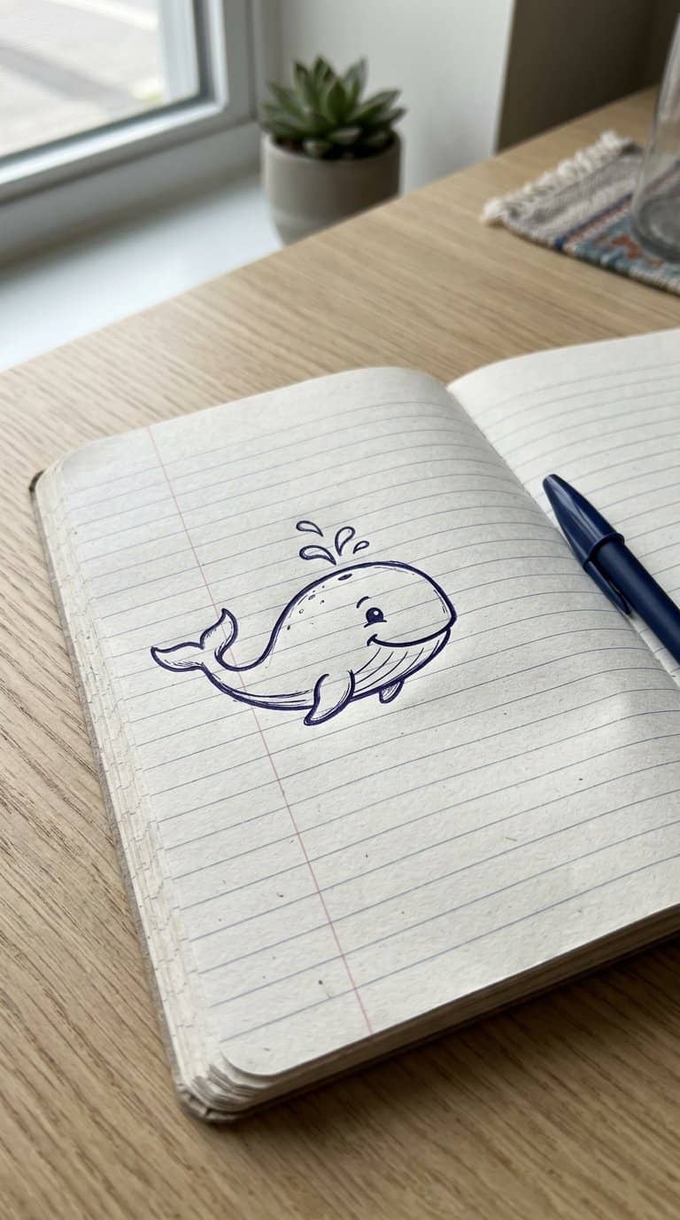
I draw a simple whale with a rounded body, a small tail, and a curved smile. I add a short spout above its head, using two or three lines to suggest water without crowding the design.
I keep the outline loose so the whale looks playful rather than detailed. A tiny eye, a few dots for texture, and a curved line for the belly give it character while leaving plenty of white space around the doodle.
I usually place it near the bottom corner of a page, where its horizontal shape fits naturally. Soft blue, gray, or black accents can add color, but the whale also works well as a quick pen sketch.
17) Little bumblebee

I draw a small oval body, then add two curved stripes and a pair of rounded wings. Short, angled lines suggest movement without making the doodle look busy. I keep the proportions loose so I can finish it quickly in a narrow margin.
For extra detail, I add tiny antennae, six simple legs, and a few dots around the bee. A pale yellow fill on the body helps it stand out, while a black pen defines the stripes and wings.
18) Butterfly outline
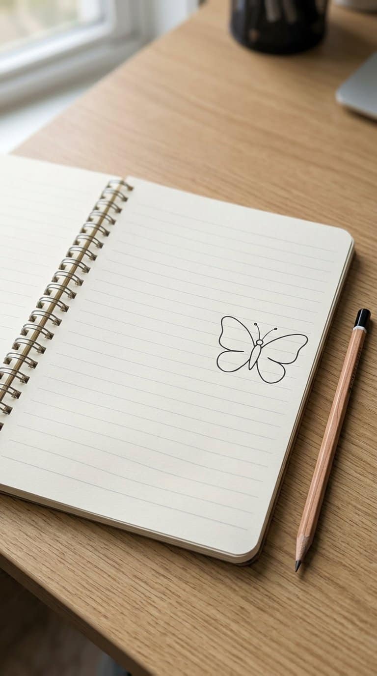
I draw two rounded upper wings and two smaller lower wings around a narrow central body. I keep the outline light and slightly uneven, which gives the butterfly a hand-drawn appearance without making the doodle look cluttered.
I add two short antennae and a few curved lines inside each wing to suggest patterns. When space is limited, I use only one inner line per wing and leave the rest open.
For a balanced design, I place the butterfly near a page corner or between notes. I can vary its size, tilt, or wing pattern to fit the available margin.
19) Snail with a spiral shell

I draw the body as a low, curved line, then add a rounded shell above it. Inside the shell, I use one continuous spiral that begins near the center and widens toward the edge. Two short feelers and tiny dots at their tips give the snail a clear expression without taking much space.
I keep the outline light and add a few short marks beneath the body to suggest movement. For variety, I change the spiral’s direction, make the shell slightly oval, or place the snail beside a small leaf. Its simple shapes fit neatly into a narrow notebook margin.
20) Hot-air balloon
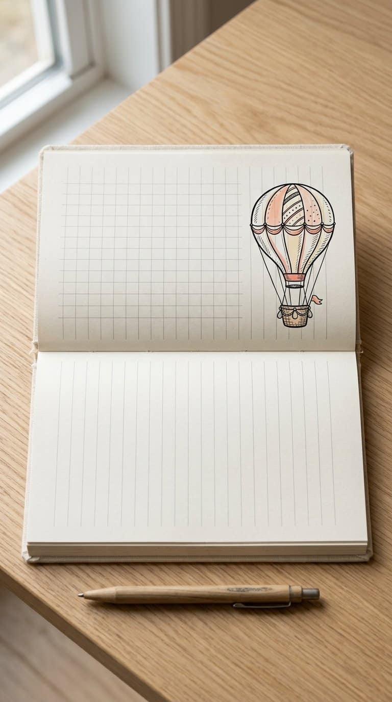
I draw a small oval balloon near the margin, then add two or three curved bands to suggest its fabric panels. A narrow basket beneath it gives the shape a clear structure without taking much space. I keep the outline light and use short horizontal strokes for texture.
For a simple variation, I add a few small clouds around the balloon or sketch dotted lines beneath the basket to suggest gentle movement. I use one accent color for the balloon panels and leave the basket uncolored, which keeps the doodle neat and easy to reproduce.
21) Stack of books

I draw three or four books with slightly uneven edges to make the stack feel natural. I use narrow rectangles for the covers, then add short curved lines to suggest pages along the exposed sides.
I vary the sizes and angles instead of aligning every book perfectly. A tiny bookmark, simple title marks, or a pair of glasses beside the stack adds detail without taking much space. For a quick version, I outline the books in pen and shade one side with short parallel lines.
22) Hanging light bulb

I draw a small bulb suspended from a curved cord, leaving enough space around it for the shape to stand out. I use an oval or pear-shaped outline, then add a narrow screw base with a few horizontal bands.
To suggest a gentle glow, I place short rays around the bulb without filling the margin. I might add a tiny highlight inside the glass and darken one side of the base for contrast.
I keep the design simple enough to repeat beside headings or notes. Changing the cord’s curve, bulb size, or ray pattern gives each doodle a slightly different look.
Simple Techniques for Cleaner Margin Art
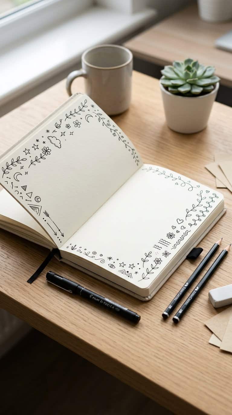
I choose tools that match the paper, build designs from controlled shapes, and leave enough room for text and corrections. Small adjustments to line weight, spacing, and placement help margin art stay neat without making the page feel crowded.
Choosing Pens, Pencils, and Markers
I start with a pencil when I need to test proportions or place a design beside handwritten notes. A 0.3–0.5 mm fineliner works well for outlines, while a slightly thicker pen adds emphasis to selected edges. I let ink dry before closing the notebook to prevent smearing.
| Tool | Best use |
|---|---|
| Pencil | Planning and light shading |
| Fineliner | Precise outlines |
| Colored pencil | Soft, controlled color |
| Mild marker | Bold accents |
I test markers on a spare page first because some inks bleed through thin paper. For erasable sketches, I use a light touch and remove stray graphite only after the ink has fully dried.
Using Shapes, Lines, and Repetition
I simplify objects into circles, rectangles, triangles, arcs, and short lines before adding details. A tiny plant might use an oval pot, a curved stem, and repeated leaf shapes; this keeps the drawing recognizable without requiring complex shading.
Repetition creates consistency. I repeat three to five related marks, such as dots around a star or parallel lines inside a banner, while varying their length slightly to avoid a mechanical appearance. I also keep one dominant line style: smooth curves for organic subjects or straight segments for geometric designs.
When I make a pattern, I establish its spacing with the first few marks. I pause after each group to check whether it remains aligned with the notebook ruling.
Keeping Designs Within Narrow Spaces
I measure the available margin before drawing and leave a small buffer beside the writing. I reduce the design to its clearest features rather than squeezing in every detail. For example, I draw a simple envelope with a flap and stamp instead of adding tiny text.
I use the notebook lines as guides for height and alignment. A design that spans two or three ruled lines usually remains visible without competing with the page content. I keep delicate details near the center and place heavier outlines toward the outside edge.
For repeating decorations, I sketch a light boundary first. This helps me maintain consistent spacing and prevents leaves, stars, or dots from drifting into paragraphs.
Making Notebook Doodles Your Own
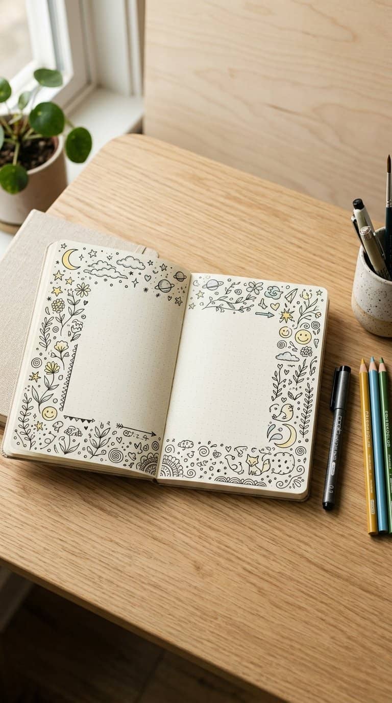
I personalize doodles by matching their shapes to the subject, limiting color choices, and repeating a few visual details. These choices keep the margins useful while giving my notes a recognizable look.
Matching Designs to Your Notes
I choose doodles that reinforce the information beside them. A small leaf works well near biology notes, while a speech bubble can mark a definition, quotation, or discussion point. For schedules, I use clocks, calendars, arrows, and checkboxes instead of unrelated decorations.
I also match the drawing’s size to the note’s importance. I place a larger symbol beside a main topic and use tiny icons for supporting details. Simple shapes work best in narrow margins because they remain readable without crowding the writing.
To keep the page organized, I assign consistent meanings to repeated designs:
- Star: important point
- Light bulb: new idea
- Exclamation mark: item to review
- Arrow: connection or sequence
Adding Color Without Creating Clutter
I limit each page to two or three colors. One color can highlight key terms, another can fill small doodle areas, and black or dark blue can define outlines. This system makes color functional rather than decorative.
I apply color selectively instead of filling every shape. A yellow center on a flower, a blue stripe on a banner, or a green leaf often provides enough contrast. Light pressure helps me create softer tones and prevents ink from showing through thin paper.
I test markers on a spare corner before using them in my notes. If a color looks too dark, I reserve it for outlines or small accents. I also leave blank space around colored doodles so nearby handwriting stays easy to scan.
Building a Consistent Personal Style
I create consistency by repeating a few choices across different pages. I might use rounded corners, thick outlines, short motion lines, or a specific lettering style. These details make separate doodles feel related without requiring identical drawings.
I keep a small reference list in the back of my notebook with symbols I use often. For example, a triangle can mark a task, a curved arrow can show cause and effect, and three dots can indicate an unfinished thought. I avoid assigning multiple meanings to one symbol.
My style improves when I draw the same basic forms in several contexts. Practicing circles, leaves, faces, banners, and arrows helps me work faster and keeps my margins balanced. I favor clear shapes over complex designs that take attention away from the notes.